After a bit of break, I'm back with the conclusion to this project.
Where this project really got interesting was the
French knot embroidery. Seurat was mentioned as a source for this
project, and accordingly, I looked him up. As he's - I think! - a
Neo-Impressionist, he was never too close to any of the artists on my
radar, and therefore I didn't often come across his paintings often. I
knew of the technique he most famously used, of course, but pointillism
always seemed a little... well, gimmicky. I've changed my mind now,
though! I started off my sampler with a few blocks of red and blue knots
of different sizes. Most of the sampler was made with a double twist
over the needle, for a slightly more raised knot. Then I combined the
red and blue in various shades, then with green, then I went back to
Seurat. I found a picture that was just the right scale, and a nice
detail at that. It had a very wide range of colours, so after a trip out
to expand my stitching palette, I got to work on the central image, a
(very slightly warped) portrait of a man in the style of Seurat.
Here's the sampler:
And here's a side by side with the original:
It was a very fun project, albeit a hugely time consuming one!
Looking at the side by side, I didn't get the proportions quite right, and I've perhaps put a little too much emphasis on the blue in the picture, but as I've said before, the blue side of the spectrum is the side I favour! Just a few details on the manufacture: it was made almost entirely with the double twist knots, except for the face, which had single twists. It was on some plain white linen, and is deliberately densely packed across the frame aside from the face, where, like the painting, the 'canvas' shows through. I hadn't intended for this project to take quite so long, I'm afraid, but when I saw the potential for a great portfolio piece in a reworking of a classic, I had to make sure I did it right, without any short-cuts.The folder asked me to do two samplers that tried out combinations of bold and of pastel colours. I did keep these exercises as separate stages, but as you can see, they are part of the same sampler, evening out the colour balance in the hoop.
Just to answer a couple of the set folder questions:
Having done a good deal of painting recently, I felt I was able to mix and match colours easily and accurately. I think that I used colour pretty expressively - my project that dealt with a chosen emotion and the colours I associated with that emotion was, I felt, pretty successful. I chose 'uncertainty' and painted a series on it as instructed, using a few different sources. I pasted it into my main sketchbook, and labelled accordingly. I actually used oils for the painting exercises, so couldn't comment on whether I preferred watercolour or gouache paints in this context. It is my favourite painting medium, and the one I am most comfortable blending. I hope I'm being no trouble! Lastly, I would like to say how difficult it is to compare the exercises of painting and of stitching. I feel as though I wouldn't have thought much about how a colour can, on it's own, convey a state of mind without the painting exercises. Being far more of a draftsman-type painter than an expressive one when I was painting a lot, I wouldn't really have considered it beyond the significance everyone associates with certain colours - red with anger, blue with serenity, white for purity, etc. However, a more concrete understanding of the effect of colour came to me when I was stitching the Seurat sampler. My favourite part of the painting was the transition into shadows, using the different grades of blue. I think I'll have to be far more open-minded about the colour-utilising techniques pursued by that movement, the Impressionists. I may not like their style, but it's true that they handle colour brilliantly.
Wednesday, 30 July 2014
Thursday, 17 July 2014
Knitted Cape, Part Two.
I've cut out my cape, re-pinning to ensure I've got the same tension all around as I go. I've learnt a lot about the process of knitting through this project. I've knitted lace before, as you've seen, but never with so many stitches to handle. Through about 150 rows, I've had up to 1280 stitches per row. Next I'll be sewing the pattern to the velvet, removing the pins one at a time, and then it'll be time to put it on the model.
Please excuse the background! I'm very pleased with this conclusion to the project, although the central Tudor Rose motif is no longer visible in the folds. When I've saved up, I'll be heading back online for some faux fur to make a proper edging. I'll be posting the finished item later on.
Saturday, 12 July 2014
Today, I finished a big project!
Recently, I bought a pattern for a fine christening shawl. I've been knitting away at it on and off for a while, using much larger than recommended equipment. Today, I finished it. You'll notice that it has no centre, and that the petal of the central flower at the top has a column of loose threads in it. That's deliberate. I modified the (twisting) pattern, so as to leave a row of extra long, unknitted threads that I could later cut down after stitching the piece down onto the black velvet you see here. Then it could be opened out and - wow! A circular cape! In this photo, I've pinned the piece to the heavy velvet. I couldn't get any velvet wide enough for the job, so did some neat seaming and joined two 54" x 80" pieces together. You'll see the dinner plate for scale in the centre of the knitting.
I'm going to leave it tacked down (attached through the velvet to my bedroom carpet!) for a couple of days, then cut it out.
Monday, 7 July 2014
Project One - Colours - Feedback and Photos
Having completed my module on painting, I've talked about colour and colour science a great deal recently. When I was working for my painting, I wrote a very long essay on Chevreul, the French chemist who wrote a couple of books on 'colour contrasts', creating plenty of diagrams and comparisons as I went along. It was quite an interesting little project, but it did make me realise a few things. Some general, probably unscientific, and opinionated talk follows:
I've found in the past that the rules governing a colour wheel aren't applicable to every case. Personally, I prefer a more instinctive approach to colour, involving context, emotional response and connotation. The idea of the phrase, 'complimentary colours' is that these colours, being opposite to one another on the colour wheel, should work together particularly well. I've never really found that myself, and I'll show you why. Take red and green as examples. They occur together frequently in nature (red roses on green stems, Boston ivy in autumn, plenty of birds), and yet, if you put together similar shades, they look strangely gaudy. Yet put another colour closer on the wheel with one of them, and they look much less offensive. As a very, very simple demo, let me put this up with polka-dots. For reference, here's the colour wheel I sampled from.
The red? Well, that's frankly alarming. One of the phenomena that Chevreul observed in his work on complementaries was the effect of 'halos' around colours that, if paired correctly, would make some 'pop', like red on green here, and 'sink', like blue on green. Basically, if you pair a colour with it's complementary, it brings out both colours. Put red and green together, and the red is a brighter red, while the green is a brighter green. It's an interesting effect, and one which can be used to great effect when treated properly. Of course, what shade you choose is very important. Take this chart of red and green in varying shades, with the amount of saturation versus black at the top.
Now take a look at this sampler, showing the extent to which the colours enhance each other according to how much 'pure' colour is contained in each combination. The brighter, or purer, the colour, the more the smaller blocks 'pop' out from the background. The lighter combination is very thinly outlined in a darker shade of red or green - it's hard to make out - but the darkest combination is outlined in a very light green halo.
So, if colours are enhanced by juxtaposition with their complementaries, why not use these pairings more often? Well, at this point, I'll also explain a little about the connotations of complementaries. Putting red and green together makes for a strangely dated looking composition in interiors or a violent clash in abstract painting, but - combine it with white, and suddenly, it's a whole other cosy world: it's the three colours of Christmas.
You'll note that here, I've toned down the brightness of the colours in accordance with my saturation chart, seen above. As I say, that's another factor to consider when picking a colour. If I made this sampler with crimson red and lime green, for me, it would tend to look cheap, especially if used in conjunction in large, uninterrupted blocks, such as part of an advert or display. That effect is furthered by using the complementary of a background colour as text. Red on green, or green on red, text is near unreadable because of the halos overlapping! So, taking an instinctive view on colour - and this is only my personal preference - I tend more towards the blue side of the spectrum, and like quite dark and watery colours best. Here is another sampler:
On the left, the primary colours. This triangle certainly stands out, and has a feel to it of three main tones - bright light in yellow, a mid-tone in red, and a shaded section in blue. The centre triangle is made up of the three main colours from the 'blue half' of the wheel - it feels very flat, without any real change in tone between green and purple. By adjusting the colours 'instinctively', I ended up with a paler triangle, seen on the left, in which all three colours have been brought closer together in tone. It certainly doesn't stand out as much as the first triangle, but it is 'easier on the eyes'. Of course, It's very different using blocks of colour in juxtaposition to using them in varying shades in a picture. As I've shown, putting red and green together in bright blocks doesn't necessarily improve them. These are only my primary thoughts on the subject, and as I had a good deal of fun with the rest of the section, I don't want to give the impression that I have in any way approached it with a closed mind.
The section of this project on understanding colour that I most enjoyed was, naturally, the embroidered demonstration of the colour principles. Here is a picture from the first exercise of three, aka 'stage 5'. Please excuse the unused part of the fabric at the top of the frame - a foot is attached there!
This project was a lot of fun, and all the more so for the way that using varied shades of my primary colours, blue and red, meant that they worked together to produce different effects close-up and far-out! I think that while the seed stitch was the most pleasing plain stitch, the way that the sampler seen at the very top left not only used up a load of my leftover threads, but created bands of blue, red, and purple was pretty special. It might look nice applied to some chiné silk patterns, as were popular in the 18th century on fabrics such as this one. Before I give my verdict on my work from this section, there are a couple more stitching exercises I'm dying to get going on, so I'll return in part two of this post.
I've found in the past that the rules governing a colour wheel aren't applicable to every case. Personally, I prefer a more instinctive approach to colour, involving context, emotional response and connotation. The idea of the phrase, 'complimentary colours' is that these colours, being opposite to one another on the colour wheel, should work together particularly well. I've never really found that myself, and I'll show you why. Take red and green as examples. They occur together frequently in nature (red roses on green stems, Boston ivy in autumn, plenty of birds), and yet, if you put together similar shades, they look strangely gaudy. Yet put another colour closer on the wheel with one of them, and they look much less offensive. As a very, very simple demo, let me put this up with polka-dots. For reference, here's the colour wheel I sampled from.
The red? Well, that's frankly alarming. One of the phenomena that Chevreul observed in his work on complementaries was the effect of 'halos' around colours that, if paired correctly, would make some 'pop', like red on green here, and 'sink', like blue on green. Basically, if you pair a colour with it's complementary, it brings out both colours. Put red and green together, and the red is a brighter red, while the green is a brighter green. It's an interesting effect, and one which can be used to great effect when treated properly. Of course, what shade you choose is very important. Take this chart of red and green in varying shades, with the amount of saturation versus black at the top.
Now take a look at this sampler, showing the extent to which the colours enhance each other according to how much 'pure' colour is contained in each combination. The brighter, or purer, the colour, the more the smaller blocks 'pop' out from the background. The lighter combination is very thinly outlined in a darker shade of red or green - it's hard to make out - but the darkest combination is outlined in a very light green halo.
So, if colours are enhanced by juxtaposition with their complementaries, why not use these pairings more often? Well, at this point, I'll also explain a little about the connotations of complementaries. Putting red and green together makes for a strangely dated looking composition in interiors or a violent clash in abstract painting, but - combine it with white, and suddenly, it's a whole other cosy world: it's the three colours of Christmas.
You'll note that here, I've toned down the brightness of the colours in accordance with my saturation chart, seen above. As I say, that's another factor to consider when picking a colour. If I made this sampler with crimson red and lime green, for me, it would tend to look cheap, especially if used in conjunction in large, uninterrupted blocks, such as part of an advert or display. That effect is furthered by using the complementary of a background colour as text. Red on green, or green on red, text is near unreadable because of the halos overlapping! So, taking an instinctive view on colour - and this is only my personal preference - I tend more towards the blue side of the spectrum, and like quite dark and watery colours best. Here is another sampler:
On the left, the primary colours. This triangle certainly stands out, and has a feel to it of three main tones - bright light in yellow, a mid-tone in red, and a shaded section in blue. The centre triangle is made up of the three main colours from the 'blue half' of the wheel - it feels very flat, without any real change in tone between green and purple. By adjusting the colours 'instinctively', I ended up with a paler triangle, seen on the left, in which all three colours have been brought closer together in tone. It certainly doesn't stand out as much as the first triangle, but it is 'easier on the eyes'. Of course, It's very different using blocks of colour in juxtaposition to using them in varying shades in a picture. As I've shown, putting red and green together in bright blocks doesn't necessarily improve them. These are only my primary thoughts on the subject, and as I had a good deal of fun with the rest of the section, I don't want to give the impression that I have in any way approached it with a closed mind.
The section of this project on understanding colour that I most enjoyed was, naturally, the embroidered demonstration of the colour principles. Here is a picture from the first exercise of three, aka 'stage 5'. Please excuse the unused part of the fabric at the top of the frame - a foot is attached there!
This project was a lot of fun, and all the more so for the way that using varied shades of my primary colours, blue and red, meant that they worked together to produce different effects close-up and far-out! I think that while the seed stitch was the most pleasing plain stitch, the way that the sampler seen at the very top left not only used up a load of my leftover threads, but created bands of blue, red, and purple was pretty special. It might look nice applied to some chiné silk patterns, as were popular in the 18th century on fabrics such as this one. Before I give my verdict on my work from this section, there are a couple more stitching exercises I'm dying to get going on, so I'll return in part two of this post.
Tuesday, 1 July 2014
Inspiration from the Library (Part Two)
Aside from prints, I've been looking at a little collection of books on the subject of samplers.
Samplers and Tapestry Embroideries, by Marcus B. Huish, (published 1913, this edition 1990); the V&A's Samplers, by Donald King, 1960; and Samplers, Five Centuries of a Gentle Craft by Anne Sebba, 1979. All three have been interesting works, and, though I haven't been able to read them cover-to-cover just yet, the title given to the third volume especially peaked my interest. I've been wondering lately about doing a project that involves elements of samplers. I was fortunate enough to win an auction on two large tapestry frames recently, at 60cm square of stitching space, and am quite keen to adapt them to work as a kind of manual loom. I've also been given a good few kilometres of Aran wool, and am hoping to make a large scale project by combining the two - perhaps a throw, or a bedcover. This wool is very thick, and I don't think it would take an unreasonable amount of time to make nine frame-fuls of wool, thereby learning about the weaving technique, and practice some drawn-thread embroidery, sampler-like, across it's width, before sewing it together and edging it. It was partly with this outlandish idea in mind that I bookmarked some of my favourite (though, I'm sure, far too intricate for this project) pieces to work from, should an exercise involving samplers arise. Again, there are a few examples from the V&A, and some others that are frustratingly anonymous, due to the vague publishing style that existed in 1913. So I present a second little gallery - with notes to myself accompanying.
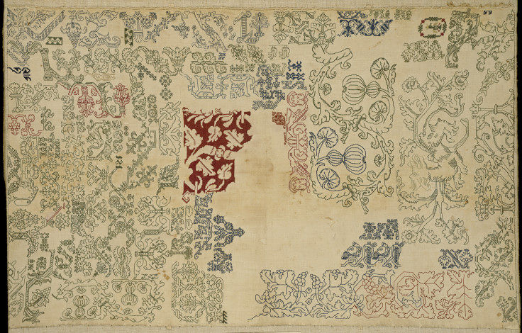
Firstly, this 16th century Italian sampler:
Filled with coloured blackwork stitching (blackwork, as most books won't tell you, and as I need to remember, being the style of stitching, and nothing at all to do with being made only in black. This sampler reminds me that even in such strict times as the years this must have been worked, all techniques had to be learnt. Yes, learnt from a very young age, so that finished products would rarely feature mistakes or visible un-pickings, but slowly, painstakingly, and untidily, learnt. I needn't think that because an artwork isn't on paper, I can't 'sketch' before trying an idea on a bigger scale.
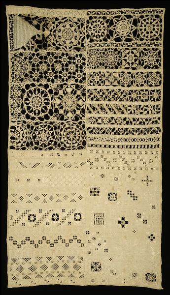
Next, this (also Italian) sampler, probably from the first half of the 17th century- mostly cut and drawn work. If I remember rightly, the Italian method of cutwork, where threads are removed, leaving only a few to anchor a geometrical pattern, is called 'Punto in Aria' which means something like 'work in air' or 'stitches in air', or in one book that I'm rather sceptical about, 'something from nothing'. Perhaps that was the motto of the stitchers, rather than the name of the work. I've always tended to call it the more time-specific name, 'reticella', which is not a term applied to modern lace, unlike 'punto in aria'. This kind of lace is one of my favourites - because it's featured so prominently in the portraits of the time.
Take this portrait detail, for example. This is Elizabeth, Duchess of Kellie, By Paul (or Paulus) van Somer. It dates from 1619, roughly the same date as the sampler above. As you can see, it contains three different kinds of 'punto in aria'. The wide collar band, the edging for the smock(?), and one piece mounted on the black of her underclothing. A close-up of the lace sampler I've been talking about is available from the V&A, and is shown here alongside a close-up of this painting, and one taken from a scan from my own copy of Federico de Vinciolo's Les Singuliers et Nouveaux Pourtaicts, 1587 (obviously, my copy is a facsimile). Similar motifs are circled in red and green.
This similarity in dress across Europe is a testament to the power of the printing press! Here is a painting of an English lady, living in Scotland, painted by a Flemish (probably Dutch) painter, which shows a striking similarity to a sampler from Italy and a diagram from a book published in France.
I would love to be able to work a sampler like this one, but it's so difficult to judge the scale, or to know what scale to start learning a craft like this one. I've done a few samplers before in crochet cotton that incorporate elements of needle-lace, though only as fine as No. 20 cotton. Again, these are only notes, so there's no need to publish a finished idea here - unless I decide to do some lace-based prints for this section.
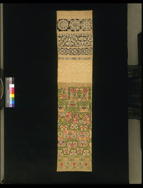
Thirdly, this late 17th century British sampler, which can be dated definitely to 1696. It's an interesting one, not only because the colours have kept so well, but because of the mixture of techniques. As you can see, it's partly the same Italian-style (now old-fashioned) cut and drawn work at the top, then some white-work, then a length of beautifully coloured naïve style embroidery. It's difficult to discern the stitches, however. My interest in this one is less in the more popular section of the piece, the surprisingly bold colours, more the evolution in reticella technique. Here's a close-up:
The geometric roots are still obvious, but in the 'wheels', particularly the centre one, the finished piece is far denser, less 'airy'. I'm still very impressed with the slanted stitching that fills that motif, though - the 'feathers' are very unusual. If I go down this road with printing, I think I'll be more likely to look at a piece like this one, and less like the second example in this post. I've never printed before, and I've got to go easy on myself! Perhaps I can print the main motifs, and paint in the 'bars' and 'picots'? More on this topic later.
Samplers and Tapestry Embroideries, by Marcus B. Huish, (published 1913, this edition 1990); the V&A's Samplers, by Donald King, 1960; and Samplers, Five Centuries of a Gentle Craft by Anne Sebba, 1979. All three have been interesting works, and, though I haven't been able to read them cover-to-cover just yet, the title given to the third volume especially peaked my interest. I've been wondering lately about doing a project that involves elements of samplers. I was fortunate enough to win an auction on two large tapestry frames recently, at 60cm square of stitching space, and am quite keen to adapt them to work as a kind of manual loom. I've also been given a good few kilometres of Aran wool, and am hoping to make a large scale project by combining the two - perhaps a throw, or a bedcover. This wool is very thick, and I don't think it would take an unreasonable amount of time to make nine frame-fuls of wool, thereby learning about the weaving technique, and practice some drawn-thread embroidery, sampler-like, across it's width, before sewing it together and edging it. It was partly with this outlandish idea in mind that I bookmarked some of my favourite (though, I'm sure, far too intricate for this project) pieces to work from, should an exercise involving samplers arise. Again, there are a few examples from the V&A, and some others that are frustratingly anonymous, due to the vague publishing style that existed in 1913. So I present a second little gallery - with notes to myself accompanying.
Firstly, this 16th century Italian sampler:
Filled with coloured blackwork stitching (blackwork, as most books won't tell you, and as I need to remember, being the style of stitching, and nothing at all to do with being made only in black. This sampler reminds me that even in such strict times as the years this must have been worked, all techniques had to be learnt. Yes, learnt from a very young age, so that finished products would rarely feature mistakes or visible un-pickings, but slowly, painstakingly, and untidily, learnt. I needn't think that because an artwork isn't on paper, I can't 'sketch' before trying an idea on a bigger scale.
Next, this (also Italian) sampler, probably from the first half of the 17th century- mostly cut and drawn work. If I remember rightly, the Italian method of cutwork, where threads are removed, leaving only a few to anchor a geometrical pattern, is called 'Punto in Aria' which means something like 'work in air' or 'stitches in air', or in one book that I'm rather sceptical about, 'something from nothing'. Perhaps that was the motto of the stitchers, rather than the name of the work. I've always tended to call it the more time-specific name, 'reticella', which is not a term applied to modern lace, unlike 'punto in aria'. This kind of lace is one of my favourites - because it's featured so prominently in the portraits of the time.
Take this portrait detail, for example. This is Elizabeth, Duchess of Kellie, By Paul (or Paulus) van Somer. It dates from 1619, roughly the same date as the sampler above. As you can see, it contains three different kinds of 'punto in aria'. The wide collar band, the edging for the smock(?), and one piece mounted on the black of her underclothing. A close-up of the lace sampler I've been talking about is available from the V&A, and is shown here alongside a close-up of this painting, and one taken from a scan from my own copy of Federico de Vinciolo's Les Singuliers et Nouveaux Pourtaicts, 1587 (obviously, my copy is a facsimile). Similar motifs are circled in red and green.
This similarity in dress across Europe is a testament to the power of the printing press! Here is a painting of an English lady, living in Scotland, painted by a Flemish (probably Dutch) painter, which shows a striking similarity to a sampler from Italy and a diagram from a book published in France.
I would love to be able to work a sampler like this one, but it's so difficult to judge the scale, or to know what scale to start learning a craft like this one. I've done a few samplers before in crochet cotton that incorporate elements of needle-lace, though only as fine as No. 20 cotton. Again, these are only notes, so there's no need to publish a finished idea here - unless I decide to do some lace-based prints for this section.
Thirdly, this late 17th century British sampler, which can be dated definitely to 1696. It's an interesting one, not only because the colours have kept so well, but because of the mixture of techniques. As you can see, it's partly the same Italian-style (now old-fashioned) cut and drawn work at the top, then some white-work, then a length of beautifully coloured naïve style embroidery. It's difficult to discern the stitches, however. My interest in this one is less in the more popular section of the piece, the surprisingly bold colours, more the evolution in reticella technique. Here's a close-up:
The geometric roots are still obvious, but in the 'wheels', particularly the centre one, the finished piece is far denser, less 'airy'. I'm still very impressed with the slanted stitching that fills that motif, though - the 'feathers' are very unusual. If I go down this road with printing, I think I'll be more likely to look at a piece like this one, and less like the second example in this post. I've never printed before, and I've got to go easy on myself! Perhaps I can print the main motifs, and paint in the 'bars' and 'picots'? More on this topic later.
Friday, 27 June 2014
Inspiration from the Library.
The book I've most enjoyed looking at this week has been British Textiles, 1700 to the Present, a production (without any one author or editor asserted, though with a foreword by Linda Parry) of V&A publishing. It features large pictures of prints, tapestries & embroideries from the V&A (a note on museum copyright - these pictures, due to their resolution, are considered to be free-to-use, though all images are property of the V&A), whether as lengths of cloth or fragments. Among the pictures I found most interesting were these, in chronological order:
From 1715-20, a brocade woven silk in pink, red and silver. Design-wise, I like this piece, as it has distinct layers to add depth and further luxury to an already stunning fabric. Technique-wise, it's an amazingly complex piece of hand-woven fabric from before the prototype automated loom. It's got a lot of great features - but, if you look at it for a little while, it becomes obvious that it is really quite a small repeat area, which is why I am including it here at the beginning of the section - it is a reasonable repeat size for a beginner, even if the technique and complexity are out of the question!
From between 1760 and 1800, two engravings from a book of textile designs, known as the Bromley Hall Pattern Book. This book apparently contains 144 examples of patterns. I love this example of two textile arts crossing over. A beautiful variety of lace filling stitches have been delicately printed on the right, while on the left, a slightly coarser lace appears almost as a trompe l'oeil strip, knotted piece by piece together. Perhaps I could look into making lace patterns to print as well?
From around 1830, this printed blind, again with a trompe l'oeil effect, is a seemingly complex scene, apparently block printed. As I've said, I am a complete novice when it comes to printing, so, assuming that it is entirely blocked, there must be a block for each colour. So, counting up, that is, I think, seven or eight - some colours laid on over other colours to give a wider range of shades (yellow, brown, red, then green in the treetops), and the black line-work added last. Because the blocks don't line up entirely, whether by design or not, this piece feels very approachable and homely. Perhaps I could look into transparent paint layers in my prints too?
From the 1830s, this roller-printed furnishing fabric is such a quintessential design of it's time.
I love anything associated with the Gothic Revival, and this piece is a splendid example of a movement that began as a very serious discussion around theological questions, social history and state religion being welcomed into the fashionable mainstream. I especially love the honeycomb structure of the leaded windows. Perhaps if the natural, William Morris style illustrations won't work for me, turning to something a little more organised, and a little less spontaneous, might be the key?
From around 1850, this fragment of printed wool (please note, this link is for the collection of fragments to which this image belongs) is 16cm square. This piece is very accessible! It's easy to work out how to cut the blocks, even if the coloured stripes are a little beyond my understanding.
The plant chosen for the motif is perfect for use in a simple design such as this - it has a very... active feel to it's silhouette.
From 1850, and, according to the book, taking over 500 blocks to print, this paisley shawl is a masterpiece! If I ever need to be reminded why the printed medium is a worthy competitor to the other textile arts, I need look no further. Here's a detail.
A beautifully stylised piece that is inspired by exotic plants, this shawl was apparently designed by a Mr Charles Swaisland of Crayford, Kent.
Nearing the end of the century now, here is a piece of block-printed cotton, designed and made in 1888 by Arts and Crafts movement pioneer, Lewis Foreman Day. This piece is wild. It's got all the complexity of the high Victorian piece it so obviously is, yet with a colour scheme worthy of Dr Seuss. Again, there is admirable use of layering, as in the earlier, 1720 piece, as well as a combination of life-like foliage and man-made abstracts. It's the colours that really attract one to this fabric, though - you don't realise how much of the brilliantly white base is left untouched - a tricky job that I'm sure required precision.
Finally, from exactly 1892, is this combination piece of printed silk embroidered with coloured silks and goldwork. Three workers are attributed to this piece: firstly, the Leek Embroidery Society of Staffordshire as designer, Sir Thomas and Arthur Wardle Ltd. as weavers and printers, and, unusually, 'Ms Frances Mary Templeton' as embroider. Though the museum description doesn't give a source or a particular relationship to the parties involved, the technique is worthy of admiration despite the ambiguity of it's origin. The idea of the Leek Embroidery Society was to use printed silks to formalise designs and give a degree of uniformity to the fabrics produced, then take advantage of the great embroidery skills locally available to embellish the higher-end materials. In this detail, the way the printing has been covered by threads is clearly visible.
According to the museum website, textiles such as this, due to the extra skills and work-hours required to produce them were only sold in the most exclusive quarters of the British Empire.
Perhaps, if I have time, I could try a couple of combination fabrics of my own?
From 1715-20, a brocade woven silk in pink, red and silver. Design-wise, I like this piece, as it has distinct layers to add depth and further luxury to an already stunning fabric. Technique-wise, it's an amazingly complex piece of hand-woven fabric from before the prototype automated loom. It's got a lot of great features - but, if you look at it for a little while, it becomes obvious that it is really quite a small repeat area, which is why I am including it here at the beginning of the section - it is a reasonable repeat size for a beginner, even if the technique and complexity are out of the question!
From between 1760 and 1800, two engravings from a book of textile designs, known as the Bromley Hall Pattern Book. This book apparently contains 144 examples of patterns. I love this example of two textile arts crossing over. A beautiful variety of lace filling stitches have been delicately printed on the right, while on the left, a slightly coarser lace appears almost as a trompe l'oeil strip, knotted piece by piece together. Perhaps I could look into making lace patterns to print as well?
From around 1830, this printed blind, again with a trompe l'oeil effect, is a seemingly complex scene, apparently block printed. As I've said, I am a complete novice when it comes to printing, so, assuming that it is entirely blocked, there must be a block for each colour. So, counting up, that is, I think, seven or eight - some colours laid on over other colours to give a wider range of shades (yellow, brown, red, then green in the treetops), and the black line-work added last. Because the blocks don't line up entirely, whether by design or not, this piece feels very approachable and homely. Perhaps I could look into transparent paint layers in my prints too?
From the 1830s, this roller-printed furnishing fabric is such a quintessential design of it's time.
I love anything associated with the Gothic Revival, and this piece is a splendid example of a movement that began as a very serious discussion around theological questions, social history and state religion being welcomed into the fashionable mainstream. I especially love the honeycomb structure of the leaded windows. Perhaps if the natural, William Morris style illustrations won't work for me, turning to something a little more organised, and a little less spontaneous, might be the key?
From around 1850, this fragment of printed wool (please note, this link is for the collection of fragments to which this image belongs) is 16cm square. This piece is very accessible! It's easy to work out how to cut the blocks, even if the coloured stripes are a little beyond my understanding.
The plant chosen for the motif is perfect for use in a simple design such as this - it has a very... active feel to it's silhouette.
A beautifully stylised piece that is inspired by exotic plants, this shawl was apparently designed by a Mr Charles Swaisland of Crayford, Kent.
Nearing the end of the century now, here is a piece of block-printed cotton, designed and made in 1888 by Arts and Crafts movement pioneer, Lewis Foreman Day. This piece is wild. It's got all the complexity of the high Victorian piece it so obviously is, yet with a colour scheme worthy of Dr Seuss. Again, there is admirable use of layering, as in the earlier, 1720 piece, as well as a combination of life-like foliage and man-made abstracts. It's the colours that really attract one to this fabric, though - you don't realise how much of the brilliantly white base is left untouched - a tricky job that I'm sure required precision.
Finally, from exactly 1892, is this combination piece of printed silk embroidered with coloured silks and goldwork. Three workers are attributed to this piece: firstly, the Leek Embroidery Society of Staffordshire as designer, Sir Thomas and Arthur Wardle Ltd. as weavers and printers, and, unusually, 'Ms Frances Mary Templeton' as embroider. Though the museum description doesn't give a source or a particular relationship to the parties involved, the technique is worthy of admiration despite the ambiguity of it's origin. The idea of the Leek Embroidery Society was to use printed silks to formalise designs and give a degree of uniformity to the fabrics produced, then take advantage of the great embroidery skills locally available to embellish the higher-end materials. In this detail, the way the printing has been covered by threads is clearly visible.
According to the museum website, textiles such as this, due to the extra skills and work-hours required to produce them were only sold in the most exclusive quarters of the British Empire.
Perhaps, if I have time, I could try a couple of combination fabrics of my own?
Monday, 23 June 2014
Back on Track
Well, it's been an eventful time for me recently, and I'm back to my textiles after a few weeks away. I had to take time out to send away some painting work for assessment, and afterwards to sort out some personal and work issues - however, I'm back, and looking into this section on printing and painting on fabric. My initial thoughts on this technique revolve around a couple of points:
1) Printing can certainly be nice, but it doesn't have the lusciousness and tactile qualities of embroidered fabric, so, at the moment, has less appeal for me than embroidery.
2) My ideas concerning printing on a professional level mostly spring from William Morris wallpaper, which is, of course, a very natural starting point for someone that is working alone, and has never tried the medium before. Using blocks, he printed pieces such as this piece, Acanthus, in the V&A collections. It's a beautiful thing, though, as it is printed on paper, there is far more refinement in line than I feel I will be able to achieve on fabric without hand-painting. This kind of repeating pattern, building up a dense surface with plenty of layers of foliage, is what I will be using as a guide for this section.
3) Another influence I will be turning my mind to, should natural themes prove out of my league, will be something a little bolder - perhaps like this piece, the far bolder print on the dress of the witch, Sidonia von Bork, in the painting by Edward Burne-Jones.
Next, I'm taking a trip to the library to get out plenty of printing books, so I'll be posting some more photos soon.
1) Printing can certainly be nice, but it doesn't have the lusciousness and tactile qualities of embroidered fabric, so, at the moment, has less appeal for me than embroidery.
2) My ideas concerning printing on a professional level mostly spring from William Morris wallpaper, which is, of course, a very natural starting point for someone that is working alone, and has never tried the medium before. Using blocks, he printed pieces such as this piece, Acanthus, in the V&A collections. It's a beautiful thing, though, as it is printed on paper, there is far more refinement in line than I feel I will be able to achieve on fabric without hand-painting. This kind of repeating pattern, building up a dense surface with plenty of layers of foliage, is what I will be using as a guide for this section.
3) Another influence I will be turning my mind to, should natural themes prove out of my league, will be something a little bolder - perhaps like this piece, the far bolder print on the dress of the witch, Sidonia von Bork, in the painting by Edward Burne-Jones.
"Sidonia von Bork 1560",
Sir Edward Coley Burne-Jones,
1860, Photo: © Tate, London, 2014.
|
Next, I'm taking a trip to the library to get out plenty of printing books, so I'll be posting some more photos soon.
Saturday, 31 May 2014
Japanese Filling Stars
Here is an extra sampler I made after the section's official samplers were done. This is my smallest embroidery frame, and I've covered it in a star filling (officially titled asanoha-gake) from my book, 'The Techniques of Japanese Embroidery', by Shuji Tamura. It's a pretty complex pattern, with five stages in it's execution. The only trouble with it, now that I've taken the picture, and taken it off the frame, is that it is very delicate, and without arrow-straight lines, it looks odd. As an element of a wall-hanging, a screen, or something similar, I think I could get it to stay as it was. However, as part of a free-standing sampler, or a costume, I'd need to ask for some quite specialist knowledge as to how to get it to stay so nicely geometric. Then again, perhaps I've rushed into this sampler - if I repeated the pattern smaller, it might not show up quite so much if the threads were a little relaxed. I doubt that spray starch would be a great deal of fun so use on the real silk I would have to use if I bought the proper materials for Japanese stitches like this, so it might be worth asking people who know how to keep these threads taut.
Sunday, 25 May 2014
Reflective Commentary on Assignment One.
I've been asked to write a few lines on my progress through this assignment:
as I have been asked to describe my experience, I assume that my response should be a personal, not objective, view. I would say that I have enjoyed it thoroughly, and that my favourite part overall was the exercise where I got to try out creating textures with different stitches, as I could try out new techniques and look for more complex tutorials. You need only look at my last post to see me answer the question, 'what other techniques would you like to try?' with quite a lengthy list, mostly revolving around this section on stitch techniques.
Whilst I would have expected this, I’ve surprised myself as
well, and the thatched roof sampler surprised me the most – I spent a good few
frustrating evenings on it, with very sore fingers, pulling packing string
through small holes in quite tightly woven fabric, but at the end, I was really
very pleased with it – because when I picked it up, it was weighty, it had a
kind of tactile interest to both sides of the cloth, and was eventually a thick
sandwich of thread with a fine cloth filling! This somehow felt important – I felt
that it was more complete, more worthy of attention, because it was weighty.
Strange, but true.
Another part of this assignment that was surprising for me
was the moment when I panicked after taking my ‘puddle’ sampler (the one with
all the French knots!) out of the frame, and the long white satin stitches all
relaxed far more than I expected, giving a (thankfully) wavy and watery look to
the shiny threads. A ‘fluke’, but a learning experience nevertheless.
I’ve enjoyed the technique of embroidery (which I never had
a lot of practice with before) a great deal. Perhaps it’s preparing the frames,
selecting and cutting the threads, the process of preparation, which makes it
feel like ‘proper’ work. It’s unlike knitting or crochet, both of which I’ve
always liked a bit too much to have it feel like working towards an art form,
though obviously, it is!
I think that if I get to do more embroidery soon, I’m going
to search about for a stand for a slate frame, as I enjoyed setting mine up very
much for the final exercise, but found it quite cumbersome to hold properly, and it was a little too
small to be able to clamp it to my desk and not have it wobble about! I will
also work on the proper technique of having one hand above, one below, the work
surface. I’m sure that once I get the hang of it, I will speed up!
Wednesday, 21 May 2014
Sampler Based on Thread and Yarn Widths.
For this sampler, I used this picture:
From the off, this time, I knew what I wanted as the base of my composition. I wanted to have a very raised surface for the tree's foliage, and the way I imagined it was taking a knitted garment, maybe even a jersey stretch, and unravelling it to get the lengths of warped thread. These I would drape over the frame and couch roughly down, giving an organic look to proceedings. In the end, I couldn't find a jersey that would unravel - not even in stockings! So I went bolder, knowing that I had my large slate frame at the ready. I went searching in charity shops, and eventually turned up a large knitted cardigan, the texture of which wasn't exactly yarn, more like a fine tape, wound around two very fine yarns. The main colour being a kind of subdued mint, and the two fine yarns being brown and white, I saw it as the perfect base for this piece.
I began, as I say, by tacking down long lengths of yarns, which, unravelled from the garment, bunched up beautifully. Once I had the outline of the branches sorted out, I needed a contrast for the background. For this I chose some edging ribbon, cut to different widths 'on the job', and tacked down, overlapping each-other. I think that, as I had to be certain of the lengths of ribbon I would be using, and therefore having to pin down the ribbon on each fold, this tacking down of ribbon became the most time-consuming element of the project. After I had tacked down the ribbon, I decided to use packaging string to create the branches, and couched them down, again with coordinating thread. At this point, I stood back, and wasn't too pleased. I hadn't been as inventive as I would've liked - I had an idea to represent the ivy and climbing plants at the lower edge of the picture. A while ago, there was a bit of a craze for plastic knotted bracelets and key-fobs, and I thought that a few strands of this rather unusual material, looped about, might be a good inclusion.
Unfortunately, they did come with one drawback. They are surprisingly resistant, and when couching them down, it is rather difficult to keep them from twisting, or from puckering the base fabric. Therefore I didn't use them in the way I had originally intended - in couched wheels - but looped them as tightly as was comfortable, and couched them down in those places. I still wasn't satisfied, however. Looking back at my original photo gave me the hint - I needed to highlight the places of highest contrast in the branches. For this, I got out a little old-fashioned embroidery thread and using some mint-green-white thread for the highlights and some rusty brown for the lows, I think I produced something pretty different.
Finally, for this post, I'd like to answer some of the questions that came at the end of this exercise.
Can you begin to see the relationship between stitching and drawing?
I can see it all right - it's always good to have an excuse to look closely at a subject before you begin a project based on it. And even if it's just an outline, you'll learn something. Of course, it depends on how you define 'relationship'. I think if you're just going to use straight stitching to copy a drawing, it seems a little pointless. As I say, as a preliminary way to explore a subject, or just get loosened up in preparation to work in a different way, it's useful.
Were you able to choose stitches which expressed the marks and lines of your drawings?
I don't think I focused too much on following the lines of the drawings - in fact, as I worked primarily from the photos and from my ink sketches of those photos secondarily, I already had a feeling for the texture of the objects seen in the pictures, and that helped me to pick my materials and stitches straight away. For instance, on the thatched roof, I knew I wanted to work in a rougher material than I usually would, and got out the packaging string.
Did you choose the right source material to work from?
I think I did, yes. Actually, when the folder mentioned picking six of my drawings to work from, I did jump the gun and made a good few samples before I realised there were further, more detailed instructions, so I got to do most of the work I wanted. There was one other drawing I took further to the ink sketch stage, but, in the end, I found it too restrictive.
Do you think your sample works well irrespective of your drawing? Or is your sample merely a good interpretation of your drawing?
I think that, as I mentioned, as I worked from my photo collection quite a bit, and as the photos were of places and things I was very familiar with, I feel as though my samples are more likely to be interpretations of the photos than my sketches, though sketching did help me to simplify the subjects. I'm pleased with all of them, but as I'm just getting used to working from preliminary drawings, I'm not sure I'm the best judge of how much I've imagined, and how much I've truthfully drawn!
Which did you prefer - working with stitch to create textures or working with yarns to make textures? Which worked best for you and why?
I definitely preferred working with stitch to create textures. I love puzzles, and figuring out how the difficult and twisting stitches went together on my large sampler was great fun. I especially love stitches like the plaited braid stitch, and the stitch I mentioned the tutorial for earlier, the 'casalguidi'. Working with a different method, to me, is just as good as working with a different material. And, though I know how boring it is to say, it is often more engaging, as you work out ways in which you could utilise your new (albeit, quite small) skill, rather than struggling to keep together bunches of experimental materials that often, just won't behave! I must make a note to be more ambitious this way.
Did you experiment enough? Did you feel inhibited in any way?
As I say, I prefer figuring out techniques, rather than using lots of applied materials. I have been creating something of a stash for later use, though - gathering plenty of scraps and old fabrics. I'm happy with my 'working with thread and yarn' texture piece, but I suspect I could be more adventurous when I comes to my materials. I didn't feel inhibited, as far as I can tell, because I enjoyed the projects very much, and therefore, was simply keen to get on with them!
Do you prefer to work from a drawing or by playing with materials and yarns to create effects? Which method produced the most interesting work?
I think I like to have a rough goal in my head, and find a good way to reflect the essence of the scene/subject/feeling in material or method, as above, where I wanted very much to be able to stitch with wonky, unravelled yarns, so I could convey that 'bobbly' texture of the tree's foliage.
Are there other techniques you would like to try? Are there any samples that you would like to do in a different way?
There are plenty of interesting stitches I would like to try - I've got books full of them! I think I would like to find an excuse to do, just off the top of my head this evening, some imitation Tudor 'strapwork' - a little like a woven fabric, with lots of strips interweaving (I may put up a little research on the project later), some blackwork, silk shading, some lacework, stumpwork, interlaced herringbone stitch (and other Celtic knots), finding a nice, not too scrappy way of including my cache of off-cuts and charity shop buys, and some goldwork. That'd be a good start! I think I'm happy with my samples, though I don't doubt that there is still plenty of potential left in the photos I took on my walk!
Is there anything you would like to change in your work?
Strangely, for someone quite fixated on the past and it's fine and delicate workings, this last project has actually made me want to work bigger. How I'll achieve that without a great deal of expense (or wood for frames!), I don't know!
From the off, this time, I knew what I wanted as the base of my composition. I wanted to have a very raised surface for the tree's foliage, and the way I imagined it was taking a knitted garment, maybe even a jersey stretch, and unravelling it to get the lengths of warped thread. These I would drape over the frame and couch roughly down, giving an organic look to proceedings. In the end, I couldn't find a jersey that would unravel - not even in stockings! So I went bolder, knowing that I had my large slate frame at the ready. I went searching in charity shops, and eventually turned up a large knitted cardigan, the texture of which wasn't exactly yarn, more like a fine tape, wound around two very fine yarns. The main colour being a kind of subdued mint, and the two fine yarns being brown and white, I saw it as the perfect base for this piece.
I began, as I say, by tacking down long lengths of yarns, which, unravelled from the garment, bunched up beautifully. Once I had the outline of the branches sorted out, I needed a contrast for the background. For this I chose some edging ribbon, cut to different widths 'on the job', and tacked down, overlapping each-other. I think that, as I had to be certain of the lengths of ribbon I would be using, and therefore having to pin down the ribbon on each fold, this tacking down of ribbon became the most time-consuming element of the project. After I had tacked down the ribbon, I decided to use packaging string to create the branches, and couched them down, again with coordinating thread. At this point, I stood back, and wasn't too pleased. I hadn't been as inventive as I would've liked - I had an idea to represent the ivy and climbing plants at the lower edge of the picture. A while ago, there was a bit of a craze for plastic knotted bracelets and key-fobs, and I thought that a few strands of this rather unusual material, looped about, might be a good inclusion.
Unfortunately, they did come with one drawback. They are surprisingly resistant, and when couching them down, it is rather difficult to keep them from twisting, or from puckering the base fabric. Therefore I didn't use them in the way I had originally intended - in couched wheels - but looped them as tightly as was comfortable, and couched them down in those places. I still wasn't satisfied, however. Looking back at my original photo gave me the hint - I needed to highlight the places of highest contrast in the branches. For this, I got out a little old-fashioned embroidery thread and using some mint-green-white thread for the highlights and some rusty brown for the lows, I think I produced something pretty different.
Can you begin to see the relationship between stitching and drawing?
I can see it all right - it's always good to have an excuse to look closely at a subject before you begin a project based on it. And even if it's just an outline, you'll learn something. Of course, it depends on how you define 'relationship'. I think if you're just going to use straight stitching to copy a drawing, it seems a little pointless. As I say, as a preliminary way to explore a subject, or just get loosened up in preparation to work in a different way, it's useful.
Were you able to choose stitches which expressed the marks and lines of your drawings?
I don't think I focused too much on following the lines of the drawings - in fact, as I worked primarily from the photos and from my ink sketches of those photos secondarily, I already had a feeling for the texture of the objects seen in the pictures, and that helped me to pick my materials and stitches straight away. For instance, on the thatched roof, I knew I wanted to work in a rougher material than I usually would, and got out the packaging string.
Did you choose the right source material to work from?
I think I did, yes. Actually, when the folder mentioned picking six of my drawings to work from, I did jump the gun and made a good few samples before I realised there were further, more detailed instructions, so I got to do most of the work I wanted. There was one other drawing I took further to the ink sketch stage, but, in the end, I found it too restrictive.
Do you think your sample works well irrespective of your drawing? Or is your sample merely a good interpretation of your drawing?
I think that, as I mentioned, as I worked from my photo collection quite a bit, and as the photos were of places and things I was very familiar with, I feel as though my samples are more likely to be interpretations of the photos than my sketches, though sketching did help me to simplify the subjects. I'm pleased with all of them, but as I'm just getting used to working from preliminary drawings, I'm not sure I'm the best judge of how much I've imagined, and how much I've truthfully drawn!
Which did you prefer - working with stitch to create textures or working with yarns to make textures? Which worked best for you and why?
I definitely preferred working with stitch to create textures. I love puzzles, and figuring out how the difficult and twisting stitches went together on my large sampler was great fun. I especially love stitches like the plaited braid stitch, and the stitch I mentioned the tutorial for earlier, the 'casalguidi'. Working with a different method, to me, is just as good as working with a different material. And, though I know how boring it is to say, it is often more engaging, as you work out ways in which you could utilise your new (albeit, quite small) skill, rather than struggling to keep together bunches of experimental materials that often, just won't behave! I must make a note to be more ambitious this way.
Did you experiment enough? Did you feel inhibited in any way?
As I say, I prefer figuring out techniques, rather than using lots of applied materials. I have been creating something of a stash for later use, though - gathering plenty of scraps and old fabrics. I'm happy with my 'working with thread and yarn' texture piece, but I suspect I could be more adventurous when I comes to my materials. I didn't feel inhibited, as far as I can tell, because I enjoyed the projects very much, and therefore, was simply keen to get on with them!
Do you prefer to work from a drawing or by playing with materials and yarns to create effects? Which method produced the most interesting work?
I think I like to have a rough goal in my head, and find a good way to reflect the essence of the scene/subject/feeling in material or method, as above, where I wanted very much to be able to stitch with wonky, unravelled yarns, so I could convey that 'bobbly' texture of the tree's foliage.
Are there other techniques you would like to try? Are there any samples that you would like to do in a different way?
There are plenty of interesting stitches I would like to try - I've got books full of them! I think I would like to find an excuse to do, just off the top of my head this evening, some imitation Tudor 'strapwork' - a little like a woven fabric, with lots of strips interweaving (I may put up a little research on the project later), some blackwork, silk shading, some lacework, stumpwork, interlaced herringbone stitch (and other Celtic knots), finding a nice, not too scrappy way of including my cache of off-cuts and charity shop buys, and some goldwork. That'd be a good start! I think I'm happy with my samples, though I don't doubt that there is still plenty of potential left in the photos I took on my walk!
Is there anything you would like to change in your work?
Strangely, for someone quite fixated on the past and it's fine and delicate workings, this last project has actually made me want to work bigger. How I'll achieve that without a great deal of expense (or wood for frames!), I don't know!
Tuesday, 13 May 2014
Using a Slate Frame
I'm preparing my largest slate frame to take some embroidery for my finished piece this section. I've used a tutorial, again from my favourite embroidery tips source - Needle 'N Thread, the instructions from which can be found here. The author does warn in the tutorial that dressing the frame can take a good long while, and she was right! However, look at that professional finish! It's almost a shame to cover it up.
Monday, 5 May 2014
Sampler Showing Stitches that Create Texture.
For the section, Stitches that Create Texture, I did this sampler on a large frame. I started at the lower part of the frame, with the dark green blocks. I later moved on from the stitches mentioned in the folder to others I had picked up from books and tutorials. For the full list of stitches, see the incredibly gaudy colour-coded key that I made to ensure no mistakes!
Key list:
1 - Straight / Stroke stitch.
2 - Detached Buttonhole
3 - Casalguidi - learnt from the lovely tutorial over at Needle 'N Thread.
4 - Plaited Braid stitch
5 - Japanese Darning
6 - French Knots and 'Drizzle Stitch', a cross between French knots and bullion stitch, found here.
7 - Woven Circle
8 - Bullion Knots
9 - Ribbed Circle
10 - Pekinese stitch
11 - Star Filling stitch
12 - Blocked Straight stitches
13 - Double Buttonhole Bars
14 - Large Layered Over-stitching
15 - Plate stitch
16 - Passed Satin stitch
17 - Couched Spiral
18 - Decorated Couched Filling stitch
19 - Ceylon (Knitted) stitch
20 - Shaded Cubes
21 - Layered Grass Effect
22 - Shaded Chevrons
23 - Raised Chain stitch
24 - Couching Practice
25 - 3D Japanese 'novel' Latticework
26 - Blocked Straight stitches
27 - Shaded and Woven Straight stitches
A few close ups of my favourite effects: Braided Chain Stitch, Ceylon Stitch, Detached Buttonhole, and Casalguidi.
Also a woven stitch that came about as I was doodling - it probably has an official name, but as I didn't take it from a tutorial, I'll just call it woven!
Key list:
1 - Straight / Stroke stitch.
2 - Detached Buttonhole
3 - Casalguidi - learnt from the lovely tutorial over at Needle 'N Thread.
4 - Plaited Braid stitch
5 - Japanese Darning
6 - French Knots and 'Drizzle Stitch', a cross between French knots and bullion stitch, found here.
7 - Woven Circle
8 - Bullion Knots
9 - Ribbed Circle
10 - Pekinese stitch
11 - Star Filling stitch
12 - Blocked Straight stitches
13 - Double Buttonhole Bars
14 - Large Layered Over-stitching
15 - Plate stitch
16 - Passed Satin stitch
17 - Couched Spiral
18 - Decorated Couched Filling stitch
19 - Ceylon (Knitted) stitch
20 - Shaded Cubes
21 - Layered Grass Effect
22 - Shaded Chevrons
23 - Raised Chain stitch
24 - Couching Practice
25 - 3D Japanese 'novel' Latticework
26 - Blocked Straight stitches
27 - Shaded and Woven Straight stitches
A few close ups of my favourite effects: Braided Chain Stitch, Ceylon Stitch, Detached Buttonhole, and Casalguidi.
Also a woven stitch that came about as I was doodling - it probably has an official name, but as I didn't take it from a tutorial, I'll just call it woven!
Wednesday, 30 April 2014
Embroideries based on photo walk and sketches. Part six. Leaves as overlapping outlines.
In the reference photo for this piece, the leaves were very mechanically shaded and divided, the lighting being rather harsh.
I thought that using this type of shading, whilst I'm sure it would be effective, would be too similar to my last piece. Therefore I used more intuitive stitches (as they are almost always crossing over each other, it doesn't seem quite right to call them straight stitches, though it is the same basic action) to create the outlines of the leaves, and overlapped them by pretending they were transparent, going down through all the layers. Here is the result:
It took a good long time to do, and though I used plenty of different colours in working it, I don't know if I should have used such a dark green as the top(-ish) layer. If I was working in textiles generally, and not just embroidery, I could perhaps have done this as part-appliqué.
I thought that using this type of shading, whilst I'm sure it would be effective, would be too similar to my last piece. Therefore I used more intuitive stitches (as they are almost always crossing over each other, it doesn't seem quite right to call them straight stitches, though it is the same basic action) to create the outlines of the leaves, and overlapped them by pretending they were transparent, going down through all the layers. Here is the result:
It took a good long time to do, and though I used plenty of different colours in working it, I don't know if I should have used such a dark green as the top(-ish) layer. If I was working in textiles generally, and not just embroidery, I could perhaps have done this as part-appliqué.
Friday, 25 April 2014
Embroideries based on photo walk and sketches. Part five. Leaves as blocks of colour.
Three of the pictures I took on this walk were of quite dense groupings of leaves. This is the second of those pictures. As I've probably said before, I was given quite a substantial collection of embroidery silks, and have quite a lot of scrap fabric I'm trying to use up. I thought that using another scrap of velvet, as I did in part two of this series, this time in black, would create a good contrast to the smooth surfaces of the 'leaves'. Here is the reference:
I thought I would be a little less strict, and try and use my satin stitches in different ways to create the leaves. By less strict, I mean that I used the basic outlines of some leaves from my reference photo, but made no effort to copy it. I'm quite pleased with the result. Using so many stitches grouped so closely together, however, meant that the fabric was beginning to weaken at the edges of some of the more densely stitched leaves - so I thought I would stop here. A larger study, perhaps of a single leaf in silk shading, on such a background, would be a good next step.
Wednesday, 16 April 2014
Raised Embroidery
Another example of historical needlework I'm a big fan of is raised work. In particular, I like stumpwork and raised goldwork. I wanted to show some examples of the craft here, but some of the best images are under copyright, and subject to very strict rules of reproduction on other websites, so I'll have to link. I think that what first got me interested in the technique was the Lord Chancellor's purse, held by the National Trust at Wimpole Hall in Cambridgeshire. Some pictures of it are available to view here on the NT's 'treasure hunt' blog. It's beautiful, and so refined! Stumpwork, on the other hand, is much more... colloquial? Here's an image of one of my favourite pieces, from the Royal Collection.
It's the top of an entirely embroidered casket. Further details can be found on it here. As I've been saying quite a bit recently, I love cross-overs between different art forms, and this is a brilliant expression of a flat art (embroidery, that is, and mostly in detached-buttonhole stitch) made into practically a whole sculptured landscape. Click on the image to be able to zoom in, especially to see the sheep. Another lovely version of the landscape casket can be found here, at Christie's. As you can see, this version has a whole garden of near-life-sized flowers inside the fold-out box.
I think if I was going to pick a favourite piece of raised - no, maybe of all embroidery - and I don't say this lightly, it would be Krakow Cathedral Museum's Kmita Chasuble. This close-up of it is unattributed, unfortunately, but as it was originally uploaded to Pinterest, I'm sure a few extra 'shares' won't do it any harm. It looks like layers of padding, built up with gold couching.
One day, I'll visit. Even the most amazing zoomed photo wouldn't be able to tell me how it was made so effectively as being there, I'm sure. God, it's fantastic. You can see it full length here.
It's important, when studying textiles, I think, not to look at any recent, unorthodox pieces and say 'but that's not how it was used in the past!' when clearly, it's always been as dynamic as it is today.
It's the top of an entirely embroidered casket. Further details can be found on it here. As I've been saying quite a bit recently, I love cross-overs between different art forms, and this is a brilliant expression of a flat art (embroidery, that is, and mostly in detached-buttonhole stitch) made into practically a whole sculptured landscape. Click on the image to be able to zoom in, especially to see the sheep. Another lovely version of the landscape casket can be found here, at Christie's. As you can see, this version has a whole garden of near-life-sized flowers inside the fold-out box.
I think if I was going to pick a favourite piece of raised - no, maybe of all embroidery - and I don't say this lightly, it would be Krakow Cathedral Museum's Kmita Chasuble. This close-up of it is unattributed, unfortunately, but as it was originally uploaded to Pinterest, I'm sure a few extra 'shares' won't do it any harm. It looks like layers of padding, built up with gold couching.
One day, I'll visit. Even the most amazing zoomed photo wouldn't be able to tell me how it was made so effectively as being there, I'm sure. God, it's fantastic. You can see it full length here.
It's important, when studying textiles, I think, not to look at any recent, unorthodox pieces and say 'but that's not how it was used in the past!' when clearly, it's always been as dynamic as it is today.
Saturday, 12 April 2014
Embroideries based on photo walk and sketches. Part four. Hedge.
Again, I thought about the Japanese approach for this little exercise. When it's not layers and layers, it's the minimalist approach on black. I went towards this photo:
With the intention to do it in the same way as the puddle picture. Lots of tiny pink French knots for the centre buds, surrounded by mint and lime green satin stitched leaves. However, I started to put it down (on a plain cotton this time), and realised I actually quite liked it minimal. That's a first for me! I may lay it aside and come back to it later on, after a few more frame-fuls, but for the moment, I quite like it like this (though the colours aren't really as deep in this photo version as they should be!) What's happening to me?!
Thursday, 10 April 2014
Embroideries based on photo walk and sketches. Part three. Underside of a thatched roof.
One of the (and I know, it looks as though they're few and far between) things that I do like about modern needlework that's still going on is the amazing overlapping of Japanese embroidery. It's built up in layers, which is what gives it it's unique look. I was thinking about this when I put together this new embroidery based on this picture:
As a surface, it looks chunky, tough, rustic, and above all, thick! So I went back to my little sampler of thread sizes and picked packing string, without thinking about the burns it would later exact on my fingers! I used a form of backstitch on a fairly loose linen cloth, and looking at it now, it must be 10-15mm thick! I formed the backstitch into a kind of 'brick stitch', rather than being abstract with it, as, after all, the straw is added methodically to a roof! When I ran out of string, I added the white sky in the same way as the puddle last time, and added lots of little spool ends of embroidery floss and ecru crochet cotton between the brick stitch. Then I took some darker floss and made a rough diamond/hexagon pattern over the surface. I never thought I'd say this, comparing it to the delicate historical objects that I admire, but wow, I'm really pleased it's so chunky! Brief fulfilled!
Subscribe to:
Posts (Atom)


.jpg)