Sunday, 29 March 2015
Section Reflection.
This section has been a classic example of my working
method. I’ve started it, and I’ve got involved with the methods and techniques
that are mentioned. I’ve then made them my own by creating projects that
utilised them. I’ve over-complicated them by my drive to make useful or
sculptural works. Then, I’ve spent a long time on them and off-shoots from
their ideas (in this section, see the way my gold box linked to my gold bug). I’ve
become afraid of spending too much time on the practical work, and not long
enough in thinking about it’s meaning, or coming up with new designs. Feeling
defeated, I’ve become despondent. Then suddenly, the comeback, and I’m
finishing making things, I’m generating new ideas, and I’m setting myself
proper work goals. Yes, I’ve got some excuses as to why this section has been
slow going – I’ve started a new job, meaning I’ve had to cut my course hours by
about a fifth; I’ve been exploring new art fields and thinking about the
future, as well as trying to keep up with my still recently-acquired skills,
like painting and ink illustration; I’ve been trying to keep some projects and
techniques aside as personal experiments, so that I can have moments where I
try things just because I want to try them; and I’ve had a good long period of
very complicated relationships turning rather painful. However, I’m feeling
more confident now I’m the other side. I’m beginning to realise there are links
between the different disciplines of art, and that there’s nothing I can’t turn
my hand to and try to learn because it’ll be too difficult. There is almost
nothing that can’t contain an idea. Perhaps I’m growing up at last. In the next
section, I hope I’ll be exploring (with a couple of extra-curricular essays)
what new fields of art are opening up to a less timid version of me, and how I
think they can be combined, in particular with textiles. So for now, I’m
leaving my artistic-temperament quagmire, and stepping forward into new
techniques.

Saturday, 21 March 2015
Mini-Essay. Careers in Crafts Philosophy Research Point.
The idea behind this essay has been a little difficult for me to grasp, but I think I understand what is meant now: this should be an essay that addresses the motivation behind artists and craftspeople, to see how they would word their 'statements', and to reflect on what it means for my own opinions. Why do artists and artisans do what they do? Well, I've done a little research, looking at contemporary sources mostly, and it's been quite interesting. At the heart of the matter, it seems to me, is the compulsive nature of the opinion. I'm quite sure that everyone wants to make something, because they are sure their ideas are worth expressing (I'm sure they are too), and that certain things they've seen inspire the either of these responses: "well, I could do that" or "I could make something much better than this". It's mostly a matter of finding out what that thing you want to make is, and then to overcome the fear of rejection, either from yourself, because what you've made isn't what you imagined, or from the zeitgeist, because you don't exactly fit in with the fashion. And if everyone wants to make things, surely everyone can generate an opinion on what a good thing to make would be. So, if we put aside the motivation of many an historical artist - that of "work or starve", as a necessity, rather than a 'personal philosophy', it frees us up to take a look at some more specific issues. I started my little research session by looking at some artists who I admire, and are still working today. They work in a very old medium, making wooden sculptures to serve as icons and altarpieces in Catholic churches all over Spain. Their motivation, I reasoned, must have been the motivation of many great artists for centuries. That of art as a form of religious devotion and expression. I was surprised, therefore, to find a very familiar name as the quote on motivation for one of my sculptors.
His name is Dario Fernández, a Spanish sculptor who creates life-size images of biblical figures for churches in imitation of the 17th century Spanish masters. To summarise his motivation, he had used a quote from David Hockney. It was in Spanish, and I've translated it as best I can, then gone looking for it in English - I believe it goes like this: "It is very good advice to believe only what an artist does, rather than what he says about his work.". I find this is true of my own philosophy. Take a painting, for instance, that is both beautiful, and a technical marvel - like Holbein's Ambassadors. It is obvious, after a few moments, that it is beautiful. After a few moments more, that it is marvellously complex. There are plenty of symbols pointing to the professions, habits, and wealth of the two gentlemen depicted, but you needn't know more about them to understand what makes it a great work. In this respect, I can see very few exceptions to the rule that if a 'work' has to be explained, it has not done it's job. Whereas, if you look at something that is supposedly deep, but that without explanation is without imagination, like the most famous 'paintings' by Rothko, you can look at them and say 'they are red oblongs, painted unevenly'. There is nothing of substance to them whatsoever. They display no skill, and they are not beautiful. I think this is very much the centre of what I would call my own philosophy. This is why the beauty of things is far from being a vanity, suited only for the 'apprentice' of art. It is an absolutely necessary part of existence, and without an attempt at the beautiful, what is the purpose of art? Without it's standards, the modern 'art' world has become a laughing stock, and rightly so. I am certain that this is why I find myself much more accepting of the 'craftsperson' than the artist. They are not trying to shock, to create headlines, or, for the most part, to change their vision for the purpose of making it sell. They also seem to hold themselves to far higher standards than the usual 'modern artist', and perhaps most importantly of all, they literally work for themselves and don't apply that sickeningly patronising term 'my technicians'.
But onto my research into other philosophies, before I get bogged down into a personal rant. One of the sources I've looked into most is a historical source, and one with very strong opinions: I read a lot of works by the 19th century designer, architect, and (he would probably say) theologian, A.W.N. Pugin - I'm sure I've mentioned him plenty of times before. A key belief of his design was the idea that painting was an inappropriate medium to replicate a 3D object, and that you should not attempt to do so - save that for sculpture. He felt it was deceptive, and therefore unchristian. He mentions this in a few of his books, but as I'm writing online, here's a link to a V&A article that has this quote on his designs: "In the design of wallpapers he too deplored the false illusion of depth and the use of trompe l'oeil shadows, and argued instead for flat patterns composed of simple forms which would confirm the wall as a flat surface rather than disguising or contradicting it. Pugin was one of the first to promote the idea of 'honesty' and 'propriety' in ornament and design, thus enlisting ornament as a moral influence in society. He practised what he preached, designing wallpapers with flat, formalised geometric patterns such as fleurs-de-lis, quatrefoils, heraldic motifs, and flower and foliage forms adapted from medieval art, architecture and textiles, printed in the rich colours of a 'medieval' palette."
I agree with him on so many points, but not this one. His point was that to paint in a trompe l'oeil style was morally wrong, as it pretended to be something it was not - it was therefore, deceptive and sinful. I disagree because even if you follow, as Pugin did, the catholic tradition, it is obvious to anyone that the most sublime art in all Catholicism must therefore have offended him. I wonder if he ever stopped to think about the four-fold service that art did. Firstly, I'm sure without it's influence, fewer people would have been educated and entertained by the stories of the great works of the ancient world, whether Judaeo-christian religious themes, or the legends and plays of polytheistic or 'pagan' cultures (scenes such as these have been painted for thousands of years, long before even the smallest fraction of society could read the stories of their ancestors, and therefore, it was in pictures that the works lived on in the culture, whereas, had they been confined to the page, society would have been so different. And the weaker for it, I dare say.). Secondly, it inspired people. Sometimes in small ways, such as to see a painting, and to compare the colour of the sky in it with the sky you see as you walk home. Sometimes in larger, or more 'pro-active' ways, such as to wear a different colour after seeing a new shade of cloth at a market. Sometimes seeing the right work at the right time could induce a life-changing decision - there are plenty of examples of this.
Thirdly, it has also been used as a moral tool to keep the people from committing crimes, whether in the terrifying Mediaeval visions of hell so popular in hospitals (one imagines to give you some perspective on your own situation) and churches in those times, or in the Victorian visions of the happy home in which the family are content because of their moral character, versus another home destroyed by drink or adultery.
Lastly, I truly believe that art can literally heal you. After all, we all know that the things that, generally speaking, will keep you well are good food and drink, the right amount of sleep, and few things to worry us. But contentment isn't enough. We also want to experience things that make us happy. This is obvious: given the choice, when we can, we go somewhere pretty. You wouldn't hang an ugly picture in your living room because it wouldn't make you happy. This is the same reasoning that tells you not to paint a hospital room black, and to use a small window, even if it were more cost-effective. There is, after all, a difference between being fit, and being happy. But each helps the other. If you compare two cities with the a similar population, a similar climate, and expense, and were offered a trip to each, you'd probably be more likely to pick, say, Prague (population 1.25m) over Birmingham (1.07m). Even if you've never been to either, you'd judge them on what you'd heard of them. And you'd pick the one that is, in your mind's eye, the more beautiful. You know you'd feel better while you were there because of it, and you'd come back feeling well. Because the two factors work together. If all you see is ugly, you will produce only feelings, thoughts, even objects and actions, that are ugly. Imagine a film that replicated something like the idea of room 101. Say that one person was kept in a box with only German Expressionist paintings on the walls - Kokoschka, Grosz, etc. and had Schoenberg played at them for just an hour. That could easily be made into the room in a horror film that sends someone mad, and that makes them hurt others. It's literally a traumatic assault on the senses. But imagine if you sampled the quintessential art of another era - like filling a room with Dutch Golden age paintings, and playing them Dido and Aeneas. Or with Rococo portraiture, and playing them Handel or Bach. Or Mozart. Surely it would be impossible to make only the exposure to the art, with no outside factors, upsetting? Well, beside the drama of the music, of course.
In summary, Hockney's quote is a good one - the idea that art should never be deeper than surface appeal is not always the truth, as even the most luscious and original artwork will inevitably have little parts where the influence of others shows through - and you may learn more about the artist, and the motivation behind their work, by understanding these. Similarly, if we go back to painting for a moment, in many Religious and historical works, it may be of use to know the background of a story (Athena and Arachne, for example, or The Agony in the Garden.) in order to better understand the emotions conveyed by the characters depicted. But if a work conveys nothing without explanation, it is inadequate to it's purpose, surely.
Some of the quotes supplied to me only reinforced the points I've already discussed, which makes me feel partly confirmed in my suspicions, partly afraid that I haven't challenged myself enough. Here are a few of my favourites. I should add, though, that as I have sourced these from online research, the wording may vary. However, if they convey a meaning that is insightful, does that matter much?
Here is a quote from a somewhat controversial artist, one that did rather push the boundaries. It's quite surprising when you consider his artwork.
“In our time there are many artists who do something because it is new; they see their value and their justification in this newness. They are deceiving themselves; novelty is seldom the essential. This has to do with one thing only; making a subject better from its intrinsic nature.” - Henri de Toulouse Lautrec, who I would have considered a modernist, and certainly someone who shocked the public. His quote seems very apt in this era, though. It's interesting to see how much it has endured, and how people were perceiving works at the end of the 19th century.
That's not to say that I haven't had a look at the work of contemporary artists/craftspeople. One of the short films that I've particularly enjoyed about a contemporary artist, their work and motivation, has been this film about Emma van Leest, an Australian paper-cut artist. In the film, she defines her motivation as a life-long love of creating imaginary worlds, and the reason that she enjoys her current method as "the sheer minimalism of it - all you need is paper and a blade". And that's something that we can all relate to. There's always something to love about an opportunity to dream, and to use your imagination without forcing it into a product. And there are many little repetitive acts that have their own satisfaction involved in them - knitting plain rows, filling parts of a drawing with colour, even organising books or records. That's not too far removed from paper-cutting.
I also thought it might be a good idea to have a look at what Grayson Perry would have to say on the subject, as he is so often interviewed, and has so many opinions. Here's a video of him talking to the V&A about art versus craft. This would be a good one to revisit and look into a bit deeper later on.
It's interesting that at the start of the video, what he defines craft as 'a skill that can be taught and passed on' and art as 'the individual vision, something that can't be explained or taught'.
I think that if I accept this definition - and I certainly think there's something to it, that it's a good one - then my 'art' must be about 80% craft. But I don't feel that is the wrong approach.
Taking a step back to my earlier research point; finding quotes from famous artists, there were also some great quotes out there on a lighter tone. Here are my top three.
“If people knew how hard I worked to get my mastery, it wouldn't seem so wonderful at all.” Michelangelo - a reassuring idea for us all.
“Life obliges me to do something, so I paint.” Rene Magritte - an artist who suited his work to his philosophy in a most truthful way.
Finally, my favourite quote of all came from the painter, Edward Hopper. Upon being asked why he painted, he replied, “If I could say it in words there would be no reason to paint.”. It's one of the great mysteries.
 |
| In the workshop. Credit here. |
His name is Dario Fernández, a Spanish sculptor who creates life-size images of biblical figures for churches in imitation of the 17th century Spanish masters. To summarise his motivation, he had used a quote from David Hockney. It was in Spanish, and I've translated it as best I can, then gone looking for it in English - I believe it goes like this: "It is very good advice to believe only what an artist does, rather than what he says about his work.". I find this is true of my own philosophy. Take a painting, for instance, that is both beautiful, and a technical marvel - like Holbein's Ambassadors. It is obvious, after a few moments, that it is beautiful. After a few moments more, that it is marvellously complex. There are plenty of symbols pointing to the professions, habits, and wealth of the two gentlemen depicted, but you needn't know more about them to understand what makes it a great work. In this respect, I can see very few exceptions to the rule that if a 'work' has to be explained, it has not done it's job. Whereas, if you look at something that is supposedly deep, but that without explanation is without imagination, like the most famous 'paintings' by Rothko, you can look at them and say 'they are red oblongs, painted unevenly'. There is nothing of substance to them whatsoever. They display no skill, and they are not beautiful. I think this is very much the centre of what I would call my own philosophy. This is why the beauty of things is far from being a vanity, suited only for the 'apprentice' of art. It is an absolutely necessary part of existence, and without an attempt at the beautiful, what is the purpose of art? Without it's standards, the modern 'art' world has become a laughing stock, and rightly so. I am certain that this is why I find myself much more accepting of the 'craftsperson' than the artist. They are not trying to shock, to create headlines, or, for the most part, to change their vision for the purpose of making it sell. They also seem to hold themselves to far higher standards than the usual 'modern artist', and perhaps most importantly of all, they literally work for themselves and don't apply that sickeningly patronising term 'my technicians'.
But onto my research into other philosophies, before I get bogged down into a personal rant. One of the sources I've looked into most is a historical source, and one with very strong opinions: I read a lot of works by the 19th century designer, architect, and (he would probably say) theologian, A.W.N. Pugin - I'm sure I've mentioned him plenty of times before. A key belief of his design was the idea that painting was an inappropriate medium to replicate a 3D object, and that you should not attempt to do so - save that for sculpture. He felt it was deceptive, and therefore unchristian. He mentions this in a few of his books, but as I'm writing online, here's a link to a V&A article that has this quote on his designs: "In the design of wallpapers he too deplored the false illusion of depth and the use of trompe l'oeil shadows, and argued instead for flat patterns composed of simple forms which would confirm the wall as a flat surface rather than disguising or contradicting it. Pugin was one of the first to promote the idea of 'honesty' and 'propriety' in ornament and design, thus enlisting ornament as a moral influence in society. He practised what he preached, designing wallpapers with flat, formalised geometric patterns such as fleurs-de-lis, quatrefoils, heraldic motifs, and flower and foliage forms adapted from medieval art, architecture and textiles, printed in the rich colours of a 'medieval' palette."
 |
| Wallpaper designs by Pugin. |
I agree with him on so many points, but not this one. His point was that to paint in a trompe l'oeil style was morally wrong, as it pretended to be something it was not - it was therefore, deceptive and sinful. I disagree because even if you follow, as Pugin did, the catholic tradition, it is obvious to anyone that the most sublime art in all Catholicism must therefore have offended him. I wonder if he ever stopped to think about the four-fold service that art did. Firstly, I'm sure without it's influence, fewer people would have been educated and entertained by the stories of the great works of the ancient world, whether Judaeo-christian religious themes, or the legends and plays of polytheistic or 'pagan' cultures (scenes such as these have been painted for thousands of years, long before even the smallest fraction of society could read the stories of their ancestors, and therefore, it was in pictures that the works lived on in the culture, whereas, had they been confined to the page, society would have been so different. And the weaker for it, I dare say.). Secondly, it inspired people. Sometimes in small ways, such as to see a painting, and to compare the colour of the sky in it with the sky you see as you walk home. Sometimes in larger, or more 'pro-active' ways, such as to wear a different colour after seeing a new shade of cloth at a market. Sometimes seeing the right work at the right time could induce a life-changing decision - there are plenty of examples of this.
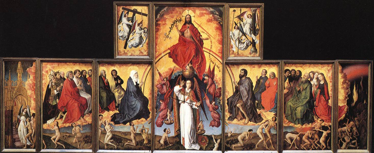 |
| Last Judgement, Rogier van der Weyden. Around 1445. |
Thirdly, it has also been used as a moral tool to keep the people from committing crimes, whether in the terrifying Mediaeval visions of hell so popular in hospitals (one imagines to give you some perspective on your own situation) and churches in those times, or in the Victorian visions of the happy home in which the family are content because of their moral character, versus another home destroyed by drink or adultery.
Lastly, I truly believe that art can literally heal you. After all, we all know that the things that, generally speaking, will keep you well are good food and drink, the right amount of sleep, and few things to worry us. But contentment isn't enough. We also want to experience things that make us happy. This is obvious: given the choice, when we can, we go somewhere pretty. You wouldn't hang an ugly picture in your living room because it wouldn't make you happy. This is the same reasoning that tells you not to paint a hospital room black, and to use a small window, even if it were more cost-effective. There is, after all, a difference between being fit, and being happy. But each helps the other. If you compare two cities with the a similar population, a similar climate, and expense, and were offered a trip to each, you'd probably be more likely to pick, say, Prague (population 1.25m) over Birmingham (1.07m). Even if you've never been to either, you'd judge them on what you'd heard of them. And you'd pick the one that is, in your mind's eye, the more beautiful. You know you'd feel better while you were there because of it, and you'd come back feeling well. Because the two factors work together. If all you see is ugly, you will produce only feelings, thoughts, even objects and actions, that are ugly. Imagine a film that replicated something like the idea of room 101. Say that one person was kept in a box with only German Expressionist paintings on the walls - Kokoschka, Grosz, etc. and had Schoenberg played at them for just an hour. That could easily be made into the room in a horror film that sends someone mad, and that makes them hurt others. It's literally a traumatic assault on the senses. But imagine if you sampled the quintessential art of another era - like filling a room with Dutch Golden age paintings, and playing them Dido and Aeneas. Or with Rococo portraiture, and playing them Handel or Bach. Or Mozart. Surely it would be impossible to make only the exposure to the art, with no outside factors, upsetting? Well, beside the drama of the music, of course.
 |
| Prague and Birmingham. |
In summary, Hockney's quote is a good one - the idea that art should never be deeper than surface appeal is not always the truth, as even the most luscious and original artwork will inevitably have little parts where the influence of others shows through - and you may learn more about the artist, and the motivation behind their work, by understanding these. Similarly, if we go back to painting for a moment, in many Religious and historical works, it may be of use to know the background of a story (Athena and Arachne, for example, or The Agony in the Garden.) in order to better understand the emotions conveyed by the characters depicted. But if a work conveys nothing without explanation, it is inadequate to it's purpose, surely.
Some of the quotes supplied to me only reinforced the points I've already discussed, which makes me feel partly confirmed in my suspicions, partly afraid that I haven't challenged myself enough. Here are a few of my favourites. I should add, though, that as I have sourced these from online research, the wording may vary. However, if they convey a meaning that is insightful, does that matter much?
Here is a quote from a somewhat controversial artist, one that did rather push the boundaries. It's quite surprising when you consider his artwork.
“In our time there are many artists who do something because it is new; they see their value and their justification in this newness. They are deceiving themselves; novelty is seldom the essential. This has to do with one thing only; making a subject better from its intrinsic nature.” - Henri de Toulouse Lautrec, who I would have considered a modernist, and certainly someone who shocked the public. His quote seems very apt in this era, though. It's interesting to see how much it has endured, and how people were perceiving works at the end of the 19th century.
That's not to say that I haven't had a look at the work of contemporary artists/craftspeople. One of the short films that I've particularly enjoyed about a contemporary artist, their work and motivation, has been this film about Emma van Leest, an Australian paper-cut artist. In the film, she defines her motivation as a life-long love of creating imaginary worlds, and the reason that she enjoys her current method as "the sheer minimalism of it - all you need is paper and a blade". And that's something that we can all relate to. There's always something to love about an opportunity to dream, and to use your imagination without forcing it into a product. And there are many little repetitive acts that have their own satisfaction involved in them - knitting plain rows, filling parts of a drawing with colour, even organising books or records. That's not too far removed from paper-cutting.
I also thought it might be a good idea to have a look at what Grayson Perry would have to say on the subject, as he is so often interviewed, and has so many opinions. Here's a video of him talking to the V&A about art versus craft. This would be a good one to revisit and look into a bit deeper later on.
It's interesting that at the start of the video, what he defines craft as 'a skill that can be taught and passed on' and art as 'the individual vision, something that can't be explained or taught'.
I think that if I accept this definition - and I certainly think there's something to it, that it's a good one - then my 'art' must be about 80% craft. But I don't feel that is the wrong approach.
Taking a step back to my earlier research point; finding quotes from famous artists, there were also some great quotes out there on a lighter tone. Here are my top three.
“If people knew how hard I worked to get my mastery, it wouldn't seem so wonderful at all.” Michelangelo - a reassuring idea for us all.
“Life obliges me to do something, so I paint.” Rene Magritte - an artist who suited his work to his philosophy in a most truthful way.
Finally, my favourite quote of all came from the painter, Edward Hopper. Upon being asked why he painted, he replied, “If I could say it in words there would be no reason to paint.”. It's one of the great mysteries.
Saturday, 14 March 2015
Theme Book: a Few Notes.
I think I've decided on the theme for my theme book. I'm still experimenting, of course, but for the moment, I'm focusing on the ways that architecture can be put to good use as inspiration for textiles. I've looked around, and found a few comparisons. The spire of Cologne cathedral is one of my favourite features, from one of my favourite buildings. Here's an image from inside.
In churches, there are often decorative tiles and mosaics on the floor, walls, sometimes ceilings.
Even the most blandly coloured sections of a building can be made an interesting feature with a clearly applied texture. Take this basic irregular block wall:
I've been working on the book quite a bit recently, and am going out to get more photos and draw more illustrations soon - this project is also helping me to keep up with my sketching schedule. More updates on this to follow.
 |
| Credit Here. |
It's a very complex structure, obviously. But aren't similar shapes found in reticella lace? Even the crochet that imitated such forms that was popular in the mid-Victorian era could be adapted to stui the Gothic frames. Of course, getting the depth/thickness that could imitate stone would be difficult, but perhaps padded stitching with the same thread as used for the crochet could be brought in?
 |
| Credit Here. |
A feature on many Victorian buildings is the decorative roof cresting. Here's a picture from an ironmongery catalogue of the period.
| Credit Here. |
There are many kinds of edging lace, and some are made in quite bold shapes, such as this black trim. This could be starched and stitched into place very easily.
 |
| Credit Here. |
In churches, there are often decorative tiles and mosaics on the floor, walls, sometimes ceilings.
 |
| Credit Here. |
These could be imitated with tiny dots of metallic fabric paint, or on a larger scale, beads and sequins. Though it has been done before:
 |
| Credit Here. |
Even the most blandly coloured sections of a building can be made an interesting feature with a clearly applied texture. Take this basic irregular block wall:
 |
| Credit Here. |
Looked at from a historical costume point of view, there's an obvious parallel. The 18th century quilted petticoat was all of one colour, and plainly made, with narrow, recessed crevices and puffs of many shapes.
 |
| Credit Here. |
I've been working on the book quite a bit recently, and am going out to get more photos and draw more illustrations soon - this project is also helping me to keep up with my sketching schedule. More updates on this to follow.
Tuesday, 24 February 2015
Another Present: my Final Project for this Section.

My last project for this section would, I thought, be worth hanging on for. I made this brooch as a present, and before I wrap it up, I'm taking a few photos. As you can see, it's a beetle. It's an amalgam of many different pictures I collected of rhinoceros beetles. It's about 4 inches long. As I wasn't sure it would be a success, I'm afraid I didn't take any pictures in progress, but I can explain the procedure. Firstly, I made a paper pattern - just of the outline. Then, I got some wire - one a thick, garden-tie type wire, the other a 28 gauge jewellery making wire. I made as streamlined a frame of legs as I could with the thicker wire, and began to wrap it in the black wire. I wrapped from the body to the toes and back once, then 2/3rds of the way up, making the spines on the way back down. Finally, I wrapped a third of the way up and back again, making three distinct leg sections. I repeated this a further 5 times. Next, I made a frame for the body with the thicker wire, and sandwiched it in felt. Then I made a frame for the face, mouth-parts and horns. I built up layers of felt, appliquéing them together. I took some embroidery floss and wrapped the visible wire elements of the face, holding two strands at a time, and stitching the ends back into the felt. I used a little more of jeweller's wire to make some feelers for either side of the mouth. Next, I covered the underside and face with satin, carefully cutting holes for the horns and stitching around the mouth. Then I made the 'cap', and again, made some very careful holes for the horns. I stitched it into place. I went out and bought a gold mini-dress with a high sheen from a charity shop, and cut a piece about 5-6 inches square from the hem. I was originally going to use some of my leftover lamé, but decided it wouldn't be hard-wearing enough for a piece that would be worn. I stitched it into place as invisibly as I could, gathering it so that the outlining stitches would cover the curved seam. I carefully folded and tucked the gold and satin in at the neck. I over-stitched the outline of the felt wing casings with some more embroidery floss. I edged the head with some tiny bugle beads and gave it some metallic pearl eyes. Finally, I attached the legs, covered the unwrapped framework with some more folded satin, and attached the pin on top. I'm very happy with it, particularly the range of techniques I got to use, and the amount of improvisational challenges I faced whilst designing it. I think that whatever I decide to make for my final assignment, it'll have to have a sculptural element to it, as this was so much fun to think about. The only issue I would have with making more of them is the amount of time it takes to wrap the legs - probably about an hour per leg. See below for a little gallery.


Sunday, 15 February 2015
Extra Texture 'Sketches'.

I've been feeling that I haven't taken enough time recently to work in my sketchbook, and as sketchbooks are really all about experimentation, I've put together this little collection of machine-stitched 'sketches' of architectural textures that I think may come in useful in my final assignment.
These little exercises were simple, though very time-consuming. They were inspired by the technique I had to improvise to ensure my stitching lines were straight when stitching the panels for my box.
I made these by collecting some basic stock images of textures from the internet and either making them into line drawings, or keeping them as they are and improvising with the machine. Once I was happy with them, I printed them on some cheap paper, as the thinner kind makes it easier to tear at the end. As you can see there are 8, and they're only partially torn away. They feature a mix of textures, some more regular than others. The irregular patterns were, obviously, the more difficult to execute. I would say there were three of these. The wood, a close-up of which can be seen below, and the two kinds of church wall - flint and reclaimed stone. I think I'm most pleased with the wood, though that slightly puffed, quilted effect lent by the felt means that each of them has a lovely, tactile surface. In some cases, shorter lines had to be recrossed by the machine because the pattern wouldn't allow for a single pass across the sheet. This was most obvious in the brick patterns. However, carefully stitching into the same holes prevented this from becoming an issue. Let's have a look at a few close-ups: firstly, the wood.

Some of the irregular stones (each marked with a tick when I had stitched all the way around them).

Part of the flint sampler, only stitched midway across to show a little of the original photo.

The slightly raised effect demonstrated nicely by the scallops.

And your basic bricks:

I'm very encouraged by this section, and the emphasis I've placed on architectural motifs means I have an obvious choice for my theme book later in the course. Expect more sketches and experiments on this idea to come.
Wednesday, 4 February 2015
Fabric Manipulation: the Finished Box.

My box is finally finished. There was a lot more tricky hand-sewing involved than I had thought when I set out, so the amount of work-hours involved was very high, but I think I've covered most of the asked-for techniques. Gathering in the inside of the lid and on the smocked sides. folding and pleating - in the lining of the box body. Tucking I didn't quite manage to include, but as I said, I did make a piped effect around the wooden dowel edging. Quilting - I did a lot of this, both in the box panels and in the 'roof'. Raised shapes - this seems to me to have quite a lot of overlap with shadow quilting, and I think I've used it in stitching around my felt frame in the roof and around the beads in the 'windows'. Before I properly analyse the piece, here are some more photos of it from all angles.

Side view, showing the completed window and smocking.

Roof and reverse.

Reverse and base. Here you can also see the way I folded in the ends of the 'piping'.

Close up on the windows and 'lock' at the front.

The lining in purple satin. Knife pleating in the main body, and thick, decorative hand-gathering in the lid.

Another angle (the flash used in this photo shows up the colour better).

A close-up on the join in the lining.

Finally, lying back with the lid open. I've enjoyed this project, especially the fact that I have taken it a little further and made it into an object with a purpose, which lends even a piece as gaudy as this a little dignity. So, as I've made quite a feature of writing about the techniques I've used by photographing the various stages, I'm going to dive straight into the questions set by the folder.
How does working with fabric in this way compare with working directly with stitch?
If working with stitch refers to the earlier exercises that centred on creating a picture or texture with embroidery, I would most accurately compare the difference between them as the difference between painting and sculpture. Stitching has some 3D elements, like stumpwork and silk shading, as painting does with trompe l'oeil, but you can't really compare a painted object, even the most beautifully shaded and foreshortened one, with the object created in sculpture, because for all intents and purposes, it is the object, plain to be seen, and not attempting to deceive the eye. I find that working out the net, pleating up the fabric, and assembling an object, is a far more satisfying process - though often, when it comes to my own examples, a less skilled one, as the amount of time I can afford to spend on an object like this box would in no way have produced a satisfactory embroidery.
Are you pleased with the shapes and movements that you have created in both appliqué and fabric manipulation? What would you do differently?
I am pleased with the results from both. Off the top of my head, the only faults I could really find with them were that I cut a few corners on my appliqué crow by whip stitching some of the layers together, when they should have been properly stitched in blocks and then carefully attached to a layer larger than them, meaning that only short stitches were used - this would have been a much more elegant effect. And with my box, that I did not leave enough room either side of the lid to allow me to attach further covered rods as I had planned. This meant that the sides were a little flimsy. These two examples are by no means works of art, but they have been executed to my own satisfaction.
How did the pieces work in relation to your drawings? Were the final results very different from the drawings? Did the fabric manipulation technique take over and dictate the final result?
I feel a little uncomfortable answering this question - as I've explained, the raven was far from a thought-through idea, and no sketch of it ever appeared. I merely followed my instincts with it. The box I thought about quite a bit more, and did a page of A3 sketches and ideas. It ended up being quite far from my drawing, as I had imagined lots of ways to include further techniques by making objects for the box to hold. My ideas for the objects will have to wait for another time now, and though I don't think I could describe the techniques as having 'taken over', I certainly developed the idea further in the manufacture.
Was it helpful to work from the drawings in the appliqué exercise? Would you have preferred to play directly with cut shapes and materials?
As I've said, this is a little awkward for me, as I did play directly with shapes and materials. However, as I had never before attempted appliqué, the amount I learnt even in my own way of working means that the exercise held a great deal of merit as a learning experience for me.
How do you feel about working with stitch in general? Is it an area you would like to pursue in more depth? Do you find it limiting in any way?
I'm very happy with it indeed. As yet, I couldn't say I found it limiting either, as the only property that hasn't been exhibited yet in textiles is not one that inherently can have - that of hardiness, of standing on it's own. Whilst making my box, I found that even a fine sliver of wood reinforced a side of the box so well as to improve it's usefulness tenfold! There's nothing to say that textiles cannot be combined with other fields of art and craft, of course, though it does still feel a little... Well, a little like cheating! I know that's ridiculous, of course, as there is as much a limit to art as there is to the imagination. I certainly would like to explore the area more, as up to this point, I haven't enjoyed a project so much as my golden box.
Thursday, 29 January 2015
V&A Kimono Fabrics Book
Recently, I was in my usual second-hand bookshop when I noticed a strange little book wrapped in cellophane. It was vastly discounted in the sale, and, well, it looked pretty interesting. It was a compilation of images of the V&A's collection of kimono fabrics. It was partly bound into a book, and came with a CD of high-definition images from the museum files in the back. Just as a note, and to help myself come up with some more fabric designs, if they're needed, here are a couple of my favourites.
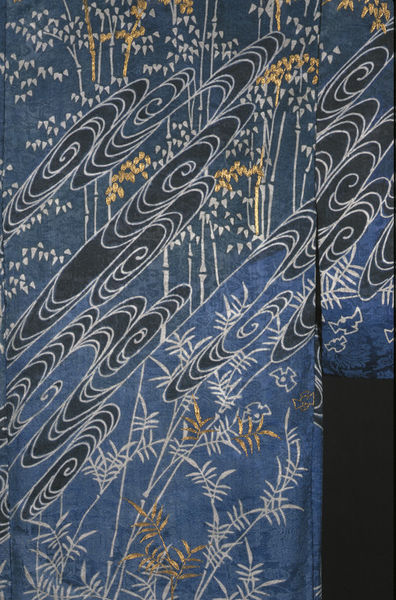
Firstly, this mid-nineteenth century kimono with natural motifs of plant life, including some bamboo, and swirling water. I've always enjoyed the way that traditional Japanese art depicts water in spirals. This is quite a popular motif for embroidery too, I understand. It's quite a restricted palette of colours, and it's certainly designed to be a cool, calming piece. If you go to the museum page (via the link beneath the photo), you can see how the space is divided up by the diagonal water-swirls, and how they section off each type of plant from the next.
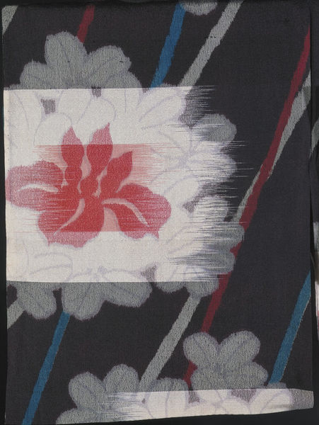
The next piece is a detail of a floral pattern, dated between 1930-50. Personally, I'm not such a fan of this piece, but the way it's been put together does interest me. The way the flower was printed looked as though it was mimicking a kind of crude weaving, as you can see: it's as though someone has scraped a palette knife across the flower. The museum record has an interesting quote on the manufacture: "This seems to be a form of mechanical kasuri whereby the warps and wefts
are printed, rather than tied and resist-dyed, before weaving
commences. In addition, this silk seems to have been printed with pale
grey petal outlines after or as it was woven.". It's an interesting, thought-provoking technique, even if the finished product in this instance isn't quite as harmonious as most of Japanese design.
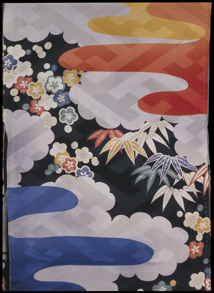
This next bright and cheery piece is actually an under-kimono from the 1940s. I like this (printed) design particularly, not just because it looks bright and modern, but because it has plenty of layers to it, which I find very pleasing. There's the dark background, the bright flowers, the clouds, other, more abstract shapes (maybe a cloud caught by the sun in orange and a rain-cloud in blue?), and then a more geometric, transparent layer over each other layer. There's a lot going on here for an under-garment, and for someone like me, with such a love of elaboration, that is something I can respect.
The next piece is from 1910-1930, and is rather mysteriously described on the museum records as "pine trees, plum blossoms and clouds", though (and this is more obvious on the larger image), I think that they must mean bamboo, blossom, and clouds. I might have thought that the description was for a different item, but that the blossoms are described as "embroidered in orange, yellow and gold", which is obviously correct. The bamboo-style background is also described as tie-dyed, which I find quite difficult to believe, looking at the larger images, which show the pale grey areas as little 'doughnuts' of slightly raised fabric. I wouldn't like to say that they were embroidered, like the flowers, but perhaps they were painted on in rows? Anyway, the reason I liked this kimono especially is the way it combines three key design concepts for prints. 1, it combines the printed sections of the design well with the overall shape of the garment, and the pre-planned use of embroidery. 2, it's use of brighter, warmer colours for the motifs closest to the viewer, and paler, less distinct forms further away is a brilliant idea, perspective-wise. 3, the proportion in which each 'layer' is brought towards the viewer by the colours is matched by the level they are raised from the base fabric, whether with painting, printing, or embroidery.
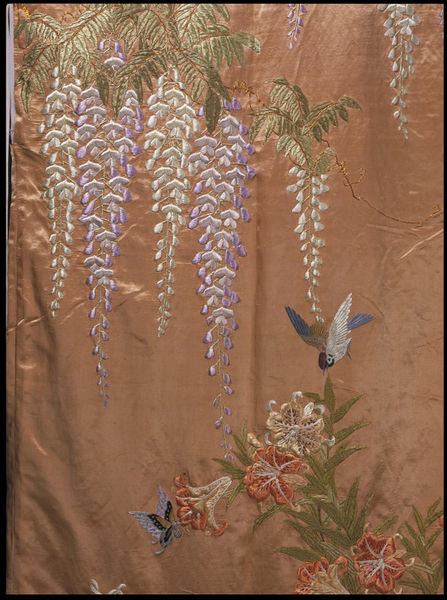
The next kimono is from around 1900, and though this is the only picture available, the description implies that all the decoration is embroidered silk. The description mentions wisteria blossoms, birds and butterflies, but it looks to me as though there are also some lovely curling lilies at the lower end of the picture. One of the best things to me about Japanese design is the way that each item included is made to float, and doesn't have to be contextualised by being placed in a garden, forest, riverbank, etc. This way, the abstracted forms don't become lost in a heavy mass of threads, and paler colours, such as these pastel wisteria, can be appreciated for their beauty of outline, and, I'm sure, symbolic meaning. You can see easily why the Impressionist movement was influenced by the new emphasis on Japanese design, as an 'impression' of the garden is all that you will find here.
This kimono is a little older than the others I've mentioned, as it is dated to the first half of the nineteenth century. At first, it doesn't look that exciting, and the depiction of the water is a little lacklustre compared to those swirls I mentioned at the top of the post, but this detail, with the discarded fan on a bridge, makes for quite an intriguing scene. As I said in my last description, this scene is in fact full of symbolism, but this time it is explained in the museum description - here's a (rather long) quote from it: "The iris and bridge motif relates to a famous passage in the 10th
century Tales of Ise, one of the most famous works of classical Japanese
literature. In the ninth chapter the hero Ariwara no Narihira comes to
a place in Mikawa province noted for its eightfold bridge and irises
and composes a poem using the syllables of kakitsubata, the Japanese
word for iris, as the first syllable of each of the lines. " The use of colour is interesting, and I wonder whether it is determined by the text - the many-coloured stems/leaves of the irises are in stark contrast to the wood and water, which are seen only as suggested textures, and very linear at that.
Lastly, this fragment of kimono fabric is far older than the others - early 17th century, in fact.
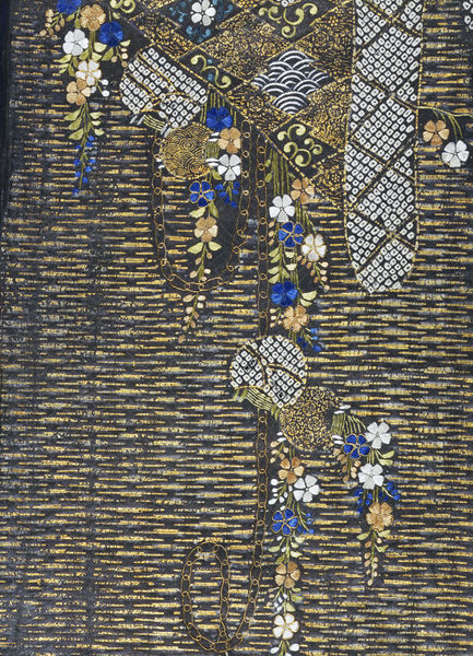
It would be an interesting project, I'm sure, to learn about the style of kimono decoration in each century, or each era, of Japanese history, as I had assumed that the fabrics of the Victorian and Edwardian periods would be the most elaborately decorated, which I suppose I did self-consciously, thinking that in European history, that era was bookended by the simplified ages of the regency and the 1920s. But this piece is one of the... the glitziest of all! Though I can't tell what the shape (again, in those grey doughnuts I mentioned above) the outlined objects at the lower edge may once have been part of, they are a little uneven in their outline. However, this is the only clue I might have gotten that this fragment dated to an earlier era. There is a lovely selection of techniques, though I can't distinguish where (according to the description) the metal thread stops, and the applied gold leaf begins. All of the flowers are embroidered in beautifully bright silks. One more thing I would mention about this fragment is that in my book, it is displayed the other way up to this, which is how it appears online. I have chosen to show it the way it appears online, as any advances in discovering how the fragment may have fitted into a complete garment or pattern would be updated there.
Well, that's a quick overview of some of the 'hits' from my new book. It just goes to show - not only that the instantly recognisable and always beautifully arranged principles of Japanese design have been applied for far longer than I might have thought, but that they were closer than expected as well. What a huge and overwhelming collection the V&A has!
Firstly, this mid-nineteenth century kimono with natural motifs of plant life, including some bamboo, and swirling water. I've always enjoyed the way that traditional Japanese art depicts water in spirals. This is quite a popular motif for embroidery too, I understand. It's quite a restricted palette of colours, and it's certainly designed to be a cool, calming piece. If you go to the museum page (via the link beneath the photo), you can see how the space is divided up by the diagonal water-swirls, and how they section off each type of plant from the next.
 |
| Credit here at V&A collections. |
 |
| Credit here at V&A collections. |
 |
| Credit here at V&A collections. |
 |
| Credit here at V&A collections. |
 |
| Credit here at V&A collections. |
 |
| Credit here at V&A collections. |
It would be an interesting project, I'm sure, to learn about the style of kimono decoration in each century, or each era, of Japanese history, as I had assumed that the fabrics of the Victorian and Edwardian periods would be the most elaborately decorated, which I suppose I did self-consciously, thinking that in European history, that era was bookended by the simplified ages of the regency and the 1920s. But this piece is one of the... the glitziest of all! Though I can't tell what the shape (again, in those grey doughnuts I mentioned above) the outlined objects at the lower edge may once have been part of, they are a little uneven in their outline. However, this is the only clue I might have gotten that this fragment dated to an earlier era. There is a lovely selection of techniques, though I can't distinguish where (according to the description) the metal thread stops, and the applied gold leaf begins. All of the flowers are embroidered in beautifully bright silks. One more thing I would mention about this fragment is that in my book, it is displayed the other way up to this, which is how it appears online. I have chosen to show it the way it appears online, as any advances in discovering how the fragment may have fitted into a complete garment or pattern would be updated there.
 |
| Credit here at V&A collections. |
Thursday, 22 January 2015
Progess in my Project on Fabric Manipulation. Handmade Trimmings.

Before the big reveal, here are some of the components to the finishing trims of my box. In the centre of the picture are the layers needed to make these trimmings. A wooden dowel, cut to the right length. A layer of felt, and a layer of lamé. I wrap the dowel in the felt, and tightly wind thread around, as seen at the top of the photo. Then I fold lamé around and stitch in place with gold thread, as seen at the bottom of the photo. I'm hoping to use these rods as a kind of piping, as well as a structural device to hold the box firmly in shape.
Tuesday, 20 January 2015
Progess in my Project on Fabric Manipulation. Machine Embellishment.

Here are some more in-progress photos of my box. This is the front panel, with windows made to contain some clear vinyl and beads.

Here are the sides to the 'roof' level with their little portholes. Next I just need to carefully hand-sew them together.

Thursday, 8 January 2015
Progress in my Project on Fabric Manipulation. Inprovising my own Technique.


Sometimes a pair of tweezers is needed to remove any stray paper, but mostly, it's quick, successful, and neat.

Monday, 5 January 2015
An Extra Project for Christmas.

Well, It's been a busy Christmas, but I'm back, and with a newly finished project to show off. This is the scarf I knitted for my brother, which I'm really rather proud of. It's part of an eBook called 'parallax', published by Alasdair Post-Quinn, who can be found at his site here. It's double-knitted, a technique I hadn't tried before, and is knitted diagonally by adding and taking away stitches at the same end on each right-side row. It took many evenings, but now, five things are true: I understand how to make a diagonal pattern. I understand how to hold two colours at once. I understand how to knit a double-sided fabric. I'm pretty unlikely to forget after all that practice. And he was very happy with his present!
Wednesday, 17 December 2014
Progress in my Project on Fabric Manipulation. Inspirations, Smocking with Beads, Learning Shadow Quilting.
My idea for this section was to make an object that combined a lot of different surface textures. I chose, as the basic shape for this, a box with a 'roof'. The item that gave me this shape, though I have expanded mine, was this - Die Stefansbursa, or St Stephen's Purse reliquary. The credit for this image is the Kaiserliche Schatzkammer, the Imperial Treasury in Vienna (the image can be found under the header "The Holy Roman Empire").
As you can see, this is a very early piece of goldwork (for the Christian tradition), and dates to the early 9th century. It looks quite disorganised and primitive, maybe even a little vulgar (I love it, personally, but I will admit that it does look like the jewels have been applied quite haphazardly).
I wanted to take this basic shape, and the main colour, and create an interesting little box of my own.

So let's have a look at where I am today. Firstly, here's a sneak preview of my smocking. I've included some little pearl beads that I managed to buy a pack of, and though they're not quite as regular as they might have been, the effect of them, caught in the smocking, is a good start towards a metallic-themed object.

Today I'm trying out some shadow-quilting by making a base in felt, pinning it down to the lid of the box, and trimming it accordingly. Next I'll be sewing some more lamé over the top. The idea here is to make a more architectural object by introducing a more obvious 'roof'. As you can see, the box itself is made of buckram, which I cut in one piece, folded back, and machine stitched. I then assembled the box with hand-stitching. I felt a little bad about machining the edges, but thought it would for the best, as the lamé needs to be protected from rough edges.

As you can see, this is a very early piece of goldwork (for the Christian tradition), and dates to the early 9th century. It looks quite disorganised and primitive, maybe even a little vulgar (I love it, personally, but I will admit that it does look like the jewels have been applied quite haphazardly).
I wanted to take this basic shape, and the main colour, and create an interesting little box of my own.

So let's have a look at where I am today. Firstly, here's a sneak preview of my smocking. I've included some little pearl beads that I managed to buy a pack of, and though they're not quite as regular as they might have been, the effect of them, caught in the smocking, is a good start towards a metallic-themed object.
Today I'm trying out some shadow-quilting by making a base in felt, pinning it down to the lid of the box, and trimming it accordingly. Next I'll be sewing some more lamé over the top. The idea here is to make a more architectural object by introducing a more obvious 'roof'. As you can see, the box itself is made of buckram, which I cut in one piece, folded back, and machine stitched. I then assembled the box with hand-stitching. I felt a little bad about machining the edges, but thought it would for the best, as the lamé needs to be protected from rough edges.
Subscribe to:
Posts (Atom)