Thursday, 29 January 2015

V&A Kimono Fabrics Book

Recently, I was in my usual second-hand bookshop when I noticed a strange little book wrapped in cellophane. It was vastly discounted in the sale, and, well, it looked pretty interesting. It was a compilation of images of the V&A's collection of kimono fabrics. It was partly bound into a book, and came with a CD of high-definition images from the museum files in the back. Just as a note, and to help myself come up with some more fabric designs, if they're needed, here are a couple of my favourites.

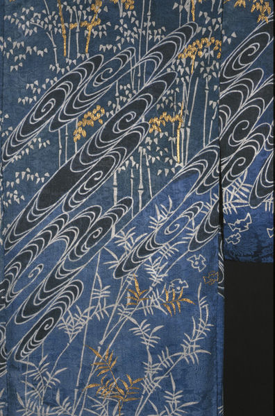
Firstly, this mid-nineteenth century kimono with natural motifs of plant life, including some bamboo, and swirling water. I've always enjoyed the way that traditional Japanese art depicts water in spirals. This is quite a popular motif for embroidery too, I understand. It's quite a restricted palette of colours, and it's certainly designed to be a cool, calming piece. If you go to the museum page (via the link beneath the photo), you can see how the space is divided up by the diagonal water-swirls, and how they section off each type of plant from the next.

Credit here at V&A collections.
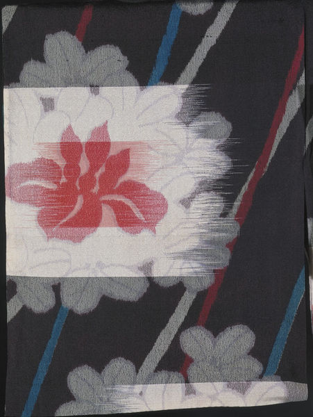
The next piece is a detail of a floral pattern, dated between 1930-50. Personally, I'm not such a fan of this piece, but the way it's been put together does interest me. The way the flower was printed looked as though it was mimicking a kind of crude weaving, as you can see: it's as though someone has scraped a palette knife across the flower. The museum record has an interesting quote on the manufacture: "This seems to be a form of mechanical kasuri whereby the warps and wefts are printed, rather than tied and resist-dyed, before weaving commences. In addition, this silk seems to have been printed with pale grey petal outlines after or as it was woven.". It's an interesting, thought-provoking technique, even if the finished product in this instance isn't quite as harmonious as most of Japanese design.

Credit here at V&A collections.
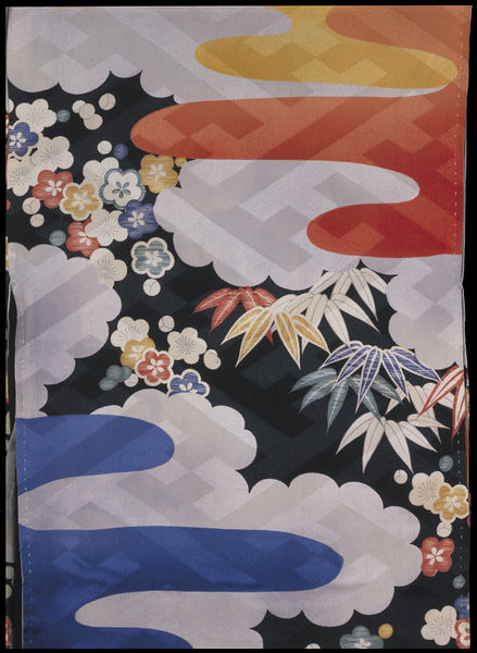
 This next bright and cheery piece is actually an under-kimono from the 1940s. I like this (printed) design particularly, not just because it looks bright and modern, but because it has plenty of layers to it, which I find very pleasing. There's the dark background, the bright flowers, the clouds, other, more abstract shapes (maybe a cloud caught by the sun in orange and a rain-cloud in blue?), and then a more geometric, transparent layer over each other layer. There's a lot going on here for an under-garment, and for someone like me, with such a love of elaboration, that is something I can respect.

Credit here at V&A collections.
The next piece is from 1910-1930, and is rather mysteriously described on the museum records as "pine trees, plum blossoms and clouds", though (and this is more obvious on the larger image), I think that they must mean bamboo, blossom, and clouds. I might have thought that the description was for a different item, but that the blossoms are described as "embroidered in orange, yellow and gold", which is obviously correct. The bamboo-style background is also described as tie-dyed, which I find quite difficult to believe, looking at the larger images, which show the pale grey areas as little 'doughnuts' of slightly raised fabric. I wouldn't like to say that they were embroidered, like the flowers, but perhaps they were painted on in rows? Anyway, the reason I liked this kimono especially is the way it combines three key design concepts for prints. 1, it combines the printed sections of the design well with the overall shape of the garment, and the pre-planned use of embroidery. 2, it's use of brighter, warmer colours for the motifs closest to the viewer, and paler, less distinct forms further away is a brilliant idea, perspective-wise. 3, the proportion in which each 'layer' is brought towards the viewer by the colours is matched by the level they are raised from the base fabric, whether with painting, printing, or embroidery.

Credit here at V&A collections.
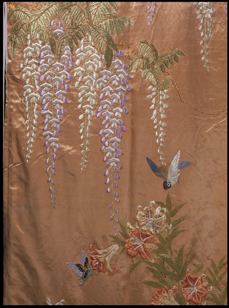
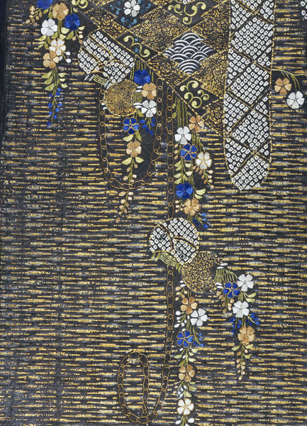
The next kimono is from around 1900, and though this is the only picture available, the description implies that all the decoration is embroidered silk. The description mentions wisteria blossoms, birds and butterflies, but it looks to me as though there are also some lovely curling lilies at the lower end of the picture. One of the best things to me about Japanese design is the way that each item included is made to float, and doesn't have to be contextualised by being placed in a garden, forest, riverbank, etc. This way, the abstracted forms don't become lost in a heavy mass of threads, and paler colours, such as these pastel wisteria, can be appreciated for their beauty of outline, and, I'm sure, symbolic meaning. You can see easily why the Impressionist movement was influenced by the new emphasis on Japanese design, as an 'impression' of the garden is all that you will find here.

Credit here at V&A collections.
This kimono is a little older than the others I've mentioned, as it is dated to the first half of the nineteenth century. At first, it doesn't look that exciting, and the depiction of the water is a little lacklustre compared to those swirls I mentioned at the top of the post, but this detail, with the discarded fan on a bridge, makes for quite an intriguing scene. As I said in my last description, this scene is in fact full of symbolism, but this time it is explained in the museum description - here's a (rather long) quote from it: "The iris and bridge motif relates to a famous passage in the 10th century Tales of Ise, one of the most famous works of classical Japanese literature. In the ninth chapter the hero Ariwara no Narihira comes to a place in Mikawa province noted for its eightfold bridge and irises and composes a poem using the syllables of kakitsubata, the Japanese word for iris, as the first syllable of each of the lines. "  The use of colour is interesting, and I wonder whether it is determined by the text - the many-coloured stems/leaves of the irises are in stark contrast to the wood and water, which are seen only as suggested textures, and very linear at that.

Credit here at V&A collections.
Lastly, this fragment of kimono fabric is far older than the others - early 17th century, in fact.
It would be an interesting project, I'm sure, to learn about the style of kimono decoration in each century, or each era, of Japanese history, as I had assumed that the fabrics of the Victorian and Edwardian periods would be the most elaborately decorated, which I suppose I did self-consciously, thinking that in European history, that era was bookended by the simplified ages of the regency and the 1920s. But this piece is one of the... the glitziest of all! Though I can't tell what the shape (again, in those grey doughnuts I mentioned above) the outlined objects at the lower edge may once have been part of, they are a little uneven in their outline. However, this is the only clue I might have gotten that this fragment dated to an earlier era. There is a lovely selection of techniques, though I can't distinguish where (according to the description) the metal thread stops, and the applied gold leaf begins. All of the flowers are embroidered in beautifully bright silks. One more thing I would mention about this fragment is that in my book, it is displayed the other way up to this, which is how it appears online. I have chosen to show it the way it appears online, as any advances in discovering how the fragment may have fitted into a complete garment or pattern would be updated there.

Credit here at V&A collections.
Well, that's a quick overview of some of the 'hits' from my new book. It just goes to show - not only that the instantly recognisable and always beautifully arranged principles of Japanese design have been applied for far longer than I might have thought, but that they were closer than expected as well. What a huge and overwhelming collection the V&A has!

Thursday, 22 January 2015

Progess in my Project on Fabric Manipulation. Handmade Trimmings.


Before the big reveal, here are some of the components to the finishing trims of my box. In the centre of the picture are the layers needed to make these trimmings. A wooden dowel, cut to the right length. A layer of felt, and a layer of lamé. I wrap the dowel in the felt, and tightly wind thread around, as seen at the top of the photo. Then I fold lamé around and stitch in place with gold thread, as seen at the bottom of the photo. I'm hoping to use these rods as a kind of piping, as well as a structural device to hold the box firmly in shape.

Tuesday, 20 January 2015

Progess in my Project on Fabric Manipulation. Machine Embellishment.


Here are some more in-progress photos of my box. This is the front panel, with windows made to contain some clear vinyl and beads.


Here are the sides to the 'roof' level with their little portholes. Next I just need to carefully hand-sew them together.


Thursday, 8 January 2015

Progress in my Project on Fabric Manipulation. Inprovising my own Technique.

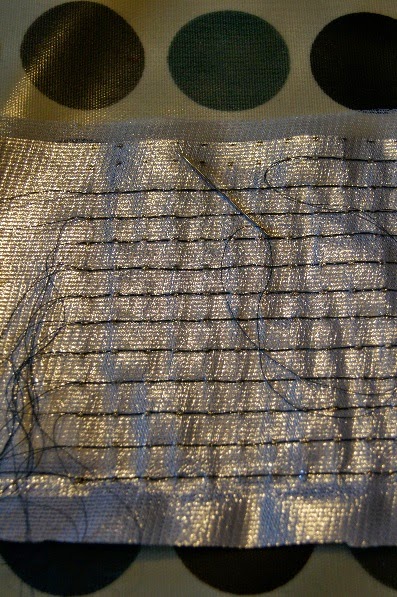
To make the front, back, and base panels of my box, I'm improvising a new technique. I'm sure it's been done before somewhere in the world, but I've come up with it independently for this section, and I'm feeling pretty confident it'll work. I'm making a basic framework of lines to stitch on paper, drawing the lines carefully with pencil and ruler. Then I securely pin them to a sheet of lamé mounted on thick felt. Then I machine stitch the perimeter and finally the design, lifting the machine and cutting the threads as little as possible. When it's finished, the sections tear away like so:


Sometimes a pair of tweezers is needed to remove any stray paper, but mostly, it's quick, successful, and neat.


Monday, 5 January 2015

An Extra Project for Christmas.


Well, It's been a busy Christmas, but I'm back, and with a newly finished project to show off. This is the scarf I knitted for my brother, which I'm really rather proud of. It's part of an eBook called 'parallax', published by Alasdair Post-Quinn, who can be found at his site here. It's double-knitted, a technique I hadn't tried before, and is knitted diagonally by adding and taking away stitches at the same end on each right-side row. It took many evenings, but now, five things are true: I understand how to make a diagonal pattern. I understand how to hold two colours at once. I understand how to knit a double-sided fabric. I'm pretty unlikely to forget after all that practice. And he was very happy with his present!

Wednesday, 17 December 2014

Progress in my Project on Fabric Manipulation. Inspirations, Smocking with Beads, Learning Shadow Quilting.

My idea for this section was to make an object that combined a lot of different surface textures. I chose, as the basic shape for this, a box with a 'roof'. The item that gave me this shape, though I have expanded mine, was this - Die Stefansbursa, or St Stephen's Purse reliquary. The credit for this image is the Kaiserliche Schatzkammer, the Imperial Treasury in Vienna (the image can be found under the header "The Holy Roman Empire").
As you can see, this is a very early piece of goldwork (for the Christian tradition), and dates to the early 9th century. It looks quite disorganised and primitive, maybe even a little vulgar (I love it, personally, but I will admit that it does look like the jewels have been applied quite haphazardly).
I wanted to take this basic shape, and the main colour, and create an interesting little box of my own.


So let's have a look at where I am today. Firstly, here's a sneak preview of my smocking. I've included some little pearl beads that I managed to buy a pack of, and though they're not quite as regular as they might have been, the effect of them, caught in the smocking, is a good start towards a metallic-themed object.


Today I'm trying out some shadow-quilting by making a base in felt, pinning it down to the lid of the box, and trimming it accordingly. Next I'll be sewing some more lamé over the top. The idea here is to make a more architectural object by introducing a more obvious 'roof'. As you can see, the box itself is made of buckram, which I cut in one piece, folded back, and machine stitched. I then assembled the box with hand-stitching. I felt a little bad about machining the edges, but thought it would for the best, as the lamé needs to be protected from rough edges.


Thursday, 11 December 2014

Progress in my Project on Fabric Manipulation. Learning Smock Pleating.


It's now time for my project on fabric manipulation. I'm taking a bit of a departure from the folder, as I did with my appliqué sampler, and making a piece that I hope will show a bit of everything. I'll be talking about my inspirations for the project in a later post. Firstly, I'm taking the opportunity to learn about different kinds of pleating, and I'm diving in at the deep end to try smocking for the first time. For this project, I've got some real gold lamé - and I'm discovering that you have to get the stitch right first time! As it's gold leaf (well, faux-gold, at least!) over a plastic frame, once a hole is made with the needle, it stays there. There's no weave to manipulate back into shape around the initial puncture. So I've gotten my ruler out and made several rows of dots, each 1cm apart, the height defined by the part of the project I want to cover with it, the width about 2.5 times wider than that to allow for the gathering. I'm doing a kind of running stitch along the rows, picking up a few millimetres of fabric at each dot, then jumping to the next one with a long loop of thread. To get this right, I referred to another of the books I have in my second-hand collection: Smocking Design by Jean Hodges, published in 1987. A very helpful book technically, and one that taught me the correct way to lay out the smocking 'plan'. More on this when I've gathered it up.


Saturday, 6 December 2014

Trip to the V&A Archives - Part Six - Orphrey Panel

Credit here at the V&A.
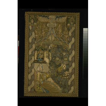
Here is an example of later English work - post-plague, that is. This piece is dated 1380-1410, and as the museum records specify, " It is not... the finest in quality." It is a panel from an orphrey, and depicts the martyrdom of St Thomas Becket. Again, as the museum records state, "the quality of English embroidery and design was starting to decline [at this date]". It is still using the same types of stitch in the main, but the execution is now flawed - as the plague years had certainly disrupted the craft and trade life of the country (and especially the inner-London guilds and workshops where the work mostly took place), it is perhaps to be assumed that the artisans who would earlier have passed on their skills to the apprentices had mostly been 'taken' with the sickness, and that the later work was a result of retrospective study of finished pieces. A few details of the piece:

Firstly, the faces of the knights, with underside-couched mail and laid silver thread for helmets, the silver having mostly oxidised and turned a dirty, dark grey. Especial care has been taken to differentiate between the knights with different styles of beard and moustache.


A detail of the altar here, which shows many different textured stitches, one of which interests me particularly - the diamonds at the lower edge of this photo. Take note also of the figure partially hidden by the icon. This face is a good example of the decline in stitching standards - compare it with the faces in my last post. The museum record remarks that the figure of Mary is "crudely drawn".


Lastly, a detail of Becket's cloak, which does hark back to earlier examples in that the direction of the stitching follows the stress of the fabric in the painted figure - but it looks as though there are only two colours used, which makes the contrast too defined. In earlier examples, the colour was slowly changed, or the stitching did the work in a single tone. This gives this example a stiff, crumpled look.


I had a brilliant day at the archives, and hope to return many times. All the images in this series are printed in low resolution, and are not to be copied! They are the property of the V&A.

Friday, 5 December 2014

Trip to the V&A Archives - Part Five - Medieval Burse

Credit here at the V&A.

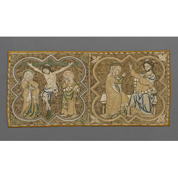
A Mediaeval Burse, made in England between 1310-40. As I've said previously, I watched a documentary on the BBC earlier this year, and it talked about Opus Anglicanum. This was a particularly English way of embroidering vestments and holy objects in the early Mediaeval period, between the mid-13th century (though it's difficult to give an exact dating, obviously, most of the larger examples of the craft can be reliably dated to 1270-1330.) and the beginning of the plague years, around 1330-40. Since I saw the programme, I've been interested to find out how many extant examples there are of this extremely precious craft. As I said in my essay on the lace rochet a couple of posts back, I found a whole thesis on it, the PDF of which is freely available from St Andrew's university. It was submitted in 1995 by a student called Christine Linnell. I've used her dating for the main English copes as a guideline, as the pieces she looks at are stated to date from between 1270 and 1330 (page 11 in the PDF). I may refer to it again as I go along. The piece I'm looking at today is one featured on the documentary, and again, it's something I saw at the V&A archives. Towards the end of my study session, I was allowed to look inside some of the cabinets containing light-sensitive materials, and saw this fantastic embroidery. As was said on the documentary, the staple features of Opus Anglicanum are two-fold. The stunning gold backgrounds, made with underside couching, and the swirling silk split-stitches that make up clothing and skin tones. Here's a good example of that stitching - a close-up on the crucifixion scene where the muscle tone is defined in stitch.


This effect was also utilised in multi-coloured strips to create strands of hair:


As well as the folds in headdress and cloak:


In this detail from the right-hand panel, you can see the way the knee holds the cloak out in folds - it's just sublime work:


Here, the effect of a darker fabric has been created by using a wider range of tones to show the bulges in the material. It's also possible to see the 'fur' lining of the garment at the lower left.


As this is quite a popular piece, I don't want to post too many pictures of it here, but I will say one thing - if ever I get the time to try out this technique of split-stitching, and can find a subject with plenty of depth to depict, I mustn't rush the execution of it - these stitches are maybe 1-2mm each. What really sets this work apart is the way the artists responsible have used texture to show depth, whilst keeping the surface of the work completely flat. Perhaps, as they only had access to quite rudimentary dyes, this was born of necessity. Thinking about this concept of '2D textures' might be quite a good starting point for a simpler project.

Thursday, 4 December 2014

Trip to the V&A Archives - Part Four - Venetian Collar

Credit here at the V&A.
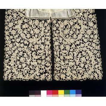
The last item I requested was another piece of Venetian lace. Although a very pretty, winding design, the workmanship in this collar is a little uncertain. It is a transitory piece between the last post, the ruff edging, and the first post, the Venetian rochet. The Style of motif is becoming very baroque, moving away from the renaissance obsession with the classics, and in particular it's insistence on geometry being the basis of all design. This is a far more 'natural' piece, and though most of the motifs are still plain-filled with rows of reinforced buttonhole stitch, some patterned fillings are appearing. The major difference in lace construction technique between this piece, dated 1660-75, and the last piece, the ruff dated 1600-20, is the outlining of the design with raised edges. This is something that is talked about a great deal in Alençon lace, where the outlines are also slightly raised. Apparently, both kinds of lace were carefully edged by buttonholing around a horsehair, though in Venice, this strengthening frame was taken quite literally to new heights, as picot-covered rings and large padded crescents emerged as staples of Italian Gros Point. In the French lace industry, this happened less often, though the workers did consider themselves excellent imitators of Italian lace when the commission required it. So once again, let's have a look at the close-ups I took.


An edging.


Some of the more raised sections.


A sense of scale.
As you can see from this piece, the design, fillings, edging technique, and scale were all advancing at terrific pace. This collar may not be the most refined piece of it's kind, but as an example of the mid-century transitional style, it's very significant indeed.

Wednesday, 3 December 2014

Trip to the V&A Archives - Part Three - Italian Ruff Edging

Credit here at the V&A.

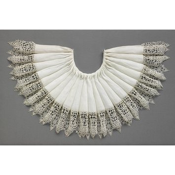
One of the smaller objects I had requested was this retticella (sometimes called retticello, though whether this is an antiquated spelling, or a plural form, I'm unsure) ruff edging from 1600-20. Again, it's Italian, and according to museum records, 203 x 11.5cm laid flat. The collar is a recent reconstruction, made to display the lace edging. It's made with linen thread, and is a perfect example of the kinds of edgings that were reprinted over and over in pattern books for laceworkers at the end of the 16th century. I'll just take the opportunity to talk for a moment about a book that's been really very helpful in allowing me to judge the age of lace. It's a facsimile of "singuliers et nouveaux pourtraicts", published in 1587. This book, with it's more recent title of "Renaissance Patterns for Lace, Embroidery and Needlepoint", was originally published in France by the Italian author/designer Frederico Vinciolo. According to the editor's note, it was republished in 17 editions by 1658, when it's geometric style of lace was going out of fashion. My edition is a smaller reprint/English translation from 1971, based on a 1909 Italian edition. So it's fair to say it's been a widely printed book in it's time. With the basic framework of 'wheels', radiating 8 points outwards to the slightly rounded edges of the piece, themselves covered in stacks of semicircles, those in turn decorated by small picot, this is a classic piece of early 17th century Italian lacework. It's beautifully preserved, almost as white as the fine linen to which it has been attached in recent years. And it bears more than a passing resemblance to some of the patterns featured by Vinciolo. The trick to successful lacemaking in the early 17th century, it seems, is to make your patterns very 'black and white'. That is, a pattern is set down, and filled in very densely, the picots making the only concession to fancy stitches. There are no fillings, stars, or meshes. Only geometric lace in white that shows up magnificently against a black jerkin or doublet. Just to show how dense that stitching is, let's take a look at some of my close-ups.


The visible pattern repeats of the edging.


A sense of scale. Again, the black tip of the pencil is 18mm.


The fluting means some of the motifs are partially hidden.


Viewing this last picture full-size, it's possible to see that in each of the leaf-shaped constructions, there are about 5/6 rows of stitching. In the triangles near the edging points, there are about 9/10 rows. Judging by the scale of the pencil, that's 15-20 rows in a centimetre. Considering that this piece represents some of the earliest styles of lace, and that it is in such a fantastic state of preservation, the construction, compared to later lace, seems a little limited. It is a little basic in the range of stitches used, and the finished item often distorts as it is not sufficiently supported, as later laces were, for example by a mesh 'background'. However, it is a stepping stone that must be recognised in the evolution of lace, and I felt privileged to view it. 

Tuesday, 2 December 2014

Trip to the V&A Archives - Part Two - Victorian Lace


Credit here at the V&A.

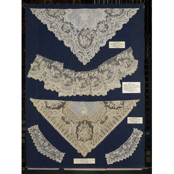
The second item I chose to look at was inspired by a detail seen in the marvellous book, Victorian Lace, by Patricia Wardle. I may well refer to it in this post, so just to make sure I get the page numbers right, my copy is from the first edition in 1968. Seen above, in the first picture of this post, is the V&A reference picture for the item I viewed, though as you can see, there are a few pieces which have been photographed together. The piece I'm talking about today is second from the top. The second picture on their collection page is an excellent detail, showing to better advantage the magnificent design used to create the illusion of a sheen on a three-dimensional object. In my book, a mid-shot is used (plate 14, page 76). The study table was very large, and the lace laid out this way, so without rotating all of my photos, and possibly losing my bearings in the process, the details I took are seen this way up:


As I say, this book has been very useful in showing me the various sorts of Victorian lace available, the stand-out exhibition pieces, and the scale of the industry. At the risk of sliding back into the purely speculatory maths of my last post, there is an interesting figure at the start of the book. On page 18, she quotes from a source near-contemporary with this lace - and I'm going to quote her, quoting them: "P. L. Simonds wrote in the Art Journal of 1872 (p. 295): 'Besides the enormous consumption of our cheaper Nottingham lace and the pillow-lace of Honiton, we import foreign lace to the value of £750,000 sterling.' ". One assumes this is an annual figure. He goes on to list the different components that make up this figure, stating that they are 'declared imports', and seeing as he is nearer them than I am, I will give him the benefit of the doubt, and assume that he is unlikely to wish to embellish those figures, and even though his tone seems to imply he is unhappy at the volume of these imports, to believe that he has used a reliable source(s) for his information. So again, I will use the calculators at the fantastic Measuring Worth and adjust £750k for 1872 prices. This time, as it's a nationwide import, I'll use the calculator for a share of GDP. This comes out at £973,700,000. Adjusting that to US dollars (just over 1.52bn), and checking up on a list of UK Imports for 2012, available in list form from the Observatory of Economic Complexity, we can see that that is pleasingly approximate to what the UK spent on "Artificial Textile Machinery" in that year. So it's less than 0.01% of imports, supposedly. But £750,000 was surely more than a fortune in Victorian times - I would have thought it played more of a role in the economic life of the 19th century. But that's a question for another time.

According to my book, and backed up by the museum entry, the piece I'm talking about today is of Alençon lace, made for the Paris International Exhibition (or exposition, though both are used) of 1867, and was designed by a man by the name of Alcide Roussel. I can't find out much about him, which is disappointing. The only other piece I can see that is attributed to him is also mentioned in my book, though where the item itself is now, I don't know.
It's this parasol cover, apparently designed for the same event -


Edit note: I have since found this piece actually pictured in the original journal from 1867. It can be found in digitised form here. Edit note 2: I have now found in this same exhibition catalogue the actual piece of work that is the subject of this post. It is viewable on page 103.

On a side-note, two other illustrations in the catalogue were also familiar to me. One piece, seen here on page 167 of the catalogue, is actually viewable in the Met - I'd seen it in the Met collection quite a while ago, just browsing, and had been greatly impressed with the naturalism of the piece, which helped me to remember where it was - I thought it looked familiar! The actual record photo for the piece puts it on a red background, which makes it look quite crude and results in a very harsh photograph, so here is the link to the piece on the museum's timeline of art history. It is also featured in a small plate in my book, no. 39 on page 142.

The second piece I recognised as a different plate in my book (again, I'm still talking about Victorian Lace, the book I mentioned at the top of the post), number 28, on page 119. It's a much better image than in my print book, though! The two shawls featured can be seen here. They were included in the book, not just for their significance and expense, but because they were such excellent examples of the design trends seen at the height of the lace revival. The design in the piece I got see could also be favourably judged by these standards, so let's look at that design.

Quite apart from Roussel's insistence on using the best lacemakers in the business (as this piece is true Alençon lace, albeit, according to my book, made by a company based in Paris and Bayeux; Auguste Lefébure & Fils (more about them later). and making the lace as light and, again, as fine as possible (see some of my photos lower in this post with the scale shown), his designs were going to be a hit with the mid-Victorians who flocked to see them because they were so quintessentially of that time. As my Victorian Lace book says (on pages 30/31), the major decorative elements used in lace were taken from architecture (in the book, the two shawls that I linked to in the last paragraph were given as the best examples of architectural motifs), featured past lace motifs categorised by era 'Gothic', 'Rococo', for example, stylised monograms, crests, and various intertwining borders, such as ribbons, bows, and other such imitations of textiles. But by far, the biggest decorative theme was the natural world, especially bouquets or 'sprays' of different flowers.


In the catalogue entry from the 1867 journal, the engraving is surrounded by the words, "we engrave also on this page a FLOUNCE of Alençon point, after the design of Mr. ALCIDE ROUSSEL, of perfect workmanship. The system of shading is happily introduced, so as to give to the border that surrounds the foliage the very remarkable effect of being fluted." [sic]. I hope that Roussel familiarised himself with what was possible by watching (or perhaps even participating in) the manufacture. Looking at that fluted effect myself, I was astounded by the effect, and how delicately it was introduced over several layers of denser and denser stitches. Now, without further ado, a small gallery of the piece in close-ups.

A dragonfly (the sections of whose wings are each filled with a different stitch, some like picot'd portholes, and some beautifully fine twisting fronds, woven into the mesh background.


The speckled fillings of the leaves.


Scale of the border. The black pencil tip, without lead extended, is about 18mm.


More scale, and the corner of a section.


The remarkable fluting effect.


Some 'windows' in the scroll-work.


Finally, a close-up showing how the smallest parts of the design are attached to the mesh.

I've been unable to find out more about Alcide Roussel apart from his name mentioned once in an old French art journal, towards the top of page 196. I have been unable to ascertain, due to the very sparse mentionings of lace (or dentelle) in the following pages, why his name appears.

The Lefébure family are less obscure. In fact, the Auguste who ran the manufactory at the time Roussel was designing for them was something of an author, with a fairly long (300+ pages) book to his name; Dentelles et Guipures [Lace and Guipure]. His son Ernest, who ran the business after him, also wrote a book, a history of French lace, at a more modest length of around 70 pages; Les Points de France [Needlepoint Lace of France]. Both of these books are readable online, thanks to the University of Arizona. They are available, about 2/3rds of the way down the page, here.