Recently, I was in my usual second-hand bookshop when I noticed a strange little book wrapped in cellophane. It was vastly discounted in the sale, and, well, it looked pretty interesting. It was a compilation of images of the V&A's collection of kimono fabrics. It was partly bound into a book, and came with a CD of high-definition images from the museum files in the back. Just as a note, and to help myself come up with some more fabric designs, if they're needed, here are a couple of my favourites.
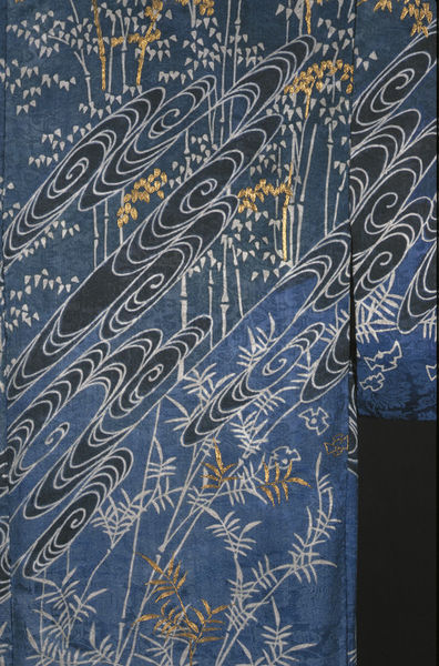
Firstly, this mid-nineteenth century kimono with natural motifs of plant life, including some bamboo, and swirling water. I've always enjoyed the way that traditional Japanese art depicts water in spirals. This is quite a popular motif for embroidery too, I understand. It's quite a restricted palette of colours, and it's certainly designed to be a cool, calming piece. If you go to the museum page (via the link beneath the photo), you can see how the space is divided up by the diagonal water-swirls, and how they section off each type of plant from the next.
 |
| Credit here at V&A collections. |
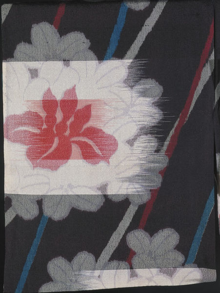
The next piece is a detail of a floral pattern, dated between 1930-50. Personally, I'm not such a fan of this piece, but the way it's been put together does interest me. The way the flower was printed looked as though it was mimicking a kind of crude weaving, as you can see: it's as though someone has scraped a palette knife across the flower. The museum record has an interesting quote on the manufacture: "This seems to be a form of mechanical kasuri whereby the warps and wefts
are printed, rather than tied and resist-dyed, before weaving
commences. In addition, this silk seems to have been printed with pale
grey petal outlines after or as it was woven.". It's an interesting, thought-provoking technique, even if the finished product in this instance isn't quite as harmonious as most of Japanese design.
 |
| Credit here at V&A collections. |
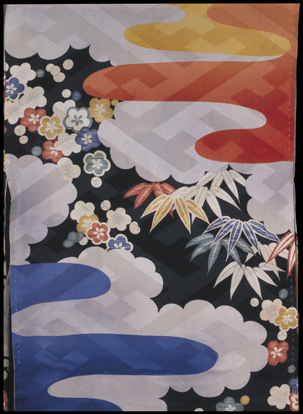
This next bright and cheery piece is actually an under-kimono from the 1940s. I like this (printed) design particularly, not just because it looks bright and modern, but because it has plenty of layers to it, which I find very pleasing. There's the dark background, the bright flowers, the clouds, other, more abstract shapes (maybe a cloud caught by the sun in orange and a rain-cloud in blue?), and then a more geometric, transparent layer over each other layer. There's a lot going on here for an under-garment, and for someone like me, with such a love of elaboration, that is something I can respect.
 |
| Credit here at V&A collections. |
The next piece is from 1910-1930, and is rather mysteriously described on the museum records as "pine trees, plum blossoms and clouds", though (and this is more obvious on the larger image), I think that they must mean bamboo, blossom, and clouds. I might have thought that the description was for a different item, but that the blossoms are described as "embroidered in orange, yellow and gold", which is obviously correct. The bamboo-style background is also described as tie-dyed, which I find quite difficult to believe, looking at the larger images, which show the pale grey areas as little 'doughnuts' of slightly raised fabric. I wouldn't like to say that they were embroidered, like the flowers, but perhaps they were painted on in rows? Anyway, the reason I liked this kimono especially is the way it combines three key design concepts for prints. 1, it combines the printed sections of the design well with the overall shape of the garment, and the pre-planned use of embroidery. 2, it's use of brighter, warmer colours for the motifs closest to the viewer, and paler, less distinct forms further away is a brilliant idea, perspective-wise. 3, the proportion in which each 'layer' is brought towards the viewer by the colours is matched by the level they are raised from the base fabric, whether with painting, printing, or embroidery.
 |
| Credit here at V&A collections. |
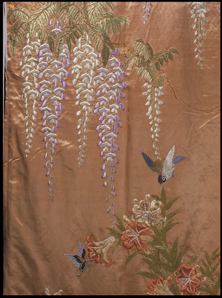
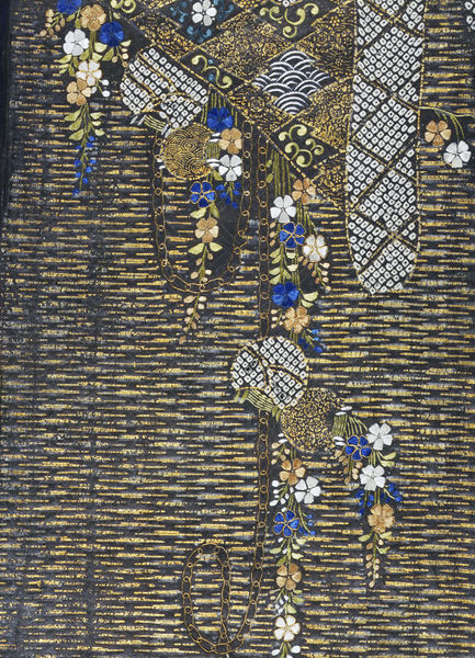
The next kimono is from around 1900, and though this is the only picture available, the description implies that all the decoration is embroidered silk. The description mentions wisteria blossoms, birds and butterflies, but it looks to me as though there are also some lovely curling lilies at the lower end of the picture. One of the best things to me about Japanese design is the way that each item included is made to float, and doesn't have to be contextualised by being placed in a garden, forest, riverbank, etc. This way, the abstracted forms don't become lost in a heavy mass of threads, and paler colours, such as these pastel wisteria, can be appreciated for their beauty of outline, and, I'm sure, symbolic meaning. You can see easily why the Impressionist movement was influenced by the new emphasis on Japanese design, as an 'impression' of the garden is all that you will find here.
 |
| Credit here at V&A collections. |
This kimono is a little older than the others I've mentioned, as it is dated to the first half of the nineteenth century. At first, it doesn't look that exciting, and the depiction of the water is a little lacklustre compared to those swirls I mentioned at the top of the post, but this detail, with the discarded fan on a bridge, makes for quite an intriguing scene. As I said in my last description, this scene is in fact full of symbolism, but this time it is explained in the museum description - here's a (rather long) quote from it: "The iris and bridge motif relates to a famous passage in the 10th
century Tales of Ise, one of the most famous works of classical Japanese
literature. In the ninth chapter the hero Ariwara no Narihira comes to
a place in Mikawa province noted for its eightfold bridge and irises
and composes a poem using the syllables of kakitsubata, the Japanese
word for iris, as the first syllable of each of the lines. " The use of colour is interesting, and I wonder whether it is determined by the text - the many-coloured stems/leaves of the irises are in stark contrast to the wood and water, which are seen only as suggested textures, and very linear at that.
 |
| Credit here at V&A collections. |
Lastly, this fragment of kimono fabric is far older than the others - early 17th century, in fact.
It would be an interesting project, I'm sure, to learn about the style of kimono decoration in each century, or each era, of Japanese history, as I had assumed that the fabrics of the Victorian and Edwardian periods would be the most elaborately decorated, which I suppose I did self-consciously, thinking that in European history, that era was bookended by the simplified ages of the regency and the 1920s. But this piece is one of the... the glitziest of all! Though I can't tell what the shape (again, in those grey doughnuts I mentioned above) the outlined objects at the lower edge may once have been part of, they are a little uneven in their outline. However, this is the only clue I might have gotten that this fragment dated to an earlier era. There is a lovely selection of techniques, though I can't distinguish where (according to the description) the metal thread stops, and the applied gold leaf begins. All of the flowers are embroidered in beautifully bright silks. One more thing I would mention about this fragment is that in my book, it is displayed the other way up to this, which is how it appears online. I have chosen to show it the way it appears online, as any advances in discovering how the fragment may have fitted into a complete garment or pattern would be updated there.
 |
| Credit here at V&A collections. |
Well, that's a quick overview of some of the 'hits' from my new book. It just goes to show - not only that the instantly recognisable and always beautifully arranged principles of Japanese design have been applied for far longer than I might have thought, but that they were closer than expected as well. What a huge and overwhelming collection the V&A has!