Friday, 28 August 2015

Extra-Curricular: getting back into costuming.

I had a crazy idea recently. Despite being a vegan, I've always had a love for the look of leather clothing - I just couldn't buy or wear the real stuff myself. As previously discussed, I also love all things Victorian, particularly the clothing (and within that, particularly the puffy sleeves of the 1890s). So when I decided life was too short not to have a crazy leather-ish jacket, I went out and bought some of the plastic imitation stuff, and set to work on an 1894 fashion plate. What follows is the result.

Having never made a jacket before, and having only limited experience of adapting old patterns, I'm very pleased with how this turned out. Ludicrous, probably. But a great deal of fun. The best part was edge-stitching the collar, and turning it the right way out to make sure it laid flat. It did, and the collar's roll line, which was the part that needed the most modification from the original, sat perfectly.


Being very thick fabric, it was difficult to hand-stitch anywhere, which made for some very creative machine work, especially when the shoulder pleating was pinned into place. Naturally, it being a leather jacket, I needed to add some studs, and several rows of alternating 10 and 15mm spikes did the job nicely, their backs being covered by a wide cuff lining. It remains unlined, albeit with a large hem turn up and reverse panels up to the dart of the jacket front, also in the black faux leather. As yet I need to make a finished belt for it from my leftover fabric, and add belt loops. But it's great to know that my crazy jacket modification will fit, and despite it's weight, be wearable without slipping off the shoulders!


Completing this project, silly as it is, has helped to reinvigorate my enthusiasm for all things costume. If I can somehow bring together costuming and textile art, I think I might have a pretty good final project on my hands.

Wednesday, 19 August 2015

Stage 4: Developing Design Ideas into Weaving.


For this exercise, I was asked to choose a sketch, image, or idea, and develop it into a piece of woven cloth. Thus far, in this section, this was my second favourite thing to do, after the lace squares. I had seen a tutorial a while ago online for circular weaving, and without more than a few seconds thought, decided to do this. The idea is a kind of rose window - I was originally going to weave quite a simple shape, and then embroider (in a soumak style) some black wool 'lead' over the top, possibly in the traditional diamond shape. However, I felt that (as usual) this would give me too much of a certain framework, and I would become frustrated at not being able to make all 6 sections match exactly, when I was supposed to be experimental and spontaneous. There was also the trouble of the shape itself - obviously, all warp strands cross in the centre of the board, and are therefore very closely grouped in the centre, tapering off towards the edges, and spacing out. I soon realised that if I was to embroider over these unevenly spaced threads, the shape would be likely to pucker up. So I went out shopping, and found a crochet cotton weight yarn, roughly the same as the black edging. It had a nice colour change in it, and I thought it would be fine to replicate stained glass, as seen from a distance. I was pleased with this project - I felt quite fulfilled. I think that's because it looked like a finished product, rather than a sample, though of course, that's what it was. One problem that became apparent once I cut it from the 'loom', though, was that it almost immediately lost it's shape - this was due to the threads being so loosely packed at the edges of the board. It might be a good idea to insert some small "v" shaped warps in at some point, anchoring them around one or two of the weft threads in previous rows. A future experiment, perhaps.

Thursday, 6 August 2015

Experimenting with different materials, large sampler.


I've been writing, recently, in one of my research/inspiration books, about the strange appeal of metallic elements in clothing. It's certainly something that appeals to me, anyway - and for this exercise about using unusual materials I thought I'd go all out. It was important to use a very rigid structure as a warp, and - for fear of it sliding out - decided to make a frame for it that wouldn't have to be removed, in much the same way as I did for the lace sampler project a few posts back. This time I used some quite thick wooden dowels. I began by weaving with thick wire used for gardening, then built up with some jewellery chains from eBay, some metallic yarn, and strings of beads or buttons.


My idea for this was partially with the final project in mind - I wondered whether it would be possible to make a 'suit of armour' that, with the right wire/chain/metal to thread ratio could be semi-viable as an actual suit! I had a vision in my head of being able to weave panels of the right shape, then remove the wooden frame, and 'sew' the panels together with wire. I imagined I could lay them out as a finished shape, embellish, and lift. This thought was inspired by a piece of cloth from the Metropolitan museum of Art, NY. Here's a picture:

Source

I've seen a few historical documents that show this was the way such jackets were constructed, and I must say that from the little experience of embroidery I've had, having a well-stretched surface to stitch has been a vital element. It makes sense to keep it a regular shape for as long as possible.
It's been an interesting project, if one that's very hard on the hands. I've not been entirely won over to the idea of working intuitively yet, but it's true that until you do something, you are never sure what you will learn. Being given more ideas for the final project is always a good thing, too.

Friday, 24 July 2015

Experimenting with Different Materials, Sampler 1


This section of the folder has asked me to try a more experimental, freer way of weaving, and though I am usually quite an inhibited person, who likes to plan things out in advance (and am often too eager to cling to rules and restrictions), I've given it a try. I thought a good way to pick my materials was to begin with a nice warp - this one is a thick yarn with metallic elements, and a colour progression from blue-purple to turquoise. Then I would loosely theme my different weft materials into see through, metallic or sheer. I've got quite a selection - from the left, we've got tin foil, folded into weaveable strips, wire, PVC strands of 'scoubidou', bubblewrap, clingfilm, strips of a plastic tablecloth, and some twisted clingfilm in more complicated stitches, as it worked the best! As I was working this sampler, I had a good idea for a larger one - see my next post for more details.

Wednesday, 15 July 2015

Project 9 - First samples, Experimenting with Weave Textures + Making a Loom.

Just a few notes on the samplers that tested different weaving techniques - the only background I have for this is when I was trying out the instructions for making a loom and used a large tapestry embroidery frame to attach the warp threads - sewing each loop of navy wool to the twill tape nailed to either end of the frame. I then took a piece of bamboo cane and made a continous string heddle (credit for the tutorial goes here) for it - as well as a reinforced cardboard shed stick and shuttle, which I covered with clingfilm to reduce the friction (it increased the static electricity though!). This made it easy work, though the fibres occasionally felted together with those of the heddle - if I tried this full weaving method again I'd use a tightly woven cord, perhaps the kind you can find in Roman blinds. Once I'd finished, I was quite happy with the product - but holding it up, realised that it was really quite see-through. In some places the tension was a little uneven, too. So I put it away for a bit, and worried about it. Looking through the folder's instructions, I saw that the way forward was to tighten the whole thing using the suggested fork method. I thought that I had been really very thorough with my (again) cardboard beater, but this worked like a dream. As it was only a trial - and one where the shuttle had run out about halfway through, I decided I would move either side of the shuttle join back out towards the edges of the loom. With a large gap of warp threads exposed in the centre, I thought I would take the opportunity to try a little needleweaving - the only trouble this caused in the end was not showing up on camera!


The second sampler I tried out my makeshift loom on, I made a little easier for myself. I made it much narrower, and stuck to the brief - just a few repeats of each technique until I felt confident I could remember and untilise them. Currently, the biggest problem I have in terms of finish is that I somehow never manage to make the warp threads tight enough, and they bow inwards. However, as an experiment, I think this one went very well indeed. I learnt a good few techniques in a short space of time, and without a large outlay of resources. Roll on the next exercise!

Thursday, 2 July 2015

Exercise 4 - Rigid Grid Weaving.

This is the result of me wishing to recreate a sampler I made a few years ago, in which I tried out the many different recommended stitches in a lovely book, the Encyclopedia of Needlework by Th. de Dillmont, of which I have an old copy. Wishing to make the original in the correct way, I put together several layers of felt, and stitched over the top of them a sheet of paper with the grid marked out on it, and then outlined it with some medium-thickness crochet cotton. However, I failed to secure the outlining thread with enough stitches, and as a result, as I filled in the squares with the needlelace stitches, the frame buckled, and warped until there was no tension left. Being very disappointed at wasting so much time,  I left the project alone for more than a year. Reading the brief for this exercise, though, and being interested in the idea of combining weaving and lace - possibly without having to cut the threads of both directions, and weaving more organically shaped windows in the cloth, I decided to resurrect the sampler. Used in real cloth, rather than a frame, I think it would be a little like this one, though I'm pretty certain this used cutwork:
Source here.
Therefore I felt justified in using needlelace - which, quite often, with the needle passing up and down regularly through the fabric - is very similar to needleweaving itself. There are 36 samples of needlelace involved, as well as some experiments with different thread weights at the top and bottom of the frame. The frame itself is made of a pictureframe with wooden skewers glued across. They are not entirely even, and I may well trim their sharp ends! Without listing the stitch used in every part - as they are often given numbers, rather than names, in her book, I found out many interesting things about my favourite subject, lace. I found out that the tougher your border, the better your lacework. In fact, the lace itself is quite tightly pulled up, especially the closely packed stitches made to resemble cloth - I packed them a little too closely myself, and they are slightly popping out the frame. I learned that the fine threads seen in museum examples are both tinier than you would imagine and puzzlingly, a little more possible than you'd think - as long as the needle you're using doesn't have an end sharp enough to damage the threads. I also learned that the amount of concentration needed was high and it was constant. Like painting, there isn't a part of it you can do on autopilot, as the tension of each stitch - and the impact of the current stitch on the last - must always be judged by eye. My only regret regarding this exercise is that I didn't use the experimental materials that I had collected. On the one hand, I feel that I might be missing out on an important learning experience by not trying out the possibilities listed in the folder. On the other, I realise it's quite subjective; it is open - very open - to personal expression and experimentation. And after all, the textiles fields are all very closely linked, and combine so happily.

Thursday, 4 June 2015

Stage 2: Experimenting with Structures. Exercises 1-3.

In this bundle of exercises, I found a surprisingly relaxing experience. I liked all aspects - matching the colours of my thread collection to my chosen image (which I think came out quite well), weaving little strips out of paper, and going back to a craze from my early teens involving many, many plastic cords. At the time, I remember it having many different names, but the one that stuck with me was 'Scoubidou', which I understand was it's original French name. I was pleasantly surprised by how easily it came back to me, though I wanted to include more strands - Googling about, I came across this page: Palma and Margarita braids each of which use an amazing 24 strands. As a part of traditional south American weaving, these braids are apparently used to keep the frames taut. Making plenty of different braids was good fun, and looking into different weaving patterns to construct in paper was actually very educational. Looking at patterned cloth before, I wasn't sure how to count the threads, or to work out which ones rose and fell at which parts of the pattern. Although tapestry weaving, and how to create a smooth surface with so many overlapping colours still seems a long way off for me, I can understand some basic weaves much more easily, and recognise them on sight. I also imagine you could combine the two - braiding and weaving - to make some very tough, colourful cloth. Especially if you very the materials, and include, say, some of the PVC scoubidou threads, or some metallic effect yarn, maybe even some fine wire. I think, though, in that case it might be difficult to create something regular - unless you used a proper weaving frame, and wrapped your threads very tightly indeed around the wire when braiding to stop it from poking out at the end of a row. Then again, perhaps just wrapping wire to weave with would be an interesting experiment, as long as it stays in place.

As regards the colour matching exercise, I chose two images to attempt to match the colours from - one was The Ideal City (Urbino version), the famous 1470 painting of unknown authorship, the restricted colour palette of which would, I thought, encourage me to use the threads in a traditional way, trying my best to hide the shift between colours by blending them as subtly as possible. The second was Our English Coasts by Holman Hunt, the colours of which are some of the finest in painting - the red-brown clay soil, the tones of the sky meeting the sea, and my favourite part, the pink ears of the sheep with the sun behind. I thought it'd be good to keep them all together, and stuck them into my sketchbook, together with the little windings of thread, my coloured pencil blocks, and the labels for each part of the painting. It makes you realise both the limitations of the form and the doggedness of the weavers - a painter can mix two colours he has seamlessly together - and must do so often. A weaver needs a whole new tube of paint every time - combining strands of thread and continuing to weave won't give the right impression of blending up close.

The picture used above is one of my last experiments - trying to weave flat braids together into cloth. It was actually quite successful, but very time-consuming indeed. Picking a colour from each bunch of 8, when it reached the edge of another braid, I would swap the threads over, creating a join. This happened naturally fairly often, but if I were to do it again, I would make the joins twice as frequent, perhaps by colour-coding them along the width of the weave, just to save confusion.
So altogether, it's been a good refresher on some of the basics, and a good introduction to the mechanics of weaving.

Thursday, 14 May 2015

Assignment 4: Research point. The work of textile artists.


I’ve been asked to look into the work of the textile artist, and specifically, the categories that many people find themselves labelled with. Here’s a table I’ve made with my initial thoughts on the categories set by the folder.


Looking at the table, I feel that there are some areas of ambiguity. Here are a couple of questions I’d like to be able to answer. These might be good to build on for further essays.

A designer I’ve looked at previously on this blog is Alcide Roussel, the Frenchman (?) who made the lace I visited at the V&A. Roussel was a designer, and in his workshop were craftspeople. Were their products art? Their inclusion in the V&A collection would suggest so. If this is accepted, who is the artist? The owner of the concept, or the person that creates the object?  I would argue that both are. Art is an inclusive family, or it should be. Anyone that can use skills that they have worked hard at learning to create an object of beauty, such as this lace, must surely be an artist.

The second question I would ask is: is labelling useful? Take, for example, some historical figures that are old enough to be indisputably called artists. Dürer is known firstly for his oil paintings, then his prints. It’s likely that he designed the blocks, and handed the work over to a professional carver to replicate his fine lines. So does this make him a designer, too? He also probably made his own paints from pigments, and mixed them himself, despite the size of his workshop. He worked in a traditional form, on many religious subjects, as well as contemporary paintings. So was he also a craftsperson? Working with tools partly of his own making, and learning from a master of his trade, as well as in a manner established by long tradition. Take just those factors, and surely he would be an artisan.

Moving on to textile art, though, the folder asks me if I look at a piece of textile art in the same way as a painting or sculpture. My answer to that would be – I do, but I think that I’m in the minority. It’s got the wrong image – and I think that’s to do with the history it’s missing. Or rather, not missing, but overlooked. The history of many art forms – painting for example, have a long and revered history – as far back as Egyptian tomb painting – or those prehistoric depictions of hunts on cave walls. Or sculpture – back all the way to ancient Greece – or further, to those early humanoid figures, like the Löwenmensch figurine. But textiles have far less history left, due partly to its uses, partly to its very nature. Sculpture, in early times, aside from flint knapping, was given significant uses – lucky charms and early gods were made to last. Painting was used to tell stories and to brighten the lives of the inhabitants of those caves. Therefore it would be placed were they would be much of the time – in a sheltered location. So both sculpture and painting survived. But textiles were much more transitory, as they were almost always made with a practical view – as far as we know, anyway. They probably had dyeing and decorative weaving, even if it was just stripes in cloth. (link to 27,000 year old cloth) but the point is that they would be constantly in motion. And wear out. And be used on the floor, or thrown away, and rotted down, or maybe even burnt for kindling.

So we only have a cultural view of the work from civilizations with writing systems. And although it is equally important as a craft for a prosperous society, as an art, it was thought almost beneath contempt.
For the most obvious theory as to why this is, we only have to look at who made the work. Women – and most likely, wealthier women. But is this why it’s still on its own in the art field? In cultures were artistic textiles were traditionally made by men – in Japan, for example, whilst the genders were as segregated as in any other nation, their clothing was less so, and the craft was a respectable profession, recognised as demanding a great deal of dedication and skill. Yes, women were still dressier, but a man wearing an embroidered outfit, or a bright colour would only be thought of as an important man, and not one that was in some way effeminate.

This is not to say that in European society up until 1800, the upper-class man would not be pleased by an embroidered court suit. But the workers who created such a suit would be subservient to the designer, and unlikely to have been paid anything more than an hourly rate for a job well done. It’s interesting that the religion of the 19th century is still dictating a dress code for men today. Their policy of ‘stark and dark’ for much of men’s fashion is still adhered to. A man wearing a boldly printed shirt wouldn’t arouse interest. But an embroidered jacket? Madness.

Embroidery and lace seem to have come off worst from this change in fashion. It’s true that most people wouldn’t recognise the difference between machine-made and handmade examples, and that therefore there is very little trade to be had from making either in the old style – the prestige of either as a display of wealth is gone. For some, the appeal of a well-tailored suit remains, but the Georgian ideal of a brightly woven and glitteringly embroidered one has vanished. Again, the Victorians are probably responsible. Whereas a man was a tailor, a woman was a seamstress. And she did a lot of the decoration. Embroidery would not only have been a ridiculous hobby for a Victorian who couldn’t afford to be an eccentric lord, but in the later years of the age, it might even have been regarded as suspiciously female.

It has the lazy connotations of a system many years old. It sometimes applies, sometimes it doesn’t. A woman that cooks is a cook. A man that cooks is a chef. A woman that designs fashions is a dressmaker. A man that designs fashions is a couturier. A woman that embroiders is a hobbyist. A man that does it – well, he might be an artist. But we still haven’t got there yet. He’d probably just be ‘unusual’. It’s not fair on either. It’s an art-form. And people that do it are artists. It has possibilities other spheres do not. Therefore people that want to explore those spheres want to for their own sake. It shouldn’t say anything about them as a person.

With that in mind, let’s look at two artists who have crossed those boundaries. Firstly, Japanese artist Takahiro Iwasaki. As a multi-media artist, he doesn't work only in textiles - in fact, even in the article where I first discovered his work, his textile work took second billing to a model carved from electrical tape. His work seems to share a theme of intricacy throughout, though. It also demonstrates another quintessentially Japanese trait - that of taking any small twist on a concept and demonstrating it in an unbelievably elegant, understated way. The article where I first saw his work was a report on his exhibition, "out of disorder". Here's a link. It featured sculptures such as this: 


This was the first piece I'd seen by him, and I was immediately taken by the scale. However, some of the other textile pieces displayed in the article show that scale more effectively: 


I've been asked to talk about his work in terms of imagery, technique, etc., but the truth is that it is quite difficult to find examples of his work online. Therefore I will explore themes as best I can. 

His work in this medium consists of a series of tiny thread sculptures, made (mostly) to match their colour with other objects, onto which they are attached. The sculptures are all of modernist buildings, mostly those made with many steel struts; pylons, observation towers, Ferris wheels. The objects are all textile pieces found around the home.

I think the effect that makes these so memorable for me is the idea of worlds running parallel to ours, especially in mysterious or hidden ways. Here, with the threads of household objects spinning their own tiny worlds, it's... well, enchanting. I think it's a similar kind of appeal to that of spy novels - the thrill of something unknown being so near to us, but unseen. In constrast, though, industrial landscapes are rarely thought of as something ambiguous. They imply decay, poisonous atmospheres and unforgiving, utilitarian design. They're harsh, verging on cruel. So the other advantage, it seems to me, of using this technique and scale is the way that it makes an effective commentary on the way people adapt to their surroundings. Other objects featured in the exhibition show towels and bedsheets as well as these toothbrushes, with added industrial features. Notice that these are all objects that come into contact with the skin of the owner, and that they are textiles, and therefore absorb and stain. So perhaps it implies that people in a city can't quite get the dirt of it off their skin in a day. As these are everyday objects, they are becoming clogged with the dust of the environment their owner brings through the door each night, and are starting to show their wear. Or maybe they're learning to adapt, and blend in.

Another of his works - not a textile piece, but one that does show beautifully the elegance I mentioned, is part of a series of wooden sculptures exploring reflections: 

Source here.

It's a good example of a concept - that of a sculpture that implies reflection without using mirrors or water - being used in a way that communicates only that idea, without fuss or distractions. It's interesting that he should have made a sculpture, architectural in form, that is suspended by fine wires in a gallery. Because that is precisely the theme of the next artist I want to talk about - Korean multimedia artist, Do-Ho Suh.

The theme of a few of his exhibitions has been transforming his sketches of objects and buildings into 3D, life-size fabric replicas. The first object I saw was this one, the oven from his Manhattan apartment. It's well worth zooming in on.


It's interesting in two ways - firstly, that the material used means that the interior of each object can be seen and inspected - it's almost 4D! Secondly that by changing the technique/material of an everyday object, it can be made interesting enough to be worthy of exhibition. It's a fascinating collection of objects, more of which can be seen here. It's also brilliant to be able to see how skillfully the nets to such complicated objects must have been cut. From a practical point of view, I'm glad that I am not making objects like these, where there is no 'wrong side' to hide knots, frayed edges, etc.
However, he didn't stop at the domestic scale, and expanded on this theme into lifesize silk replicas - of his previous homes. One inside the other. They look so much like CGI, it's quite difficult to believe.

Man viewing the exhibition up close.
I think that what I find most inspiring in a textile sense about these two artists is the way that their concepts are a shift from one medium to another - and they're relatively humble ideas, too. There are so many ways to embellish something with textiles - beading, embroidery, lacework, appliqué, probably dozens. They've taken objects of little interest, and by moving them into this field, and changing small things about them, they've made them something almost completely new. Yes, I think that's what I like most about textiles - that they always have an extra layer of technique to apply.

Note: like many contemporary artists - I'm sure both of the artists I'm talking about today are no exception - these two seem to come up with ideas in any medium, and probably find technicians to make the objects themselves. Certainly that is true of the house project pictured above - it's a lifetime of work otherwise! So it is a little difficult to find a textiles artist whose work is on a human scale (that is, all the components are handmade by the artist), but has the same impressive quality that a large project like the silk houses have. We must admit that the field of textiles is one in which time can really sink before any satisfactory results can emerge. It's the point of compromise for an art field in which there are so many possibilities and styles. However, it also means that - for a good deal of time - there are points where collaboration by a group of people is possible before the final assembly of a project. It would obviously have been better to more openly acknowledge this kind of work as a community project with Suh as the director/creator, but it is part of the routine now.

Saturday, 25 April 2015

Catch-up Post. What I've been up to lately.


My tutor has been on holiday, and I've been taking the opportunity to finish some other projects that, I hope, will have a bearing on my course. I've been very nervous about my work recently, and it's taken a bit of a drop in pace. I've put together a little gallery here. I have been working on my theme book, and it's seen quite a bit of progress - 70+ pages of workings-out, sketches and reference photography trips. Seen here in this post, however, are some of the 3D projects I've been working on.
Firstly, either side of this paragraph, another appliqué raven that I was commissioned to make as a present for a friend's son after I showed her mine. The original piece of coursework is seen on the left. I tried a slightly different working method with the new crow, and I'm not so happy with it as I am with the original. I worked out which part of the crow was the largest 'slice' and drew on two copies of that slice, adding paper when necessary. I cut out the template, trimmed the paper to the next slice, usually 2-3mm smaller than the last, and cut that one. I stacked them all together as they appeared from the scissors so as to check they were still in scale. This is opposed to my method with the earlier version, where I started from the smaller layers and cut around them larger each time, using the last layer as my template. However, my new crow turned out quite a bit larger than the previous, and the face didn't narrow into the beak as nicely.


Above: a scale comparison.


A close-up of the face, where you can see the second new technique - no whip-stitching used whatsoever, thanks to every layer being pre-cut. This made for much easier assembly, as each piece could be truly appliquéd.


Detail of the back of the crow. I was pleased with the regularity in the 'feathers' and the stitching, and thought was worthy of another photo.


As I know the next part of the course is to do with weaving, while I take a break from the more serious work, I decided to use an old tapestry frame as a loom. I think I've pictured the set-up for this before, so I'll just show the recent additions. I used a tutorial over at this blog of traditional weaving techniques to set up a continuous string heddle system, made my weaving sticks from bamboo garden canes, and my shuttle and beater from thick cardboard, reinforced with glue, and wrapped in cling-film to reduce friction. The heddles were something I had to look into, though the rest of the equipment was improvised by me, which goes some way to explaining why the weaving got to difficult towards the end of the frame! Here are my first couple of rows complete:


And here's the finished product - obviously, as the warp threads were held in place by being sewn to the frame, and as they were fairly thick wool, there was a little stretch in them, hence the curvy shape of the finished edges.


Towards the end of the frame, there wasn't enough space left to move the weaving equipment, so I carefully unwound it, and removed the card that opened the shed (in opposition to the string heddles). I took my largest tatting needle, about 4-5" long, and threaded the shuttle's remaining thread into it. I carefully pulled it through, replicating the weave above. I made a few mistakes along the way, and had to unravel back to them, but I think I can say I didn't miss any.


The tatting needle on the last row.


A close-up of the cloth.


The next thing I'd like to show is this odd little piece of work, on a completely different scale to the others. I was struck, recently, by the possibilities of 'invisible' nylon mending thread. I made a tiny loom with polystyrene packaging and pins (though unfortunately, my camera malfunctioned and I lost the pictures of it set up), and 'wove' with a needle and some short lengths of embroidery floss. It's not actually as flimsy as it looks, and I'm hoping that (and I've mentioned this in my theme book) I'll be able to use it to create an interesting stained-glass effect. Here, I wove with one colour. I was planning to use a contrasting colour, perhaps a dark red, in the centre of the weave. However, from a distance, it looks like empty space, which in itself is a worthwhile effect.


When I removed it from the 'loom', it held it's shape nicely, and I stitched it to a thick felt frame, for better display.


Project number four I'd like to show off is this 1890s hat base, made from a little garden wire, some off-cuts of velvet and polysatin, and a chevron-printed blouse from a charity shop.


A side view.


And the very lovely lining.


I'm very pleased with it - the idea is to finish the crochet project I spoke about earlier (that was, using authentic Victorian pattern books to replicate the look of the time) to use as decoration. More updates on this soon. 


Projects five and six can be seen either side of this paragraph, and represent something of a cheat - a pattern to follow! These hoods were both made as presents for friends with new babies, and therefore are displayed on one of my bead jars! I thought them worth including here because I learnt a new technique whilst knitting them: they feature a drawstring, the casing for which is knit in one piece. This was similar to my project earlier in the year, the double-knit scarf. A practical feature, yet one I would never have thought could've been achieved so easily in knitting. Alternating knit stitches with yarn-overs, the two sides easily stayed separate, forming a tube, until being joined at the 'nose'. I finished off both foxes with button eyes and noses, and some 'i-cord' drawstrings, as seen in the pattern.


The fox with more sensible eyes.


Here's something else I've been doing in my spare moments. I haven't felt too bad whilst doing it, although it feels quite far from the folder work, because it's only an extension of that: it's textile work, it's creative, it's personal expression, and it incorporates the three artistic virtues of practice at the design stage, practical practice at stitching, and being patient whilst working through the more repetitive elements of the craft. However, whilst I feel great wearing such a ridiculously heavy costume (8kgs - I weighed each piece on the kitchen scales separately), I do feel a little silly talking about something that was really quite a lot of fun as though it was a very serious exercise. Ah, but I was forgetting:


 I upgraded a bag to match, as well.


 Here's a full-front view, on my dress-making stand.


 And finally, a view of the less decorative back. All the components were made from recycled/salvaged components of my old outfits and other pieces found in charity shops. It was sewn together almost entirely by hand by myself, getting in plenty of practice at using my thimble properly, in the tailor's manner (thimble on the middle finger of the hand, using the side to push in the needle, and the forefinger guiding it). This was necessary because of all the metal components, which made it impossible to sew by machine.


 An update! Once I'd realised there was only one day of work left in my hat, I took the time out to finish it so I could present it here before submitting my assignment. I'm very happy with it indeed, though I have yet to acquire the requisite skills necessary to the historical hairdressing to support such a hat. For the moment, here are some pictures of it 'as is'. Above, the back - a combination of Irish crochet motifs of curling Asters and Chrysanthemums, an abstract base or 'ground' forming the centrepiece, and three differently styled butterflies. At the top left are some leaves from an anonymous Russian pattern found online.


 A front shot, again showing off that pretty lining. Edging around the velvet crown of the hat, from the top down are three roses, each of a different pattern, in large, medium, and 'bud'. These were the most time consuming elements of the hat, and so take pride of place. They come complete with calyx(es) and picot-edged leaves. Then comes another butterfly, another leaf, this time in a grape-vine fashion, and finally, a stem of bluebells.


 Here's a better view on the butterfly.


 Roses, as seen from above.


 A better view of the bluebells.


 And finally for this section on the hat, two of the butterfly hat-pins I made earlier. They look rather out of scale in this photo - they must be about 3cm across. I'm thinking of adding some ribbon ties to the hat, and then I think I can call it complete.


Lastly, I've been up to the attic to fetch down my yarn 'stash' for the next assignment. Whilst I was there, I came across lots of my plastic strings used in the great 'scoubidou' craze. I think I may include some of them in the weaving project.

Sunday, 29 March 2015

Section Reflection.

This section has been a classic example of my working method. I’ve started it, and I’ve got involved with the methods and techniques that are mentioned. I’ve then made them my own by creating projects that utilised them. I’ve over-complicated them by my drive to make useful or sculptural works. Then, I’ve spent a long time on them and off-shoots from their ideas (in this section, see the way my gold box linked to my gold bug). I’ve become afraid of spending too much time on the practical work, and not long enough in thinking about it’s meaning, or coming up with new designs. Feeling defeated, I’ve become despondent. Then suddenly, the comeback, and I’m finishing making things, I’m generating new ideas, and I’m setting myself proper work goals. Yes, I’ve got some excuses as to why this section has been slow going – I’ve started a new job, meaning I’ve had to cut my course hours by about a fifth; I’ve been exploring new art fields and thinking about the future, as well as trying to keep up with my still recently-acquired skills, like painting and ink illustration; I’ve been trying to keep some projects and techniques aside as personal experiments, so that I can have moments where I try things just because I want to try them; and I’ve had a good long period of very complicated relationships turning rather painful. However, I’m feeling more confident now I’m the other side. I’m beginning to realise there are links between the different disciplines of art, and that there’s nothing I can’t turn my hand to and try to learn because it’ll be too difficult. There is almost nothing that can’t contain an idea. Perhaps I’m growing up at last. In the next section, I hope I’ll be exploring (with a couple of extra-curricular essays) what new fields of art are opening up to a less timid version of me, and how I think they can be combined, in particular with textiles. So for now, I’m leaving my artistic-temperament quagmire, and stepping forward into new techniques.

Saturday, 21 March 2015

Mini-Essay. Careers in Crafts Philosophy Research Point.

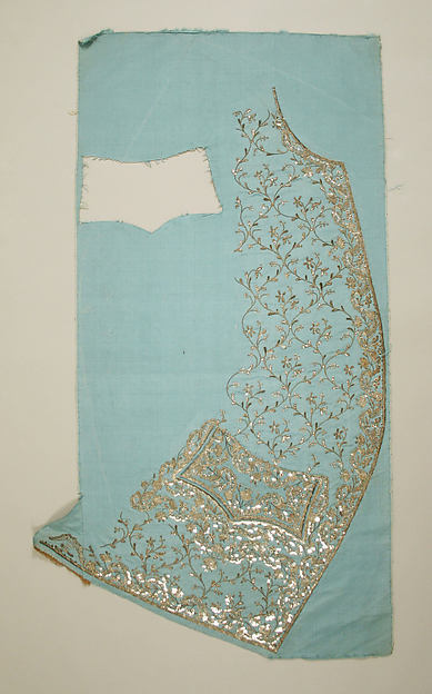
The idea behind this essay has been a little difficult for me to grasp, but I think I understand what is meant now: this should be an essay that addresses the motivation behind artists and craftspeople, to see how they would word their 'statements', and to reflect on what it means for my own opinions. Why do artists and artisans do what they do? Well, I've done a little research, looking at contemporary sources mostly, and it's been quite interesting. At the heart of the matter, it seems to me, is the compulsive nature of the opinion. I'm quite sure that everyone wants to make something, because they are sure their ideas are worth expressing (I'm sure they are too), and that certain things they've seen inspire the either of these responses: "well, I could do that" or "I could make something much better than this". It's mostly a matter of finding out what that thing you want to make is, and then to overcome the fear of rejection, either from yourself, because what you've made isn't what you imagined, or from the zeitgeist, because you don't exactly fit in with the fashion. And if everyone wants to make things, surely everyone can generate an opinion on what a good thing to make would be. So, if we put aside the motivation of many an historical artist - that of "work or starve", as a necessity, rather than a 'personal philosophy', it frees us up to take a look at some more specific issues. I started my little research session by looking at some artists who I admire, and are still working today. They work in a very old medium, making wooden sculptures to serve as icons and altarpieces in Catholic churches all over Spain. Their motivation, I reasoned, must have been the motivation of many great artists for centuries. That of art as a form of religious devotion and expression. I was surprised, therefore, to find a very familiar name as the quote on motivation for one of my sculptors.

In the workshop. Credit here.

His name is Dario Fernández, a Spanish sculptor who creates life-size images of biblical figures for churches in imitation of the 17th century Spanish masters. To summarise his motivation, he had used a quote from David Hockney. It was in Spanish, and I've translated it as best I can, then gone looking for it in English - I believe it goes like this: "It is very good advice to believe only what an artist does, rather than what he says about his work.". I find this is true of my own philosophy. Take a painting, for instance, that is both beautiful, and a technical marvel - like Holbein's Ambassadors. It is obvious, after a few moments, that it is beautiful. After a few moments more, that it is marvellously complex. There are plenty of symbols pointing to the professions, habits, and wealth of the two gentlemen depicted, but you needn't know more about them to understand what makes it a great work. In this respect, I can see very few exceptions to the rule that if a 'work' has to be explained, it has not done it's job. Whereas, if you look at something that is supposedly deep, but that without explanation is without imagination, like the most famous 'paintings' by Rothko, you can look at them and say 'they are red oblongs, painted unevenly'. There is nothing of substance to them whatsoever. They display no skill, and they are not beautiful. I think this is very much the centre of what I would call my own philosophy. This is why the beauty of things is far from being a vanity, suited only for the 'apprentice' of art. It is an absolutely necessary part of existence, and without an attempt at the beautiful, what is the purpose of art? Without it's standards, the modern 'art' world has become a laughing stock, and rightly so. I am certain that this is why I find myself much more accepting of the 'craftsperson' than the artist. They are not trying to shock, to create headlines, or, for the most part, to change their vision for the purpose of making it sell. They also seem to hold themselves to far higher standards than the usual 'modern artist', and perhaps most importantly of all, they literally work for themselves and don't apply that sickeningly patronising term 'my technicians'.

But onto my research into other philosophies, before I get bogged down into a personal rant. One of the sources I've looked into most is a historical source, and one with very strong opinions: I read a lot of works by the 19th century designer, architect, and (he would probably say) theologian, A.W.N. Pugin - I'm sure I've mentioned him plenty of times before. A key belief of his design was the idea that painting was an inappropriate medium to replicate a 3D object, and that you should not attempt to do so - save that for sculpture. He felt it was deceptive, and therefore unchristian. He mentions this in a few of his books, but as I'm writing online, here's a link to a V&A article that has this quote on his designs: "In the design of wallpapers he too deplored the false illusion of depth and the use of trompe l'oeil shadows, and argued instead for flat patterns composed of simple forms which would confirm the wall as a flat surface rather than disguising or contradicting it. Pugin was one of the first to promote the idea of 'honesty' and 'propriety' in ornament and design, thus enlisting ornament as a moral influence in society. He practised what he preached, designing wallpapers with flat, formalised geometric patterns such as fleurs-de-lis, quatrefoils, heraldic motifs, and flower and foliage forms adapted from medieval art, architecture and textiles, printed in the rich colours of a 'medieval' palette."

Wallpaper designs by Pugin.


I agree with him on so many points, but not this one. His point was that to paint in a trompe l'oeil style was morally wrong, as it pretended to be something it was not - it was therefore, deceptive and sinful. I disagree because even if you follow, as Pugin did, the catholic tradition, it is obvious to anyone that the most sublime art in all Catholicism must therefore have offended him. I wonder if he ever stopped to think about the four-fold service that art did. Firstly, I'm sure without it's influence, fewer people would have been educated and entertained by the stories of the great works of the ancient world, whether Judaeo-christian religious themes, or the legends and plays of polytheistic or 'pagan' cultures (scenes such as these have been painted for thousands of years, long before even the smallest fraction of society could read the stories of their ancestors, and therefore, it was in pictures that the works lived on in the culture, whereas, had they been confined to the page, society would have been so different. And the weaker for it, I dare say.). Secondly, it inspired people. Sometimes in small ways, such as to see a painting, and to compare the colour of the sky in it with the sky you see as you walk home. Sometimes in larger, or more 'pro-active' ways, such as to wear a different colour after seeing a new shade of cloth at a market. Sometimes seeing the right work at the right time could induce a life-changing decision - there are plenty of examples of this.

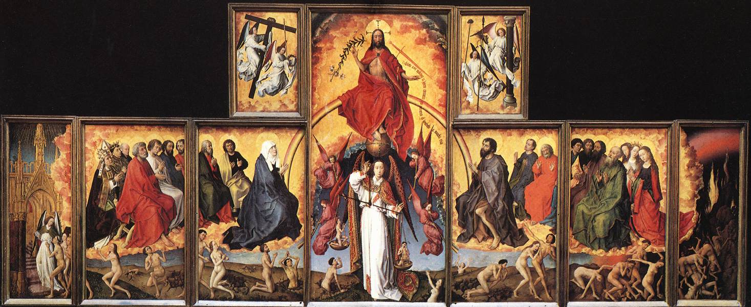
Last Judgement, Rogier van der Weyden. Around 1445.


Thirdly, it has also been used as a moral tool to keep the people from committing crimes, whether in the terrifying Mediaeval visions of hell so popular in hospitals (one imagines to give you some perspective on your own situation) and churches in those times, or in the Victorian visions of the happy home in which the family are content because of their moral character, versus another home destroyed by drink or adultery.
Lastly, I truly believe that art can literally heal you. After all, we all know that the things that, generally speaking, will keep you well are good food and drink, the right amount of sleep, and few things to worry us. But contentment isn't enough. We also want to experience things that make us happy. This is obvious: given the choice, when we can, we go somewhere pretty. You wouldn't hang an ugly picture in your living room because it wouldn't make you happy. This is the same reasoning that tells you not to paint a hospital room black, and to use a small window, even if it were more cost-effective. There is, after all, a difference between being fit, and being happy. But each helps the other. If you compare two cities with the a similar population, a similar climate, and expense, and were offered a trip to each, you'd probably be more likely to pick, say, Prague (population 1.25m) over Birmingham (1.07m). Even if you've never been to either, you'd judge them on what you'd heard of them. And you'd pick the one that is, in your mind's eye, the more beautiful. You know you'd feel better while you were there because of it, and you'd come back feeling well. Because the two factors work together. If all you see is ugly, you will produce only feelings, thoughts, even objects and actions, that are ugly. Imagine a film that replicated something like the idea of room 101. Say that one person was kept in a box with only German Expressionist paintings on the walls - Kokoschka, Grosz, etc. and had Schoenberg played at them for just an hour. That could easily be made into the room in a horror film that sends someone mad, and that makes them hurt others. It's literally a traumatic assault on the senses. But imagine if you sampled the quintessential art of another era - like filling a room with Dutch Golden age paintings, and playing them Dido and Aeneas. Or with Rococo portraiture, and playing them Handel or Bach. Or Mozart. Surely it would be impossible to make only the exposure to the art, with no outside factors, upsetting? Well, beside the drama of the music, of course.

Prague and Birmingham.


In summary, Hockney's quote is a good one - the idea that art should never be deeper than surface appeal is not always the truth, as even the most luscious and original artwork will inevitably have little parts where the influence of others shows through - and you may learn more about the artist, and the motivation behind their work, by understanding these. Similarly, if we go back to painting for a moment, in many Religious and historical works, it may be of use to know the background of a story (Athena and Arachne, for example, or The Agony in the Garden.) in order to better understand the emotions conveyed by the characters depicted. But if a work conveys nothing without explanation, it is inadequate to it's purpose, surely.
Some of the quotes supplied to me only reinforced the points I've already discussed, which makes me feel partly confirmed in my suspicions, partly afraid that I haven't challenged myself enough. Here are a few of my favourites. I should add, though, that as I have sourced these from online research, the wording may vary. However, if they convey a meaning that is insightful, does that matter much?
Here is a quote from a somewhat controversial artist, one that did rather push the boundaries. It's quite surprising when you consider his artwork.
“In our time there are many artists who do something because it is new; they see their value and their justification in this newness. They are deceiving themselves; novelty is seldom the essential. This has to do with one thing only; making a subject better from its intrinsic nature.” - Henri de Toulouse Lautrec, who I would have considered a modernist, and certainly someone who shocked the public. His quote seems very apt in this era, though. It's interesting to see how much it has endured, and how people were perceiving works at the end of the 19th century. 

That's not to say that I haven't had a look at the work of contemporary artists/craftspeople. One of the short films that I've particularly enjoyed about a contemporary artist, their work and motivation, has been this film about Emma van Leest, an Australian paper-cut artist. In the film, she defines her motivation as a life-long love of creating imaginary worlds, and the reason that she enjoys her current method as "the sheer minimalism of it - all you need is paper and a blade". And that's something that we can all relate to. There's always something to love about an opportunity to dream, and to use your imagination without forcing it into a product. And there are many little repetitive acts that have their own satisfaction involved in them - knitting plain rows, filling parts of a drawing with colour, even organising books or records. That's not too far removed from paper-cutting.

I also thought it might be a good idea to have a look at what Grayson Perry would have to say on the subject, as he is so often interviewed, and has so many opinions. Here's a video of him talking to the V&A about art versus craft. This would be a good one to revisit and look into a bit deeper later on. 
It's interesting that at the start of the video, what he defines craft as 'a skill that can be taught and passed on' and art as 'the individual vision, something that can't be explained or taught'.
I think that if I accept this definition - and I certainly think there's something to it, that it's a good one - then my 'art' must be about 80% craft. But I don't feel that is the wrong approach. 

Taking a step back to my earlier research point; finding quotes from famous artists, there were also some great quotes out there on a lighter tone. Here are my top three. 

If people knew how hard I worked to get my mastery, it wouldn't seem so wonderful at all.” Michelangelo - a reassuring idea for us all. 

Life obliges me to do something, so I paint.” Rene Magritte - an artist who suited his work to his philosophy in a most truthful way.


Finally, my favourite quote of all came from the painter, Edward Hopper. Upon being asked why he painted, he replied, “If I could say it in words there would be no reason to paint.”. It's one of the great mysteries.