Monday 27 October 2014

In the Summer, I went on a Trip. Part Two.

Another interesting item in the Museum - one among many - was an embroidered (stumpwork) casket from the 17th century. Unfortunately, my camera has irreversibly blurred the picture I took of the label, so I can only observe in retrospect.


The casket features, as almost all caskets of the period do, natural motifs of symbolic flowers, leaves, and some insects, as well as the occasional larger animal (a lion and a leopard can be seen at the top of the above photo). This photo is of the back of the box, and shows quite a menagerie. at the top, an eagle, lower, a stag, one or two caterpillars, and several snails. There is also a smaller bird, in the middle row, though it's feet and legs have evidently been stitched with iron-black thread, and have disintegrated.


There are some man-made motifs too. Here you can see a man in a tent, with long curls and what looks to be an oxidised silver crown. Perhaps one or other King Charles? In the background is a house with a Dutch gable.


The inside of the casket is also beautifully shaded in silks. Here is a detail of the inside of the door shown above.


The lower half of the box front. Here you can see the attention given the internal drawer fronts, as well as the accompanying door to the man in the tent - another lovely row of buildings stands behind the woman and girl. It's really worth taking a good look at the fabric that makes up the woman's dress. It's so vibrant, and mirrors the featured flower decoration in miniature.


Just in case you were wondering, I also took a picture of the object in front of them - I seem to remember reading the notice for this one, and it telling me it was a mid-Victorian sampler made to look like a mosaic, but I can't now confirm this.


Finally, a picture of the lid of the box - I'm afraid it does look a little washed out, but the light above me was quite bright, and I couldn't shield it. But you do get a good look at the main feature, a crest.


You'll notice that the woman on the left has very deep shading in the folds of her skirt. Here's a detail of how that stumpwork fabric was put together. It looks like buttonhole / Brussels stitch.


Like the last case of lace, I think this piece probably had a slightly... Well, if not sinister, probably not a happy history. I wonder what age the person who made this was? Probably less than 14, if the museum guides are anything to go by. Just imagine how many stitches made up the whole box. I love the idea of the box, though, with all it's drawers to keep equipment and samplers in. I'm sure people must still make these, they seem to be such a large part of 17th century needlework. I think I'll try and find some work-hour estimates, and revisit this idea.

In the Summer, I went on a Trip. Part One.

Last time, I looked at the research point that dealt with traditional textiles. This time, I thought I'd answer another one of the folder's questions - whether there were any textile arts that were unique to my local area. In August, I went to Bedford Museum. And it was great! Earlier today, I was taking some pictures off of my camera, and realised I'd never written anything up about my trip! So I'll belatedly do so now, and whilst doing so, I'll talk about the local craft.

Once upon a time, Bedford was famous for it's lace. Bobbin lace, that is. As I understand it, it was particularly popular in the Victorian period, and therefore, it is well documented in the town museum. Here's a picture of the lace display case:


As you can see, it focuses quite a bit on the man pictured at the side of the case, Thomas Lester. More about him later. There were plenty of different items on show, most prominent among which was this large item, a parasol cover.


Here's a close-up of the cloth itself. The most remarkable part, to my eye, is the number of tiny pin picots along the edges.


Some other, similarly fancy items were also in the case; I think that both of the following items are cuffs, though obviously they are displayed differently.


Part of a cap with an ostrich motif. The background is simply amazing. Two parallel rows of fine thread with looped pin picots - the thread used appeared to be finer (and neater, more tightly twisted) than modern sewing cotton, let alone crochet cotton. It was more of an equivalent to 100/3 silk. Most of these pieces were made during the mid-Victorian period, and so could well have been made with machine-spun thread. However, found elsewhere in the case are medals and certificates demonstrating the prizes won by the designer at various exhibitions and 'world fairs', so it may still have been worth the while of the manufacturer to retain some hand-spinners for his finest pieces. I think I'll do a little more research into this, and find out more about the remaining numbers of hand-spinners at the time.


At the bottom of the case was a book of sample edgings with an unreadable contents page opposite.


Some business cards and one of the prize medals.


At the side of the case was the man that ran the works producing the featured items, Thomas (sometimes spelt Thomazin) Lester. Despite producing these beautiful objects, this tale of Victorian textile production seems to have followed the usual course - the sign tells me that selling his products marketed at 'real lace' meant that the lacework itself was produced by hand (though there's no word as to the origins of the thread), and that Lester came up with many of his own designs to compete with simpler machine made lace - it was a business venture, not so much an artistic one. I said the business followed the usual course; the notice also reads "He was known as a hard task-master who would sometimes punish his workers if their lace was below his high standards.". This thought, though it is one that has followed almost all textile work, and especially lace making, throughout the ages, cast rather a pall over the jolly animal scenes for me. Though lace is probably my favourite textile art, it has a terribly hard history. I moved on to another exhibit, which I will write about in my next post.

Saturday 25 October 2014

Reflections & Research. Comparing Contemporary and Traditional Textiles.

Last time, I looked at some of the material I've been collecting. This time, as part of the same research point, the folder has asked me to look at ways in which contemporary textile design contrasts with still-popular traditional designs that offer different associations to the consumer - for example, nostalgia for a different time. Whilst I've chosen a topic that is firmly contemporary to look at for this post, whether it can be considered 'available to the consumer' is debatable. However, it's an interesting area, and one that has interested me a good deal recently. I want to look at the different techniques used by textile arts designers, and in particular the kind who are often employed by a fashion house to come up with a headline-grabbing idea for their new show. The first person I've chosen to look at is Iris van Herpen. A Dutch fashion designer, she recently caught my attention (personally, though in fashion circles, she is of international renown) by showing clothes that were made with a 3D printer, and therefore (as she proudly states in her website's pamphlet for the collection, Escapism), required no sewing or handwork of any kind. This produced 'clothing' such as this:

Credit to this Dutch fashion site.
And laser-cut 'fabrics' such as this:

Credit to her official site, here.
This is, of course, only to be expected when such a cult exists around a new piece of technology - the rise of the 3D printer is certainly something commented upon in the media very often, and the fashion world being what it is, it must be obviously current and cutting-edge to keep up. But, I wonder - fashion being basically an off-shoot of the textile branch of art, whether the change in materials (these two outfits, I understand, are made entirely from plastic) means that these pieces don't qualify as textile pieces at all, although they fulfil the same purpose, and are approached with the same design ideas in mind. Perhaps, but then, synthetic fibres, such as nylon and rayon are just as processed as the basic materials used to make these pieces. So perhaps it's the way they're made? After all, rayon and nylon are at least spun into threads and woven or knitted into cloth. Well, that could also be true. But then, are we to say that anything that doesn't use a traditional method to make a cloth can't be used by a true textile artist? For instance, vinyl raincoats and tablecloths, or a lamé dress, which is, after all, gold leaf applied to plastic mesh. On Collins English Dictionary, for example, 'textile' is defined vaguely as "1. any fabric or cloth, esp woven. 2. raw material suitable to be made into cloth; fibre or yarn.". There is no mention of the origin of the 'raw material', and only two examples are given. There is no definite boundary given for the techniques used, only the phrase "especially woven". Surprisingly, the Oxford Dictionary is even more ambiguous: "Noun. A type of cloth or woven fabric". A type of cloth OR woven fabric? Well, their definition of 'cloth' hardly clears things up. "Woven or felted fabric made from wool, cotton, or a similar fibre". Surely it can be argued that Jersey fabrics, with their knitted structure, are kinds of cloth, though they are not woven or felted in the stricter sense? So, if modern design of clothing, and in particular, new materials being involved in it's production (even if ancestors of those new materials have been involved, one way or another, for the best part of a century in manufacture), are still on the borderline with textile arts, can this type of clothing be argued as a viable branch of modern textiles?

Credit to Neri Oxman.
This is a piece - one of several in the collection - that is again constructed by 3D printer, then filled out with selected micro-organisms that (if I understand the press release correctly) are to generate and store oxygen. They are billed on the designer, Neri Oxman's website as "3D printed wearable capillaries designed for interplanetary pilgrims". It's incredibly 'sci-fi'. At first glance, you might assume that this was the next step on - as far removed from our origins of simple woollen cloth as possible. But think about it - if this strategy evolves, as surely it will (it's a fantastic idea, if nothing else) and it becomes useful in a new environment, then surely it continues in the greatest purpose of textiles - that of using the tools around you to create a personal shelter, whether from the elements, from illness, or from other people. The idea of creating a kind of micro-biotic colony that you can transport sounds mad, but it builds on current technology by bringing further, natural ingredients 'to the table'.

So, whilst we're impressed by the ideas behind the future of textiles, let's take a moment to appreciate more traditional methods. It is clothing that has, arguably, formed the core of our history in textiles, and so for far comparison I will keep it as my topic. Simplifying wildly, and abridging ruthlessly, let's think about a little of it's evolutionary trail. Once the problems of being cold, being burnt by the sun, being wet, or being engulfed by a sandstorm were partially overcome, at least for the leaders of our oldest societies, what one wore was more than ever indicative of social standing. You showed that not only could you afford to provide adequate clothing to protect your family/tribe/group/self from the weather, but you could afford to be more elaborate, and less practical, because you wouldn't be dragging your clothing through mud, up trees, or into fields. If we look at even the most isolated group of people, or the poorest, or those who live(d) in the most extreme situations, there is always some kind of social structure, and therefore, some kind of signal to others in the appearance of the leader(s) as to who was in charge. And this was invariably something to do with the way they dressed. Since that point, further markers, not just those of authority, have been developed in dress. This is most notable in the dress of people who represented well-thought-of professions, or people with a religious rank, for example, scribes and master masons in ancient Egypt, or the high priests of Jerusalem in the early centuries BC, both of whom had garments that were firmly restricted to their class and occupations. Later on, in Medieval and (at least for Britain) Tudor society, it was possible to know exactly what rank a nobleman was by the kind of fur with which he lined his cloak. But surely no society of any time had a system not just of clothing, but of all design, that contained symbols in every shape, harmony in every item, and respect in every gesture, than Japan. Japan is a perfect candidate for comparison with contemporary textiles, for not only is it constantly drawing on inspiration from all corners of the globe and combining it with an utterly unique perspective, but it has a great sense of tradition, of what is appropriate and when, and a powerful feeling of it's own identity. Of course, the great icon of Japanese dress is what is popularly known as 'a Kimono', though in Japanese, if I understand correctly, this translates more easily to clothing oneself as a concept, and less to do with one or more items of dress. So let's take a look at a very traditional ensemble. 


Credit to the Metropolitan Museum of Art, NY

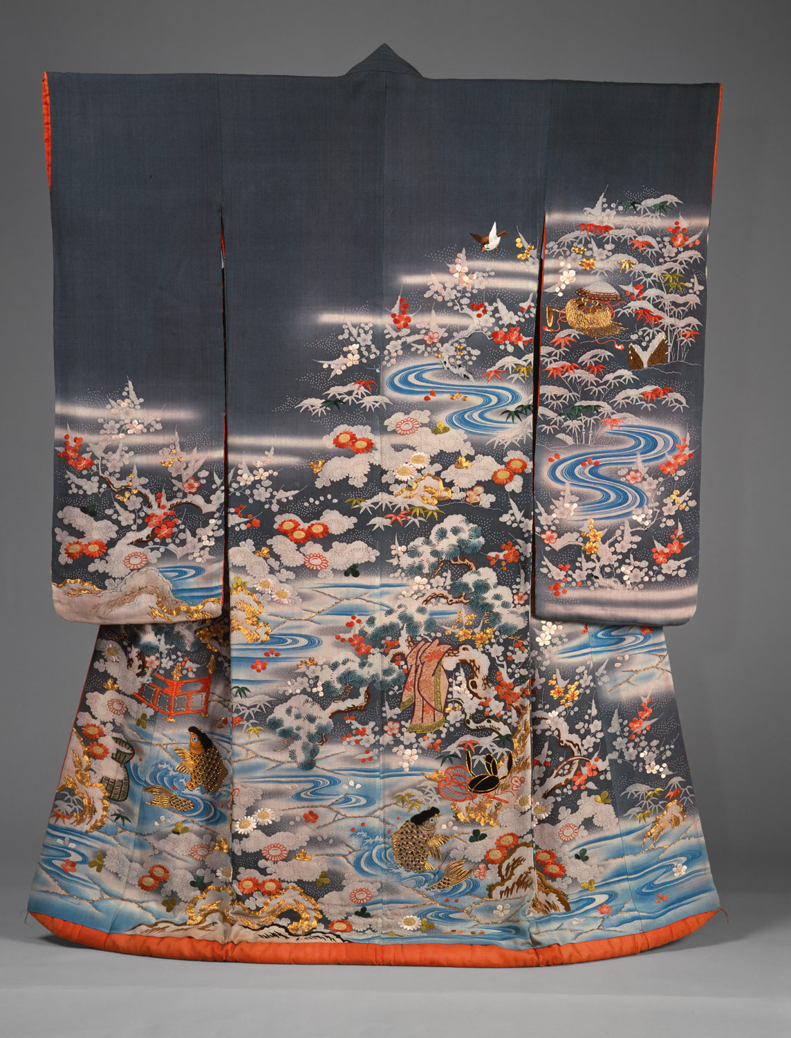
This is an Uchikake, a formal or wedding kimono, held at the Metropolitan Museum of Art in New York. It dates from around 1800, and is a combination of dyeing techniques and embroidery. Here's a close-up of the embroidery in the lower right corner.


This particular Uchikake is designed in quite a reserved style, which one might think was characteristic of Japanese design overall, but this is not the case - for me, this item is a piece of art which has it's beauty mainly in it's arrangement. The composition of the motifs is what makes it stand out - of course, when you look more closely, you can also see the incredible artisan workmanship that has helped to bring the vision of the designer to life, and that is of equal worth with the design, if not more, but the way that it, as a garment, turns you into a gallery for artwork with a legacy of literally centuries, if not millennia of tradition... The refinement of that time is evident in every part of the piece. Now, I said that the reserved look of this garment is not always the case - the best example I could find of this is pictured below, but frustratingly without a date.

Credit to this Japanese Photography Blog.
This example is another Uchikake, but as you can see, this is much more heavily and brightly embroidered (whether by hand or machine, though as there are a couple of visible repeats, I would tend to say machine). As I can't be sure of the date, I think that I will say it's fairly recent, but obviously with a basis in traditional design. There are many different types of flowers depicted, and equally brightly-coloured birds can be seen in swooping poses moving across the surface. To many people in the modern age, the sheer amount of bright colour and clustered decoration seems unwise, not to say a little unsophisticated and perhaps 'trying too hard'. Personally, I think it's a terrible shame to put up boundaries to 'good taste' that limit the amount of work and decoration an artist includes in their work - surely the more time you are willing to dedicate to project, the more you value it, and the more others can appreciate how much work you put in. Of course, it's a different question depending on the medium, but when it comes to traditional dress, would it really be right to impose our modern "standards" of what is good design?
Lastly, I'd like to show this recent Kimono, which I believe is printed (again, there is little information provided) and which is inspired by the Aurora Borealis.

Northern Lights Kimono, origin unknown.
Now, the folder has asked me to consider what it is that keeps traditional designs popular. I think it's a combination of factors. In the case of the Kimono, it's partly because there are occasions where it (or a simplified modern version of it) are the only truly appropriate things to be worn, partly because they are such an icon of the country, it's history, and it's artistic heritage, and partly because whatever your background, they are undeniably beautiful. I hope that they will still have a place for many years.

Wednesday 22 October 2014

Adding to my Material / Resource Collection, Part Three.

Next, I went to a shop that specialised in quilting, and had a look at their selection - they had plenty of fabrics that came in 'fat quarters', smaller pieces that you could buy a couple of to use in your appliqué and quilting when a whole metre length would be excessive. I bought seven small pieces, choosing them only with regard to my own likes and dislikes. Like the designer fabrics I bought earlier this week, I picked fabric that had colour shifts, some metallic elements, and bold colours. I surprised myself when I reviewed my selection at home, realising that four of the pieces I'd chosen were more or less floral. The three pieces unfolded to show their larger repeat areas, and the top left folded scrap, were those four. However, I chose them because I was reminded of Kimono fabrics when I saw them. These prints - and they are true prints - are going to be a little less precious than my other recently acquired woven material, as the shop apparently has a large stock of many of these designs. So I can be a little freer in the rest of the section, should they come in handy.


Monday 20 October 2014

Adding to my Material / Resource Collection, Part Two.

Here are some of the larger pieces from the end-of-roll section from the same shop - they're lovely designer fabrics with a beautiful sheen to them.
The two in the foreground are my personal favourites - the print on the left has a larger repeat area, so it doesn't come out so well in a photo - it's a kind of Baroque design with plenty of scrolling leaves and interesting borders. These particular material scraps, being mostly for upholstery, are very weighty, and have their designs woven in, rather than printed on.
They are exceptionally nice pieces of material, and I'm going to have to hang on to them until a really good use for them comes up - they're too good to waste on an experiment!

Adding to my Material / Resource Collection, Part One.

I've been out shopping, as recommended by the folder, looking for interesting fabrics. The first place I went to was a warehouse of interior furnishings. The whole place was full with beautiful fabrics, but all at prices far out of my range. Luckily, there was an end-of-roll room. Here are some photos of my new stash, beginning with a range of fabrics from two sample books they gave me for free!


Friday 17 October 2014

A Follow-up Follow-up. The Chasuble of the Order of the Golden Fleece.

Ok, so in my last post, I talked a little about the items and their history, but here, I'd like to show off the technology that lets everyone view them, and see a little more about how they were made. Firstly, I'd like to show a picture of the Opus Anglicanum that was, as I said in that previous post, said to be the finest example of Mediaeval needlework in existence. The main points stressed in the documentary that statement came from were the split-stitching, and the expressive nature of the faces. So here's a detail of one of my favourite pieces featured in the documentary, a nativity from the Bologna cope.


I couldn't agree more that the faces are beautiful, and very emotive. However, in an objective way, I want to know more about the manufacture of both before I decide that one is better than the other, if I decide at all! The difficulty in manufacturing pieces such as these has to be taken into account when discussing which has achieved greater realism and, effectively, triumphed over it's medium. So let's look at the Belgian vestments more closely.
The chasuble is a unique item amongst the set, and seen here is the back view.


This item is far more 'zoomable' than the copes, and therefore, a sequence of captures follow. First, see the angel to the left of the figure of Christ above. His face is constructed in silk on linen (laid on top of the gold, or padded onto the original linen base, it's hard to tell) in 'burden' stitch. But his hands are stitched directly over gold, though using the same method.

Looking at the face of the angel, you can clearly see (it may be necessary to view this picture full-size), the linen base coming through - these spots are ringed in blue. With the hands, the gold base is even more evident. In the lower ring of the face detail, it's also possible to see a strand of the gold thread turning back on itself. This is why I say I am uncertain as to whether the gold stops are the boundaries of the face, or carries on underneath padded linen across the width of the cloth.

Unlike the angel, in this detail of Christ's face, it is easy to see how the red and pink threads have been laid onto the gold to construct the features - as far as I know, this is the only face in Or Nué in the set.


It is also possible to see the different directions of each layer of 'gilding', but again, the ends of the threads are so beautifully covered, that it is difficult to decide whether they are literally layered (which seems unlikely) or that the direction of each thread is decided beforehand - for example, I think that the halo's circular thread placement must have been pre-planned, and the horizontal threads turned back on themselves all around it. However, the hair appears to be laid on over the top of the robe's horizontal threads. Another detail:


And another of the hair over the robe:


Finally, a closer shot of the eye, where you can see a thread outline.


Again, the workmanship is incredible. The shading along the bridge of the nose, the different colours in the hair - it's amazing. But now observe this: two of the pictures I've already shown, but reduced in scale to life-size. The detail of the angel, if displayed at the correct resolution, should be no larger than 75mm high. The detail of Christ's face with halo, 150mm.


So, what techniques are viewable in these details? Well, it's almost entirely made from Or Nué, most often creating a picture through use of multi-coloured silks. In some places, a gold or white silk has been used to create the illusion of patterns made entirely from undulating gold - this is most noticeable in the borders surrounding the angels and (on the copes) the halos of the saints. Around each irregular hexagonal frame housing an angel or saint, there is also a strip of fine red velvet, with the pile somewhat worn. This has been embroidered over with more gold. The faces of the minor characters on the chasuble (and I suspect this to be case with the figures on all three copes) are stitched with silk on linen, raised in some way. For the moment, I'll leave this little research point at that - looking around for more information on similar vestments, I came across a thesis written by an Art History PhD student on the subject of Opus Anglicanum. Maybe it'll shed more light on the early works, as so few really good illustrations exist of them.

Thursday 16 October 2014

A Follow-up to my Thoughts on Opus Anglicanum.

When I was studying painting, I became particularly interested in one website, and the detail available on it. The website was based in Belgium, and named 'Closer to Van Eyck'. It can be viewed here. It allowed you to zoom in on any frame of the Ghent Altarpiece, as painted by Jan van Eyck, and look at the utterly phenomenal details he included. Recently, I heard about another website whilst following Wikipedia image tags - I noticed that many of the best and largest images available were from a site called the 'Google Art Project'. I wondered why I hadn't visited it before. I soon discovered the way that it let you view the insides of museums, read about the objects contained, and, most interestingly, to zoom in on those objects. I found the van Eyck Altarpiece of embroidery on that website - it's part of the permanent collection of the Kaiserliche Schatzkammer, Wien (otherwise known as the Imperial Treasury of Vienna). This set of masterpieces, known as the Vestments of the Order of the Golden Fleece, are almost certainly Belgian in origin, most likely from Brussels. Their design has been attributed to the early 15th century Flemish artist, Robert Campin. Made on linen from a combination of beautiful goldwork (mostly Or Nué), and incredibly fine burden-stitched details, these pieces are almost certainly the finest artworks in embroidery to come out of the 15th century. I was so glad to find them, and to see how they were made in enough detail to (perhaps one day) work out how to replicate their techniques on the same scale. Looking at them, I was so 'blown away', that I felt I had to write a little about them. But first, a short gallery and explanation. There are eight pieces still in existence that form the set - I am uncertain as to whether this is the original number of vestments, as they are numbered thus: two 'altar frontals', two dalmatics, one chasuble, and three copes. This seems odd - perhaps there were originally three dalmatics and chasubles, though this is just speculation. Made between 1425 and 1440 for the court of Burgundy, they are often referred to as the 'most costly and finest' set of Medieval embroideries ever made. But I'm getting away from my point. Here are some images. Bear in mind that the copes are about 3.3 x 1.6m across. This first cope is the Marienmantel, aka the cope (or cape) of Mary. This cope follows the theme of female saints, and uses a lot of blue in its palette, surely in allusion to the colour most associated with Mary. She is seen seated in the very centre of the pattern.


A detail from the Marienmantel: the angels that surround her.

 
A second detail: the shading on her robe.


The other copes - one with the figure of Christ, and themed around his representative colour, red, and one with the figure of John the Baptist, with themes of natural colours - green and brown - are equally sumptuous (both are accessible on the same site as the Marienmantel above). Here is a detail of the angels from the Cope of Christ:


These details are about as close as you can zoom on these particular objects, but the chasuble, being a far smaller object, is much more closely photographed. More about that in the sequel to this post. Looking at these objects, I was reminded of something I wrote about before - the BBC Four documentary on English embroidery of the 14th century. I watched it again recently, and was struck by his claim that embroidery had reached a high point in the 'Opus Anglicanum' of that pre-plague age, and that (I should stress, he was talking about the craft, not just the craft within the borders of England) it would never be able to reach such heights again. Surely these vestments must dispute that? Just to finish this post, here is another picture I've put together from the main images of the three copes. They are seen here exactly as they appear on the copes - their postures and even the colours of their clothing a tribute to their Belgian Tradition - and so similar to the van Eyck they are pictured with.